Did you know that over 70% of artists who try working on toned paper describe it as a transformative experience for their creative practice? This surprising statistic reveals a world of untapped potential.
We invite you to explore this versatile medium that opens up creative possibilities beyond traditional methods. It challenges your artistic perspective in exciting new ways.
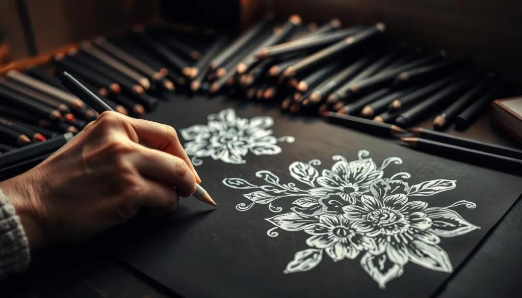
This unique approach lets you work with light values on darker surfaces. You essentially reverse the traditional method of adding dark marks to white paper. The results can be stunningly luminous.
Our comprehensive guide walks you through everything from fundamental concepts to advanced methods. We ensure artists of all skill levels can confidently incorporate this tool into their work.
We combine technical expertise with accessible language. Complex concepts become understandable and achievable for every creator wanting to develop their skills.
Key Takeaways
- Working on toned paper can fundamentally change your approach to creating images.
- This method reverses the traditional process of applying dark marks to a light surface.
- The technique produces a unique, silvery luminosity in finished pieces.
- Our guide is designed to be accessible for both beginners and experienced artists.
- You will gain a thorough understanding of materials, applications, and professional methods.
- We provide clear instruction and supportive guidance every step of the way.
- Mastering this skill expands your artistic toolkit with a powerful new option.
Overview and Essential Benefits
The true magic of this method lies in the luminous, almost ethereal quality it brings to your artwork. This unique aesthetic is often described as silvery or velvety, creating a presence that is difficult to fully capture in photographs.
We love how this approach fundamentally shifts your process. Instead of erasing to correct or lighten, you add light values directly with your tools. This additive nature allows for more fluid and confident mark-making.
Another significant advantage is the control over color temperature. When you blend white charcoal with regular charcoal pencils, it cools the darker tones, introducing a subtle blue hue. This creates a sophisticated and cohesive look throughout your composition.
This technique is remarkably versatile. It works beautifully for a variety of subjects, from portraits to still life. You learn to think more deliberately about value relationships and the interplay of light and shadow.
Artists who master this skill develop a more nuanced understanding of value structure. Your final drawings become more compelling and sophisticated. It’s a powerful addition to any creative toolkit.
Materials and Tools for White Charcoal Pencil Drawing
We believe that quality supplies should be accessible to every artist exploring this medium. The right foundation makes all the difference in your creative journey.
Essential Supplies and Recommended Brands
After extensive testing, we enthusiastically recommend General’s Charcoal White 558 as our top choice. These white drawing pencils deliver superior performance with smooth application.
Pair them with General’s Charcoal Pencils in various grades (HB, 2B, 4B, 6B). This combination creates the value range needed for sophisticated artwork. A comprehensive starter kit includes three grades of regular charcoal, one white tool, and a kneadable eraser.
Choosing the Right Toned Paper
Your paper selection significantly impacts results. We suggest Strathmore Artagain Black paper or Fabriano Black for dramatic high-contrast work.
Mid-tone Artagain paper offers versatile applications. Consider the texture carefully—rougher surfaces allow richer layering while smoother ones create delicate effects.
You can also create homemade toned paper using Strathmore 400 Series, giving you complete control over your surface. Investing in quality materials enhances your learning experience from the start.
Preparing Your Workspace and Toned Paper
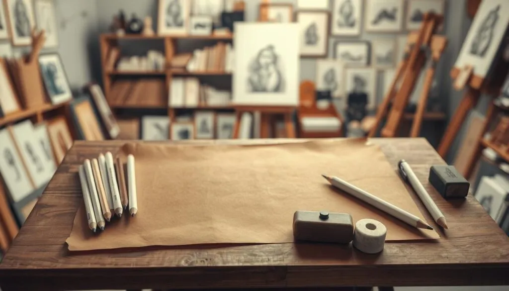
A well-prepared workspace is the unsung hero of any successful artistic endeavor. We focus on creating an environment that supports your entire creative process. This setup saves you time and lets you concentrate fully on your work.
Homemade versus Store-Bought Toned Paper
The choice between these options depends on your needs. Creating your own homemade toned paper offers a unique benefit. When you apply your medium to a surface you’ve prepared, the materials blend more quickly.
This approach can feel more integrated from the start. We recommend Strathmore 400 Series as a great base. It gives you control over the final value of your paper.
Pre-made toned paper provides excellent convenience. It comes in many colors and is ready to use immediately. This is a fantastic way to begin if you are short on preparation time.

Setting Up a Comfortable Drawing Station
Your physical setup is crucial for long sessions. Ergonomics prevent fatigue and help maintain focus. We suggest a few key tools for a professional-grade station.
- A sturdy drawing board secured with bulldog clips, which are gentler on your paper than tape.
- A Mahl stick, a simple but brilliant tool. It lets you rest your hand while working without smudging your creation.
- Good lighting and a comfortable chair to support your posture throughout your drawing process.
This thoughtful preparation paves the way for more enjoyable and productive artistic exploration.
Understanding Drawing Technique Fundamentals
Before we explore specific application methods, let’s build your foundation in the universal language of light and shadow. These core principles apply to every medium and skill level.
Basics of Value, Contrast, and Gradation
Value represents the lightness or darkness in your artwork. Mastering this element creates the illusion of three-dimensional form. It’s the backbone of realistic rendering.
We encourage analyzing subjects through three value families. Identify dark values in shadows, middle values in transitions, and light values in highlights. This simplification makes complex scenes manageable.
Squinting at your subject is our favorite technique. Half-closing your eyes blends similar values into unified shapes. This helps you see the essential pattern of light and shadow.
Establish your value extremes early. Find the darkest dark and lightest light areas first. These anchors help you accurately judge all intermediate values.
Contrast creates visual emphasis when you place lightest areas near darkest ones. Gradation produces smooth transitions that suggest curved surfaces. Understanding these relationships gives you conscious control over your artwork’s impact.
Technique One: Blending White and Regular Charcoal
We find this initial technique offers the gentlest learning curve while delivering stunning visual results. It feels familiar yet opens a new creative door.
This method uses both light and dark tools on your prepared surface. You build the image entirely by adding material, which is a liberating way to work.
Process Highlights and Step-by-Step Guidance
Start by blocking in major dark shapes with your darker tool. Then, introduce the lighter medium to establish highlights. The true magic happens in the middle tones.
You create these intermediate values by layering and mixing the two types of material. A soft brush is perfect for blending them smoothly on the paper’s surface.
| Aspect | Focus | Primary Tool | Key Consideration |
|---|---|---|---|
| Light Values | Adding brilliance | Lighter medium | Apply progressively |
| Dark Values | Establishing depth | Darker medium | Build layers gently |
| Middle Values | Creating form | Blended mixture | Use a brush for smoothness |
Benefits and Potential Challenges
The additive nature of this approach is a major benefit. There is no need for an eraser to correct light areas. You simply layer more light material.
Blending the two materials creates a unique, cool aesthetic. This gives your artwork a sophisticated and cohesive look. For best results, use the light material throughout the entire piece to maintain temperature consistency.
A potential challenge is paper saturation. Applying many layers can fill the paper’s tooth. Choosing a quality, textured sheet helps minimize this issue from the start.
Technique Two: White Charcoal on Black Paper
If you’re ready for a creative challenge that will transform how you see light and shadow, this method is for you. This approach completely reverses traditional thinking about value relationships.

We introduce this as a medium-difficulty method that produces striking, high-contrast results. You’ll work with only one tool on a dark surface.
Step-by-Step Tutorial and Key Tips
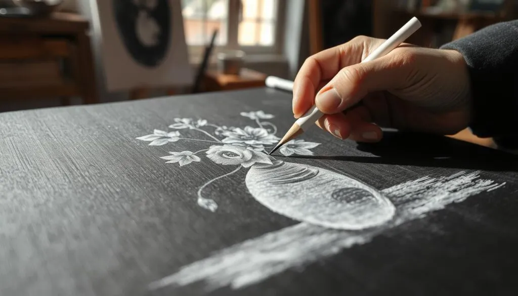
Begin by identifying where light hits your subject. Leave the paper untouched in shadow areas. Apply your medium only to create highlights and mid-tones.
This process can be surprisingly quick. You’re building up light values rather than rendering extensive shadows. The simplicity of using a single tool is one of its greatest strengths.
We recommend this approach for subjects with dramatic lighting. It works beautifully for rendering glass objects with strong highlights. The draw glass using white charcoal method creates especially effective results.
Pressure Control and Eraser Usage
Mastering pressure is essential for this technique. Light pressure creates subtle mid-tones while firm pressure produces bright highlights. You’ll develop a sensitive hand since you can’t switch tool grades.
The eraser plays a unique role here. Instead of lightening values, you’ll use it to darken and blend marks. This creates smoother transitions between values.
Embrace this reversed thinking process. It will expand your understanding of value relationships in all your future work.
Technique Three: Leaving Half-Tones as the Value of the Toned Paper
Ready to elevate your artistic practice with the most sophisticated approach to working on toned surfaces? We present this as the most advanced of the three methods. It requires careful planning and a deep understanding of value relationships.
The results, however, are absolutely worth the challenge. Your artwork will have a distinct, intentional appearance.
Planning Your Value Structure
This refined approach transforms your surface into an active component of the composition. You’ll use a light tool for highlights and a dark tool for shadows.
The crucial middle values are strategically left as the exposed tone of your sheet. This demands thorough forethought.
You must map out where light, middle, and dark values exist in your subject. The goal is to avoid accidentally covering those essential mid-tones. This disciplined planning is the foundation for success.
Creating Smooth Transitions and Gradations
The key distinction here is transparency. Instead of opaquely covering the surface, you apply both types of medium more lightly.
Allow them to gradually gradate into the tone of the sheet. This creates subtle and beautiful ranges of middle values.
This technique works exceptionally well for subjects rich in mid-tones. It gives the impression that your creation is emerging organically from the paper itself. Mastering this way of working will significantly stretch and enhance your overall skills.
Mastering White Charcoal Pencil Drawing
We’ve discovered that the most compelling artwork often results from thoughtfully combining multiple application methods. True mastery involves understanding when each approach serves your creative vision best.
The three foundational methods we’ve explored represent starting points, not rigid rules. As you gain confidence, experiment with blending opaque and transparent applications within a single composition.
| Technique | Best For | Skill Level | Combination Potential |
|---|---|---|---|
| Blending Both Types | Subtle transitions | Beginner to Advanced | High – works with all methods |
| Light Tool Only | Dramatic contrast | Intermediate | Medium – great for focal points |
| Reserving Mid-Tones | Sophisticated effects | Advanced | High – creates depth variation |
Consistent practice develops the muscle memory and intuitive judgment that separates competent work from truly masterful creations. This investment of time yields significant creative returns.
The point where these methods become second nature marks a powerful evolution in your artistic journey. You’ll naturally develop preferences while remaining open to new discoveries with each project.
Inspiration from Life Drawing Examples
Matthew James Taylor’s charcoal figure studies offer a fascinating window into professional artistic decision-making. We find examining how accomplished artists approach the human form provides invaluable learning opportunities that can accelerate your own development.
Insights from Matthew James Taylor’s Work
Taylor’s preference for General’s tools aligns perfectly with our recommendations. He appreciates their beautiful sooty texture and strong leads that rarely break. The availability of multiple grades, including white for highlights on toned surfaces, creates versatile options for any figure drawing session.
His work demonstrates how different time frames require distinct approaches. Quick three-minute sketches focus on essential gesture and proportion. Longer sessions up to two hours allow for detailed rendering and nuanced value development.
Visual Examples and Drawing Variations
The variety of poses in life drawing work presents unique challenges. Seated figures with hands supporting the head demand careful attention to weight distribution. Foreshortened reclining positions test your understanding of perspective.
Each pose requires different problem-solving strategies that strengthen your overall observational skills. Drawing from life develops your ability to see three-dimensionally in ways photographs cannot replicate.
| Drawing Scenario | Primary Focus | Recommended Approach | Time Management |
|---|---|---|---|
| Quick Sketch (3-5 min) | Gesture and proportion | Broad strokes, essential forms | Rapid observation |
| Medium Session (20-30 min) | Value relationships | Develop mid-tones | Balanced pace |
| Extended Study (1-2 hours) | Detailed rendering | Full value range | Methodical progression |
Studying how professionals handle complex anatomy and lighting situations builds your problem-solving toolkit. Notice their strategic placement of darkest darks and lightest lights to create compelling focal points.
Advanced Tips and Troubleshooting
Even the most dedicated artists can encounter hurdles; our goal is to provide clear solutions for these common challenges. We want to help you progress smoothly from practice to confident execution.
Common Pitfalls and How to Avoid Them
One frequent issue is paper saturation. Layering repeatedly can fill the tooth, preventing more material from adhering. Use quality paper and plan your value structure from the start to minimize corrections.
Temperature inconsistencies can disrupt visual harmony. If you use your light tool only in highlights, those areas appear cooler. Apply it lightly across the entire composition to maintain unity.
Proper hand support is critical for precision. A Mahl stick is essential for hold control drawing. It lets your hand rest without smudging, ensuring stable control drawing pencil marks.
When following a step step tutorial, like an ear cast drawing, establish your darkest and lightest points early. These anchors make all subsequent value decisions more accurate.
Expert Advice for Refining Your Technique
Struggling with pressure control? This is common when limited to one grade. Practice creating smooth gradations using pressure variation alone. It builds essential muscle memory.
Learning to squint effectively is a powerful habit. It simplifies complex value relationships by merging similar tones. You see the essential structure, not distracting details.
Remember, every area relates to another. Step back often to view your work from a distance. Compare values across the entire piece for consistent lighting logic.
| Challenge | Primary Cause | Expert Solution |
|---|---|---|
| Paper Saturation | Excessive layering | Plan values; use textured paper |
| Temperature Shift | Isolated light tool use | Apply lightly throughout the work |
| Smudging & Instability | Unsupported hand | Use a Mahl stick for support |
| Value Inaccuracy | Poor initial planning | Set value anchors early |
Conclusion
Your creative journey with this luminous medium is just beginning. We hope this guide has illuminated the exciting possibilities and equipped you to start.
We’ve explored three core methods on this page—blending for harmony, high-contrast application, and reserving mid-tones. Each offers unique creative opportunities.
Mastering any new technique requires patience. The distinctive results you’ll achieve make the practice deeply rewarding. Remember, quality materials form the essential foundation for success.
We encourage you to approach your work with curiosity. Allow yourself to experiment and discover your personal voice. This resource remains here to support your growth.
Thank you for exploring this art with us. We look forward to seeing the beautiful work you create.
