
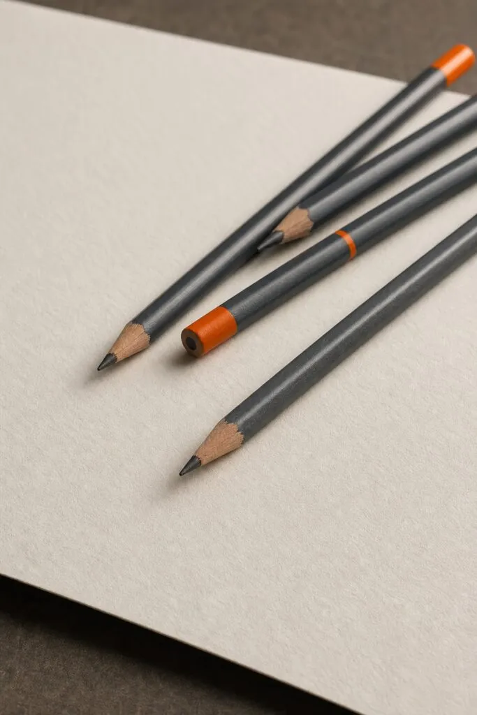
Heavy weight sketch paper can transform a good drawing into something lush and deep. The pencils you pick matter as much as the paper you feed them to. In 2026, artists are paying close attention to how soft leads feel on toothy surfaces, and how premium cores can tame shine on heavyweight stock. This guide walks you through a usable, easy path: how to choose pencil hardness, how to test shading on heavy paper, how a simple wet-method can cut glare, and how woodless graphite stacks up against traditional wood‑cased pencils. We’ll ground the steps in operational testing and a few well‑documented claims from current sources. By the end, you’ll know how to pick pencils that match your paper, your style, and your workflow, so your drawings read as smooth, confident, and ready to share.For a quick refresher on graphite basics, you can glance at the Pencil page on Wikipedia.
Now, let’s set the frame. Heavy-weight sketch paper (think 300 gsm and up) has a distinct texture that affects how graphite sits, how blends layer, and how long a line will stay crisp. The four pencils discussed in the research context span a range of cores and finishes. The soft end of the spectrum, think softer leads that lay down velvet blacks, tavors the most dramatic shading, but can shine and smear if you push too hard on glossy surfaces. The premium Castell 9000 stands out in the data as a high-end option praised for tactile smoothness, even though it’s less talked about in some video reviews. Across the board, the core material matters less than the way the lead interacts with the surface and the way you apply your pressure. Pencil basics help frame what a graphite pencil can and cannot do on heavy stock, but the real test is in your hands and your setup.
In this guide you’ll find: how to pick pencil hardness for heavyweight paper; how to test shading and blending; how the wet-method can tame shine; and how woodless pencils compare with traditional wood-cased pencils. Along the way you’ll see usable checklists, quick decision rules, and specific steps you can follow today.
Step 1: Choose the Right Pencil Hardness
The first decision on heavy weight sketch paper is the pencil hardness. Graphite pencils come with a scale from 9H to 9B, with H pencils tending toward light marks and B pencils leaning toward darker tones. On a surface with noticeable tooth, you’ll want a lead that can deposit enough graphite without leaving a chalky residue or a too‑shiny wash. For heavy paper, many artists find a mid‑range to soft set, such as HB, 2B, and 4B, works well for broad value ranges and layered shading. In the core data, reviewers favored softer leads for deeper values and smoother application. But softness is not a free pass; you must control pressure and build up tone gradually to prevent blotches or shine bleeding into highlights. Official guidance from a vendor on graphite shading and paper choices emphasizes how paper texture interacts with lead softness, and this is a good companion to your testing routine.
Usable approach: start with HB, 2B, and 4B as your baseline set. Use HB for crisp lines and lighter shading, 2B for mid-tones, and 4B for rich darks. If you want more contrast, add 6B or 8B, but keep control by layering rather than pressing hard in one pass. If you’re on the heavy-weight stock with noticeable tooth, the paper can grab more graphite; you’ll see more texture where you press, so adjust your technique. The Castell 9000, a premium option, is frequently praised for a smooth feel that can deliver gentle transitions across the surface. It’s an outlier in some video reviews, yet it performs as a refined tool for artists who seek a luxurious tactile experience on heavyweight stock.Key Takeaway: Start with HB/2B/4B as your core set, then adjust to 6B for deeper shading if the paper can handle it without smearing.
To test your choice, draw a simple 4‑step value ramp on your heavyweight paper: a light line, a medium shade, a darker area, and a near‑black corner. Apply the lead with light pressure first, then build value in stages. Observe how the tooth of the paper holds the line and how the graphite weight reads when you angle the pencil. If the surface begins to look chalky or you see too much grain in the darks, switch to a slightly harder grade or lighten the pressure to avoid packing too much pigment into the grooves. This usable test will help you choose the right hardness for the paper you use, and it avoids guesswork when you switch between brands or stocks. Pencil basics again offers a broad background, while the Strathmore page helps you link lead hardness to the specific paper you’re using.
“The best pencil choice is the one that flows with your paper and your touch, not just the one you read about.”
Bottom line for Step 1: pick a core set of hardness grades, try the premium Castell 9000 for a smoother glide if you want a premium feel, and test on the exact paper you’ll use. The paper’s tooth, weight, and finish will guide your final mix of pencils and pressure. You’ll build confidence through repeated practice and careful evaluation of how your line and shade respond to different cores on heavyweight paper.
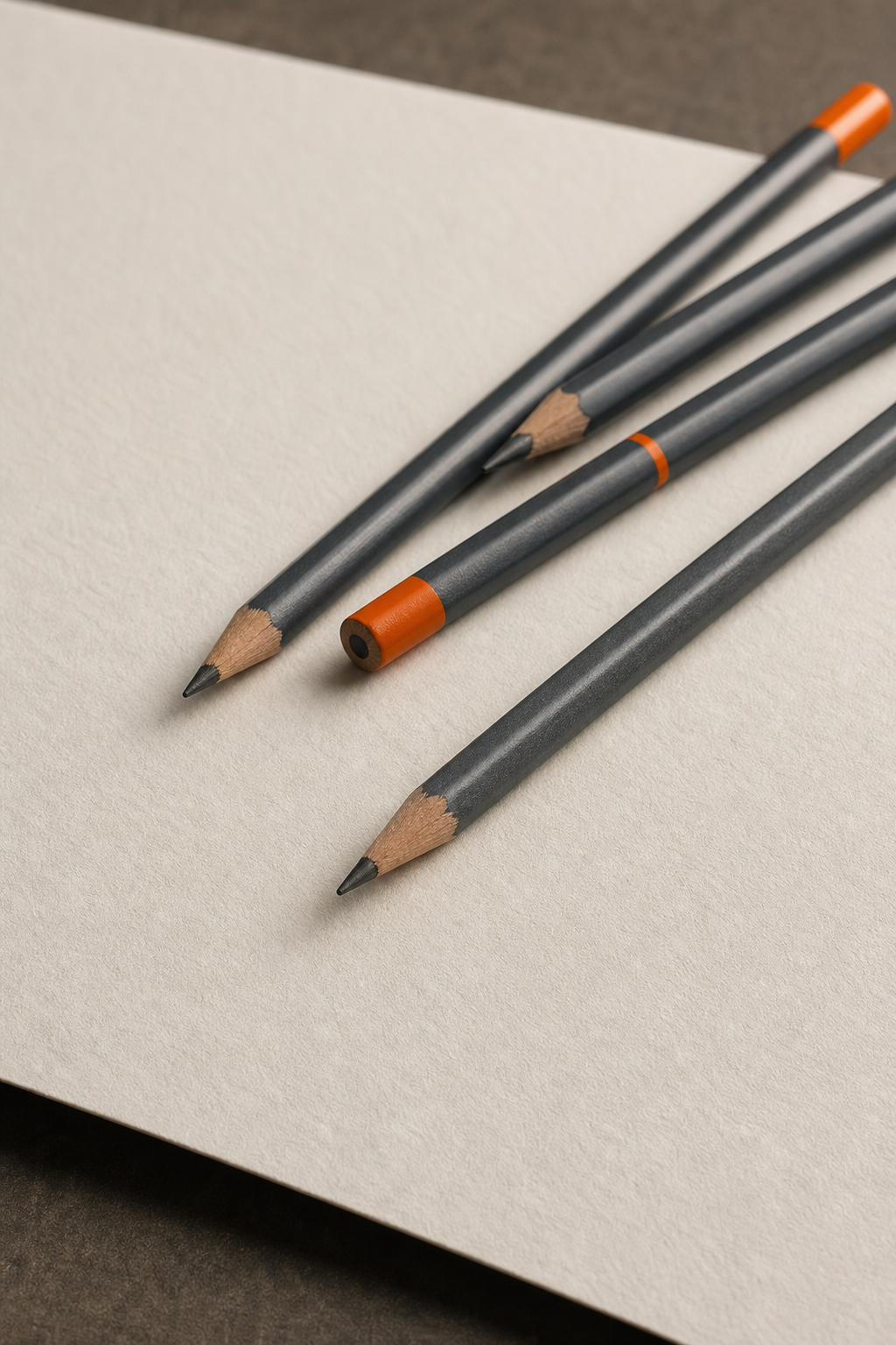
As a usable plan, start with HB, 2B, 4B. Add 6B if you need deeper blacks and your paper holds the extra graphite without over shine. If you want to experiment with the premium feel of a Castell 9000, place it as the top line on your test sheet and compare the smoothness against your standard wood‑cased pencils. In 2026, the emphasis on tactile feel, especially on heavy stock, continues to rise, and your choice will influence your shading workflow and the final mood of the piece.
Step 2: Test Shading and Blending on the Paper
Testing shading and blending on heavyweight paper is where you learn how the surface will respond to your chosen pencils. Heavy-weight stock with a bit of tooth can hold more graphite layers, but it can also grab more pigment and create visible texture in the midtones if you’re not careful. A consistent shading test helps you see where the paper shines, where it smudges, and how it holds a midtone ramp from light to dark. A usable method is to build a grayscale from 10% value to 90% value across a single row on a scrap test area, using each grade you’re evaluating. This lets you compare how each pencil type reads on your paper. Use light pressure first, then layer gradually to build depth, taking notes on how many passes you need to achieve the same tone with minimal smudge. Strathmore’s shading guidance describes how the texture of the paper influences shading, which is a big part of this test.
In addition to direct shading, test blending with a few tools: a tortillon, a kneaded eraser, and a soft tissue. On heavyweight paper, shading can be very smooth if you layer evenly and blend in small circular motions. If you see visible texture in the darkest areas, try a slightly softer lead or adjust your pressure. If the darkest area remains grainy, you might be pressing too hard or using a pencil with too much clay for the tooth of your paper. The process is iterative, not a one-shot decision. The YouTube transcript analysis for this topic (in Section 2 sources) shows how artists test with multiple papers and leads to understand which combination yields the best darks and most even shading. And for a deeper understanding, the Pencil page on Wikipedia lays out the core trade-offs between hardness and darkness, which helps you frame your testing logic.
Operational tip: set up a small test strip, label it with pencil type and grade, and keep it on the same page you intend to draw on. This makes it easy to compare the exact behavior of each pencil in the same lighting and temperature conditions. It also helps you decide if you want to stick with one pencil per zone or mix grades to preserve smooth transitions. The goal is not just to pick the darkest lead but to pick the lead that blends the best on your chosen paper and under your lighting conditions. Pencil basics again helps you understand why different cores behave differently when you blend.
Section takeaway: By testing shading and blending on your exact heavyweight paper, you learn which pencils give you the most consistent tones, the smoothest blends, and the least shine in the final piece. The research data you saw highlights that soft leads dominate in terms of perceived darkness, while the smooth feel of premium pencils can improve your comfort and control during long shading sessions. The usable test is what matches your workflow to the paper you use.
Step 3: Apply the Wet‑Method to Reduce Shine
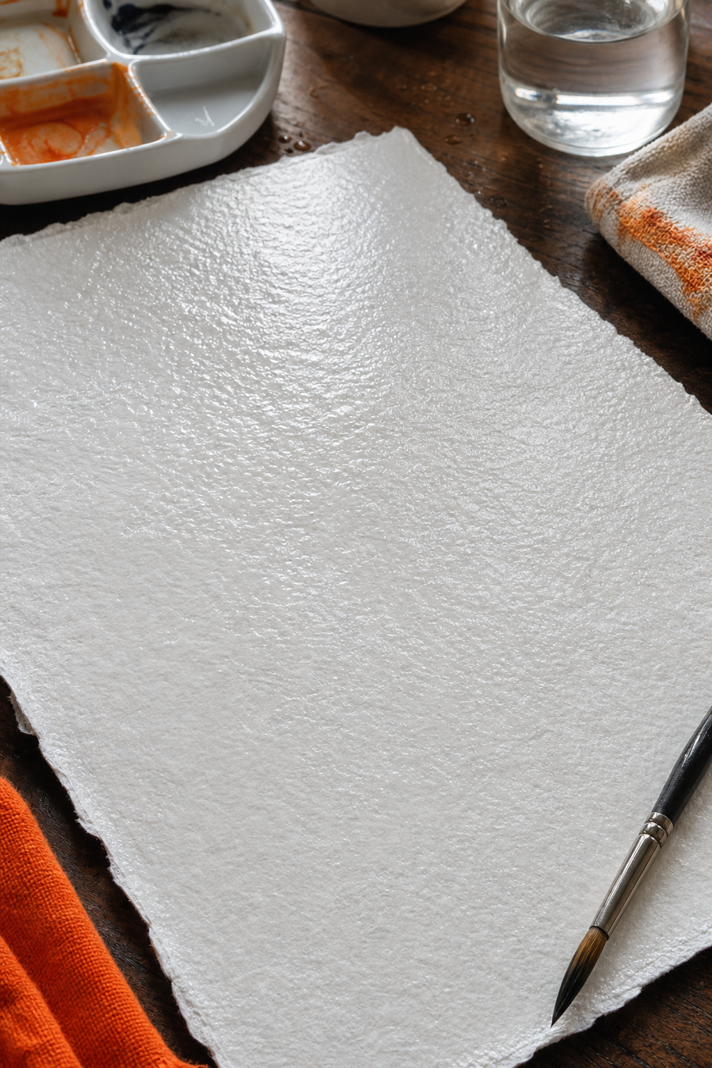
One known way to reduce graphite shine on heavyweight stock is to prep the paper with a controlled wet-method. The approach involves using a cold watercolor technique that opens up the fibers and creates a micro‑grit on the surface, which helps the graphite settle more evenly and produce deeper blacks with less gloss. The method requires 100% cotton watercolor paper (often hot-pressed) and distilled water to prevent yellowing from minerals. The process includes taping the paper edge, lightly spraying water, using a sponge to spread the moisture evenly, and then pressing slightly to create a micro‑textured surface. After this, you dry the sheet and work on one side only to keep the paper stable. The goal is to encourage the graphite to sink rather than sit on a flat, shiny surface. This technique is described in usable detail by artists who advocate gentle sanding of the surface with a wet sponge to introduce a fine grit on top of the paper’s tooth. The idea is to keep the tooth intact while opening the pores, so the graphite adheres better and the shine is reduced.
Before attempting this method, practice on a test sheet and ensure it’s completely dry before you begin drawing. You’ll see the surface texture change: it appears slightly velvety with a new grain, while the midtones gain more density. The method does affect the “feel” of the paper and can shift how you perceive shading. A reputable source for this technique notes the need to choose high-quality watercolor paper and to be mindful of how the back of the sheet remains flat after the treatment. On heavyweight stock, you may be more likely to notice a difference in tone and depth, which can be a big win for those who want richer blacks without the gloss. To verify the results, re‑test your grayscale ramp and compare shine before and after the wet-method.
Operational caution: this method adds steps and requires careful drying. Always test on scrap first, and keep a clean workspace to avoid moisture transfer to areas you don’t want damp. If you’re curious about the science behind surface prep and graphite shine, a broader background on paper types can be found in the acid-free pas. Acid-free paper background can help explain why archival papers matter when you’re making drawings intended to last.
Common takeaway: the wet-method can be a powerful tool to achieve smooth, deep blacks, but it’s not a universal fix. It works best when your paper is of good quality and you take the time to dry and test before laying down important work.
Step 4: Compare Woodless vs. Traditional Graphite Pencils
Woodless graphite pencils are a neat twist on the classic wood‑cased core. They give you a broad core that can be sharpened to a fine point or left blunt for broad strokes. The main trade-off is that woodless pencils are heavier and can feel unwieldy for long sessions if you’re not used to the weight. Wood-cased pencils give you control and a familiar grip, but you’ll need to sharpen more often as the wood wears down. On heavyweight paper, woodless pencils can create a very dense, uniform layer, which can be nice for dramatic shading and large areas. The woodless format also reduces the risk of breaking the wood around the core when you press hard, since there’s no wood to chip at the tip. A usable comparison shows that woodless pencils, like some monoliths, offer a generous amount of graphite in a single unit, great for darker blocks and bold lines. Yet you may feel the need for a lighter touch to avoid over darkening a single stroke. Traditional wood-cased pencils give you the tactile familiarity and the option to break the tip with less effort depending on sharpening angle and technique.
In real terms, you’ll want to pick based on your own workflow. If you like quick fills, large shapes, and a very dense black, woodless can be worth it. If you value precise lines, clean edges, and easier erasing with a more predictable point, a traditional wood‑cased pencil remains a solid choice. The data in the research context shows a wide range of hardness preferences across pencils, and your best bet is to experiment with a small set that includes one woodless option and a couple of wood-cased leads in the HB, 6B range. A credible visual reference for this comparison is a side-by-side studio shot that helps you see the difference in texture and point shape. When you test, try both formats on the same heavy stock and compare how they lay down graphite and hold up to erasing and blending.
Operational note: keep sharpener handy for wood-cased pencils. For woodless, you’ll want a sharp blade or a fine sandpaper sheet to maintain a crisp tip. The goal is to maintain control and consistency across your work, especially on paper with a pronounced tooth that can grab graphite unevenly. The data shows the Castell 9000 as a premium option with smoothness in some reviews, but whether you choose woodless or wood-cased should hinge on how you plan to render textures, shadows, and crisp lines.
Summary: Woodless gives you density and coverage. Wood-cased gives you precision and control. On heavyweight stock, both have a place, depending on the task at hand. The Castell 9000’s smooth feel can be a factor when you want a soft approach with a refined touch, but your best choice comes down to how you like to work and how you pace your shading.
Conclusion for the section: test both styles on your heavyweight paper to see which fits your process and helps you reach the tone balance you want. The data and expert notes show that softness and smoothness drive perceived quality, but you still have to work with your own grip, pressure, and rhythm to turn that into a successful drawing.
Bottom line for Step 4: use the table to guide your choices, but pick the pencils that feel right in your hand and match your paper’s tooth. For many artists, a small kit that includes a softer lead for shading and a harder lead for lines offers the best balance on heavy weight stock. The Castell 9000 remains a premium option for a smooth feel, but the core decision should be driven by texture, control, and how you layer on the paper.
Conclusion of the Section
With these four steps, you’ve built a usable framework for choosing pencils for drawing on heavy weight sketch paper. You started with the basics of hardness, tested shading on the surface, explored how a wet-method can change the outcome, and finally compared woodless to traditional pencils. The goal is not to pick one brand but to pick a method that makes your lines read clearly on heavyweight stock, with smooth transitions and durable results. As you apply this guide, you’ll form a natural workflow that suits your style and your paper. And you’ll be ready to move from a simple sketch to a more complete piece that stands up to scrutiny in the studio, classroom, or gallery.
Internal resource: For a step-by-step method to select pencils for heavy weight paper, see How to Select Pencils for Drawing on Heavy Weight Paper.
Authority references anchor this article in operational materials: general pencil mechanics are documented at Wikipedia, while paper‑specific shading guidance and the connection to graphite on Strathmore papers is explained by their official guidance. The acid-free background helps explain archival considerations for long‑lasting drawings.
Conclusion
Choosing pencils for heavy weight sketch paper is a balance between lead hardness, paper texture, and your own technique. Start with a core set (HB, 2B, 4B) and a premium smooth option like Castell 9000 if you crave a silken feel. Test shading and blending on your exact stock, then consider the wet-method to tame shine when you crave richer blacks. If you really want to push contrast, compare woodless vs wood-cased pencils on the same paper to see which tool best supports your scene, your value range, and your layering approach. The goal is a steady, predictable workflow that yields results you can keep. In 2026, this is still a usable, hands-on field. Keep testing, keep notes, and let the paper guide your pencil choices.
Final reminder: Drawing Pencils Guru focuses on usable, actionable guidance. The picks above are a starting point, not a final verdict. Use the testing routine, the compare-and-contrast method, and your own studio rhythm to land on the tools that make your heavyweight paper sing. And if you want a quick refresher on how to pick pencils for heavy weight paper, circle back to the internal resource linked earlier as you refine your toolkit for your next big drawing project.
