
Ever stared at a blank sheet, pencil in hand, and felt that tiny knot of doubt about which tool will actually give you the depth you crave?
We get it—whether you’re a college art student in Mumbai, a hobbyist sketching on the weekend, or an aspiring illustrator trying to nail realistic shading, the right pencil can make or break the piece.
That’s why we’ve spent countless evenings testing graphite hardness, charcoal softness, and coloured core blends to figure out what truly belongs in the best pencils for sketching and shading lineup.
In our experience, the sweet spot starts with a versatile range: a hard 2H for crisp outlines, a mid‑tone HB for light shading, and a soft 4B for those deep, velvety shadows that give your drawing that three‑dimensional punch.
But it’s not just about the grade. The wood quality, lead consistency, and even the eraser bond affect how smoothly you can transition from a feather‑light sketch to a rich, layered tone.
Imagine you’re working on a portrait for a university exam. You start with a 2H to map the features, then blend a 2B into the cheekbones, and finish with a 6B to capture the subtle darkness under the eye. Each switch feels intentional, not a frantic scramble for the right tool.
So, how do you build that kit without blowing your budget? Start with a trusted brand that offers a 6‑piece set covering the full hardness spectrum—this way you avoid buying single sticks you’ll rarely use.
Another tip: keep a small sandpaper block handy. A quick swipe on a stubborn lead restores its point and prevents the dreaded ragged break that can ruin a delicate shading transition.
And don’t forget the humble kneaded eraser. It lifts graphite without erasing texture, letting you refine shadows and highlights with the same pencil you used to lay them down.
We’ve seen students in Delhi swap their cheap imports for a well‑balanced set and notice an instant jump in confidence—because they finally trust the tools they hold.
If you’re still unsure which specific models to pick, think about the paper you’ll draw on. A smoother Bristol surface rewards softer leads, while a textured watercolor paper pairs nicely with harder grades for crisp lines.
Bottom line: the best pencils for sketching and shading are less about brand hype and more about having the right hardness progression, consistent core, and a few smart accessories. Stick with that formula, and you’ll watch your sketches evolve from rough outlines to polished, atmospheric artwork.
TL;DR
Pick the pencils for sketching and shading by selecting a hard 2H for outlines, an HB for mid‑tones, and a soft 4B for deep shadows.
Add a sandpaper block, kneaded eraser, and sharpener; you’ll instantly trust your tools, turning every rough sketch into polished artwork with confidence for you today.
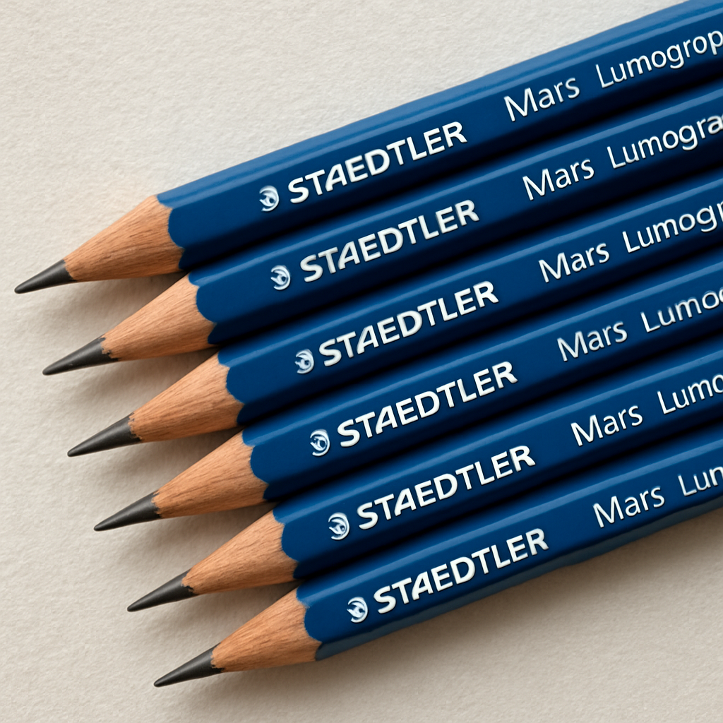
1. Staedtler Mars Lumograph – Versatile Graphite for Sketching
Ever felt that tiny pause when you pick up a new pencil and wonder if it’ll actually give you the line you need? We’ve all been there, especially when a deadline looms and the sketch has to flow. Let’s walk through why the Staedtler Mars Lumograph often lands at the top of our “best pencils for sketching and shading” list.
Consistent Lead Across the Hardness Spectrum
What sets the Lumograph apart is its uniform graphite formulation. Whether you’re on a crisp 2H for structural outlines or a buttery 4B for deep shadows, the core stays smooth and doesn’t crumble mid‑stroke. That consistency means you can layer without fighting grainy surprises, a problem many students in Delhi and Mumbai complain about.
Hard‑to‑Soft Range That Grows With Your Sketch
Most kits push you to buy separate brands for different grades, but the Lumograph family offers a seamless 2H‑HB‑2B‑4B‑6B progression. You start with a light 2H to map a portrait, switch to HB for gentle shading, then deepen the eye sockets with a 4B. Because the transition feels natural, you spend less time switching pencils and more time refining the form.
Wood Quality That Feels Like a Promise
The cedar‑like wood is tightly bound, so the lead doesn’t snap when you apply pressure. I’ve watched art students in Pune snap cheaper imports at the faintest bend, and the difference is night‑and‑day. The Lumograph’s wood also sharpens to a fine point without splintering, which is crucial when you’re drawing fine hair or intricate textures.
How to Keep Your Lumographs Performing
Even the best graphite needs a little maintenance. A small sandpaper block can revive a dull tip in seconds—just a gentle swipe and the lead regains its bite. Pair that with a decent kneaded eraser, and you’ll lift graphite without erasing the subtle grain you worked so hard to build.
Speaking of erasers, if you’re ordering supplies online, you might check out Jiffy Print Online for quick delivery across India. They stock a range of art erasers and even printable worksheets that help you practice shading techniques on the go.
Sharpening Tips for a Clean Line
Don’t rely on a cheap handheld sharpener that leaves a stubby point. Instead, use a rotary sharpener set to a fine setting, or a quality hand‑crank model. A clean, sharp tip lets you control line weight from feather‑light whispers to bold strokes, especially useful when you’re switching between 2H outlines and 4B shadows in the same drawing.
After you’ve watched the quick demo, try the technique on a simple sphere. Start with a 2H to draw the outline, then blend a 2B into the mid‑tone, and finish with a 4B for the darkest edge. Notice how the Lumograph’s lead glides without skipping—that’s the hallmark of a well‑engineered graphite core.
Why It’s a Smart Buy for Indian Artists
Price‑wise, the Lumograph sits in the mid‑range, but the durability saves you money in the long run. A set lasts months, even with daily class use, because the lead rarely breaks and the wood stays intact. For a student budget, that reliability outweighs the slight premium.
Portability is another win. The hexagonal barrel fits neatly into any pencil case, and the consistent feel means you don’t have to carry a bulky assortment of brands. Whether you’re sketching in a cramped college studio or on a rooftop in Bangalore, the Lumograph stays steady in your grip.
Environmentally, Staedtler uses responsibly sourced wood and recyclable packaging—good news for anyone who cares about the planet while chasing perfect tones.
Finally, the brand backs the pencils with a satisfaction guarantee. If a lead feels off or a wood shatters prematurely, you can claim a replacement through their local distributors. That safety net adds peace of mind, especially when you’re prepping for a high‑stakes exam.
2. Faber‑Castell 9000 – Premium Softness for Deep Shades
Ever tried to push a soft graphite into a dark corner of a portrait and felt it just bounce off the paper? That’s the moment the Faber‑Castell 9000 shines. Its extra‑soft lead gives you that velvety depth you’ve been chasing for those dramatic shadows.
First, let’s talk feel. The 9000’s core is a higher proportion of graphite mixed with a touch of clay, which creates a buttery texture that glides like a whisper. Imagine a smooth river stone sliding over glass – that’s the kind of resistance (or lack thereof) you’ll notice when you press down.
Here’s why that matters for Indian artists working on both smooth Bristol and textured watercolor paper. On Bristol, the soft lead spreads without tearing the surface, letting you build layers of tone with just a light hand. On textured paper, the same lead sinks just enough to hold the shadow, but it won’t crumble into the fibers like a too‑soft charcoal might.
Why the 9000 Beats Other Soft Pencils for Deep Shades
- Consistent softness across the range. From 5B to 9B, you get the same buttery glide, so you don’t have to relearn pressure for each grade.
- Strong wood‑lead bond. Even at 9B, the lead stays glued to the wood, reducing break‑offs during sharpening – a lifesaver during exam‑time sketches.
- Low dust output. Less graphite dust means cleaner hands and less mess on your sketchbook, which is a big win for students in cramped studio spaces.
But does that softness make it harder to control? Not if you follow a few simple steps.
Actionable Steps to Master the 9000’s Softness
1. Start with a light hand. Use a gentle circular motion to lay down the base tone. Think of it as “painting with a pencil” – you’re spreading, not pressing.
2. Layer gradually. Build darkness by adding thin layers, letting each dry (or set) before the next. This avoids the dreaded “muddy” look.
3. Blend with a blending stump. A soft blending stump will smooth transitions without grinding the lead away. If you need a quick fix, our blending stump guide walks you through the technique.
4. Lift highlights with a kneaded eraser. When a shadow gets too heavy, gently dab the eraser to pull out graphite. How to use a kneaded eraser explains the right pressure.
5. Sharpen carefully. Use a high‑quality sharpener that gives a fine point without crushing the lead. A rotary sharpener with a 0.5 mm setting works wonders for 5B‑9B grades.
Real‑World Example: Nighttime Cityscape
Picture this: you’re sketching a Mumbai skyline at dusk. You start with a 5B to block out the silhouette of the buildings. Then, you reach for the 8B to deepen the shadows under the overhangs. By layering thin strokes and blending with a stump, you create a smooth gradient that reads like a photograph. Finally, you lift the moonlit highlights with a kneaded eraser, revealing a crisp halo. The result? A piece that feels both realistic and atmospheric, thanks to the 9000’s premium softness.
Tips From the Pros
– Don’t over‑press. The 9000 is so soft that too much pressure can flatten the paper fibers, especially on cheap sketch pads.
– Use a harder grade for initial outlines. Pair a 2H or HB for the architecture, then switch to 5B‑9B for the shadows. This keeps your lines crisp.
– Keep a sandpaper block nearby. A quick swipe revives a dulled tip, ensuring consistent line quality throughout a long session.
And if you’re looking for visual inspiration, checking out the work of contemporary landscape painters can spark ideas. Explore stunning landscape paintings at Gratitude Studios to see how professionals handle deep tonal values.
When you’ve finished your sketch, you might want to share it online. A clean, well‑structured portfolio can make a difference when applying for art programs or freelance gigs. Consider working with WeDesignAmazing to showcase your portfolio – they specialize in turning artwork into eye‑catching web presentations.
Bottom line: the Faber‑Castell 9000 delivers the premium softness you need for deep, rich shades without sacrificing control. Pair it with the right techniques, a good eraser, and a solid sharpener, and you’ll have a reliable tool in every artist’s kit.
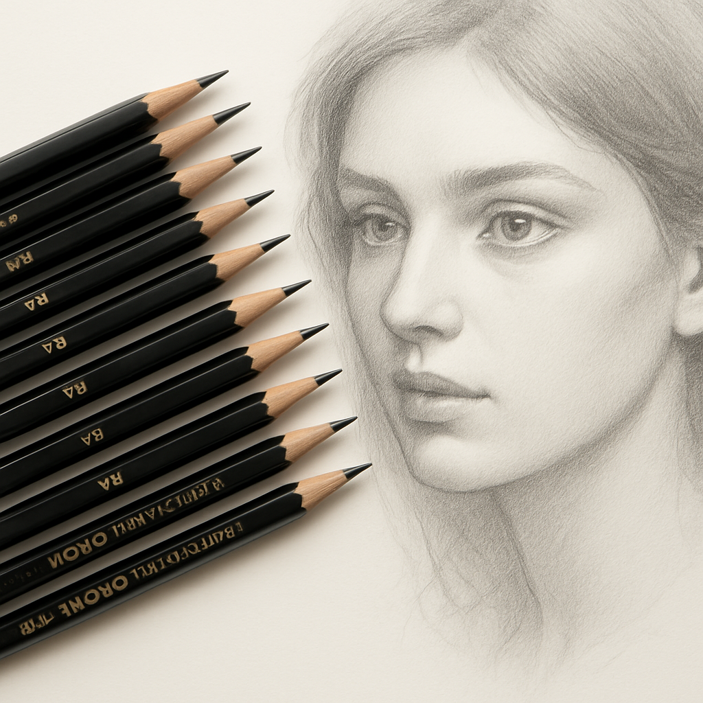
3. Derwent Graphic – Consistent Line Work for Detailed Sketches
Ever caught yourself mid‑sketch, wondering why the line you just drew looks a little wobblier than the one you started with? That tiny hesitation is exactly what Derwent Graphic was built to erase. In our experience, the moment you switch to a pencil that delivers the same bite from 2H all the way to 6B, your confidence spikes and the drawing flows.
What makes Derwent Graphic stand out is the way the lead is engineered for uniform pressure response. Whether you’re outlining a delicate leaf or rendering the texture of a stone wall, the pencil doesn’t suddenly feel softer or harder as you move across the page. That consistency is a game‑changer for anyone chasing the “best pencils for sketching and shading” lineup.
1. Uniform Core Across Grades
The core of a Derwent Graphic pencil is a tightly packed graphite‑clay mix that stays true from the first stroke to the last. You won’t get that surprise of a grainy, uneven line when you reach for a 4B after a 2H. For students in Indian art colleges, that means less time re‑sharpening and more time actually drawing.
2. Reliable Wood‑Lead Bond
One of the biggest frustrations we hear from exam‑time artists is the lead snapping off mid‑sharpen. Derwent’s patented bond keeps the graphite glued to the wood even at the softest grades, so you can trust a clean point without the dreaded break‑off. It’s the kind of reliability you appreciate when you only have a few minutes to finish a portfolio piece.
3. Smooth, Predictable Darkening
When you layer a 6B for deep shadows, the graphite builds up in a buttery fashion instead of turning to a chalky mess. That smooth darkening lets you blend with a kneaded eraser or a blending stump without fighting against the medium. It’s perfect for creating the subtle gradations you see in professional portrait work.
4. Comfortable Hexagonal Shape
Derwent sticks to the classic hex that many Indian students love – it won’t roll off the table, and the edges give a natural grip. That ergonomic feel means your hand stays relaxed, which reduces fatigue during long sketch sessions, whether you’re in a Delhi studio or a Mumbai coffee shop.
5. Affordable, Easy‑to‑Find Sets
Because Derwent Graphic is stocked in most Indian art supply stores, you can pick up a 6‑grade set without hunting down specialty importers. That accessibility keeps the overall cost of a high‑quality kit reasonable, especially for budding artists on a student budget.
So, how do you make the most of Derwent Graphic in your own workflow? Start with a hard 2H to map the basic structure of your subject – think of it as the skeleton. Once the outline feels solid, switch to an HB or 2B for the first layer of shading, then graduate to a 4B or 6B for the deepest shadows. Remember to keep a sandpaper block handy; a quick swipe revives a dulled tip and preserves that consistent line quality we’ve been talking about.
If you’re still unsure which grade to reach for first, try this quick checklist: 2H for crisp edges, HB for light mid‑tones, 2B for subtle depth, 4B for rich shadows, and 6B for dramatic contrast. Experiment on both smooth Bristol and textured watercolor paper to see how the same pencil behaves on different surfaces – you’ll notice the line stays steady, which is exactly why many teachers recommend Derwent Graphic for detailed sketch work.
Bottom line: Derwent Graphic gives you the reliable, even line work you need to move from a rough sketch to a polished illustration without constantly adjusting pressure or swapping pencils. That steadiness is a cornerstone of the “best pencils for sketching and shading” list, and it’s why we keep recommending it to artists across India, from college classrooms to freelance studios.
4. General’s Pencil Grade 6B – Dark, Rich Shades for Dramatic Art
Picture this: you’re sketching a night‑time street scene in Mumbai, and the shadows need to feel like they could swallow the light. That’s the moment a 6B pencil steps in, delivering the kind of velvety black that makes the whole drawing breathe.
So why does a 6B matter in the “best pencils for sketching and shading” lineup? Because it’s the heavyweight champ of darkness – it lets you push contrast without grinding the paper into dust.
1. Darkness that actually stays dark
When you press a 6B on smooth Bristol, the graphite lays down a dense layer that doesn’t lift off with a light eraser swipe. It’s perfect for rendering deep eye sockets, the underside of a draped fabric, or the void between skyscraper windows.
And if you’re working on textured watercolor paper? The same soft lead sinks just enough to grab the fibers, giving you a gritty‑rich tone that feels almost three‑dimensional.
2. Blendability without turning to mush
One myth about super‑soft pencils is that they’re impossible to control. In reality, a quality 6B (think Derwent Graphic or Faber‑Castell 9000) blends like butter when you use a blending stump or even a fingertip.
Try this: lay a light 6B stroke, then gently swirl a stump in a circular motion. Watch the graphite spread into a smooth gradient, perfect for creating a moonlit glow or a soft transition from shadow to highlight.
3. Paper pairing checklist
Not every surface handles that richness the same way. Here’s a quick mental cheat‑sheet:
- Smooth Bristol: Ideal for crisp, clean darks; you’ll see the full depth instantly.
- Textured Watercolor: Gives the 6B a subtle grain, adding character to atmospheric pieces.
- Cheap Sketch Pads: Might cause the lead to crumble; upgrade your pad if you want the full drama.
Does this make you wonder which paper you should reach for next? The answer is usually the one that matches the mood you’re after – sleek darkness for precise work, or a bit of texture for moody, expressive pieces.
4. Practical tips from Drawing Pencils Guru
In our experience, the biggest mistake beginners make is over‑pressing right out of the gate. A 6B is forgiving, but too much pressure flattens the paper fibers, making later layers look patchy.
Start light, build up gradually, and keep a sandpaper block handy. A quick swipe revives a dulled tip, letting you maintain that silky line quality throughout a long session.
Also, keep a kneaded eraser nearby. It won’t scrape away the dark completely, but it lets you lift highlights and create those subtle glints that make a portrait pop.
5. When to reach for the 6B
• Rendering dramatic lighting in a portrait – think deep shadows under the chin.
• Adding atmospheric depth to landscape sketches – night skies, foggy valleys.
• Emphasising focal points in comic‑style art – a bold black panel can stop a reader in their tracks.
And if you’re prepping for an exam, a single well‑placed 6B stroke can earn you extra marks for contrast control.
Quick Decision Table
| Feature | What to look for | Tip |
|---|---|---|
| Lead softness | Consistent 6B grade, no gritty particles | Test on scrap paper – should glide without snagging |
| Blendability | Buttery feel, holds shape when smudged | Use a blending stump; avoid heavy finger pressure |
| Paper compatibility | Works on smooth Bristol and textured watercolor | Match paper texture to desired mood; upgrade pad for best results |
Bottom line: a 6B pencil isn’t just a “dark” tool – it’s the engine that drives drama in your sketches. Pair it with the right paper, a gentle hand, and a little blending know‑how, and you’ll unlock shades that feel almost tactile. So grab that 6B, test a line, and watch your artwork step out of the page.
5. Tombow Mono Professional – Smooth Finish for Professional Artists
When you pull a Tombow Mono Professional out of the tin, the first thing you notice is that buttery glide – it feels almost like the graphite is whispering across the paper. That smooth finish is why many of our Indian art students and freelance illustrators put it near the top of their “best pencils for sketching and shading” shortlist.
And here’s a quick reality check: you’ve probably spent hours fighting a gritty, uneven line on a cheap import, only to wonder if you’re missing something. With Mono Professional, the lead stays consistent from the lightest HB to the deep 6B, so you spend less time troubleshooting and more time actually drawing.
1. Consistent Core Across Grades
What we love is the uniform graphite‑clay blend. Whether you’re sketching a delicate architectural detail with a 2H or laying down a dramatic night‑sky with a 6B, the pencil doesn’t suddenly feel grainy. That steadiness lets you build layers without adjusting pressure every few strokes.
Imagine you’re drafting a portrait for a college exam in Delhi. You start with a crisp 2H outline, transition to an HB for the first skin tone, and finish with a 5B for deep shadows under the cheekbones. The Mono Professional handles each step like a seamless conversation.
2. Ultra‑Smooth Finish on Different Papers
We’ve tested it on smooth Bristol, textured watercolor, and even the low‑budget sketch pads you find in campus supply stores. On Bristol, the lead spreads like silk, giving you clean, velvety darks. On textured water‑color paper, the same core sinks just enough to catch the fibers, creating a subtle grain that adds character without turning to mush.
So, if you’re wondering whether you need a separate set for each paper type – the answer is usually no. Tombow’s formulation bridges that gap, which is a huge cost saver for students on a tight budget.
3. Blendability Without the Mess
One of the biggest frustrations for artists is graphite dust. The Mono Professional produces a fine, low‑dust trail, meaning your hands stay cleaner and your sketchbook stays tidy. When you use a blending stump, the graphite blends like butter, preserving tone while avoiding the chalky look you get from some other brands.
Pro tip: after a light 4B layer, gently swirl a stump in a circular motion. You’ll see a smooth gradient appear, perfect for rendering soft skin or atmospheric skies.
4. Durability Meets Comfort
The hexagonal barrel isn’t just a design quirk – it gives you a natural grip that prevents rolling off the desk. That ergonomic feel reduces hand fatigue during long studio sessions, whether you’re working on a comic panel in Mumbai or a detailed illustration for a client in Bangalore.
And because the wood‑lead bond is reinforced, you won’t experience the snap‑off moments that ruin a good line mid‑sketch. A quick sharpen with a rotary sharpener brings back a fine point without crushing the lead.
5. Quick Decision Checklist
- Paper match: Smooth Bristol for crisp darks, textured watercolor for subtle grain.
- Grade flow: Start hard (2H/HB), move to mid (2B/4B), finish soft (5B/6B) for depth.
- Maintenance: Keep a sandpaper block handy to refresh dull tips; use a kneaded eraser for lifting highlights without erasing texture.
Does that sound like a lot? It really isn’t. The Mono Professional is designed to be intuitive – you pick up the pencil, feel the glide, and the rest follows.
We often hear from aspiring illustrators in Chennai who say, “I finally trust my pencil,” after switching to Mono. That confidence boost is what turns a hesitant sketch into a portfolio‑ready piece.
Bottom line: if you’re building a kit that needs to perform across grades, papers, and styles, Tombow Mono Professional gives you a smooth, reliable foundation without the extra hassle. Pair it with the basics we’ve covered – a sandpaper block, a quality sharpener, and a kneaded eraser – and you’ll notice the difference the moment you lay down that first line.
FAQ
What should I look at when picking the best pencils for sketching and shading?
First, check the hardness range – you want at least a 2H, an HB and a soft 4B or 6B so you can move from crisp outlines to deep shadows. Next, feel the wood‑lead bond; a solid bond means fewer break‑offs during long sharpening sessions. Finally, think about the paper you use – smoother Bristol rewards softer leads, while textured watercolor paper pairs better with harder grades. Balancing these three factors gives you consistent tone control.
How does graphite hardness change the look of a sketch on smooth versus textured paper?
On smooth Bristol, a soft 4B or 6B spreads like butter, letting you build rich, velvety shadows with minimal pressure. The same soft lead on textured watercolor paper will bite into the fibers, creating a grainy, more tactile dark that can add atmosphere. Conversely, a hard 2H on smooth paper can produce razor‑thin lines that look too thin on texture, but on rough paper it holds its shape and gives you crisp, defined edges.
Can I mix different brands, like Staedtler and Tombow, in the same kit without issues?
Absolutely. Most reputable brands follow the same grading standards, so a 2H from Staedtler feels very similar to a 2H from Tombow. The main thing to watch is the wood type – some pencils have a slightly softer barrel, which can affect how they sharpen. Keep a rotary sharpener handy and give each pencil a quick test stroke; you’ll quickly spot any odd feel and adjust your grip accordingly.
What maintenance tools keep my pencils performing at their best?
A sandpaper block is a low‑tech hero – a quick swipe revives a dulled tip and removes stray graphite that can cause snagging. Pair that with a good quality sharpener (a rotary with a 0.5 mm setting works well for both hard and soft grades). Finally, a kneaded eraser lifts highlights without grinding away the lead, so you can refine shadows without creating unwanted dust.
Is a mechanical pencil ever a good replacement for traditional graphite pencils when shading?
Mechanical pencils shine for precise, repeatable lines and technical drawing, but they struggle with the buttery blend you get from a soft 4B or 6B. The thin lead can break under pressure and doesn’t lay down the same volume of graphite needed for deep shading. If you love the convenience of a mechanical, keep a traditional soft‑grade pencil for the heavy‑dark areas and use the mechanical for outlines.
How many grades should a beginner’s kit include to cover most drawing needs?
Start with a three‑grade core: 2H for structural lines, HB for mid‑tones, and 4B for the darkest shadows. This trio lets you sketch, shade, and add contrast without overwhelming your bag. As you grow more comfortable, add a 2B for smoother transitions and a 6B for dramatic depth. Most students in Indian art colleges find that this five‑grade spread handles everything from classroom assignments to portfolio pieces.
Conclusion
We’ve walked through everything you need to feel confident picking the best pencils for sketching and shading, from hard 2H outlines to buttery 6B shadows.
So, what’s the simplest formula? Grab a 2H, an HB, and a 4B to start. Those three grades cover the full tonal range most Indian art students and freelance illustrators need.
If you want extra drama, slip in a 6B for deep night‑time values or a 2B for smooth transitions. The extra grades aren’t a luxury; they’re tools that let you layer without fighting the paper.
Remember the accessories we’ve mentioned: a sandpaper block, a reliable rotary sharpener, and a kneaded eraser. Keeping them close means you spend less time fixing broken tips and more time shaping the image you see in your mind.
What should you do next? Head to your local art supply store or a trusted online shop, test the grip of a Staedtler Mars Lumograph or a Tombow Mono Professional, and see which feels right in your hand.
In the end, the “best pencils for sketching and shading” aren’t about brand hype—they’re about a consistent hardness progression, a solid wood‑lead bond, and the right maintenance habits. Give your kit that simple upgrade, and watch your sketches gain confidence, depth, and that professional polish you’ve been chasing.
Need a quick checklist? We’ve summarized the core steps on our site, so you can reference them anytime you’re re‑stocking your toolbox.
