
Ever stared at a fresh sheet of paper, a box of bright colored pencils beside you, and felt that tiny panic because the colors look flat until you blend them?
You’re not alone. That moment when the reds stay harsh, the blues stay blocky, and the whole picture just doesn’t sing is something every budding artist knows too well.
What if I told you the secret to turning those stark strokes into smooth, buttery gradients is simpler than you think?
In this guide we’ll walk through how to blend colored pencils like a pro, using tools you probably already have and a few tricks that even seasoned illustrators swear by.
First, imagine the feeling of a sunrise melting from orange into pink, not a jagged line of two separate crayons. That’s the magic you can create when you master blending.
So, why does blending matter? Besides making your artwork look polished, it lets you control mood, depth, and realism without ever picking up a paintbrush.
And here’s the good news: you don’t need fancy blending stumps or pricey solvents. A bit of patience, the right pressure, and a few everyday items can do the job.
We’ll explore three core techniques – layering, burnishing, and the gentle use of a colorless blender – each with a step‑by‑step walk‑through that feels like a casual chat over coffee.
Think about it this way: layering is like adding slices of toast, one on top of another, until the flavor builds; burnishing is pressing those slices together so they melt into one delicious sandwich; a colorless blender is the butter that smooths everything out.
Got a favorite brand of colored pencils? Great! We’ll show how to adapt the methods to soft cores, hard cores, and everything in between, so you never feel stuck with a particular product.
By the end of this article you’ll be confident enough to blend a sky, a portrait, or a simple fruit sketch without any awkward streaks.
Ready to say goodbye to harsh edges and hello to seamless transitions? Let’s dive in.
TL;DR
If you’ve ever struggled with harsh pencil lines, mastering how to blend colored pencils transforms flat strokes into smooth, buttery gradients with just simple pressure and layering.
You’ll quickly learn three coffee‑chat‑style tricks—layering, burnishing, and a colorless blender—so you can finish skies, portraits, or fruit sketches without awkward streaks today.
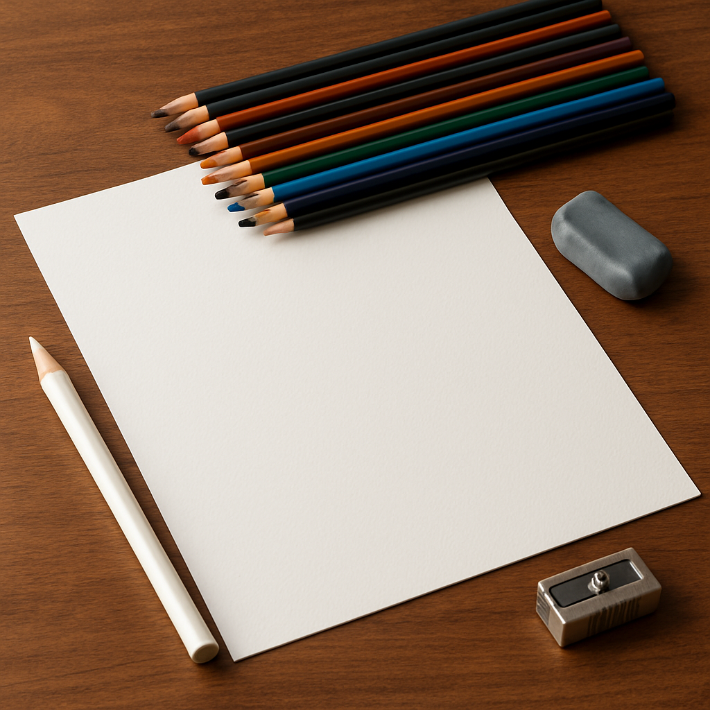
Step 1: Preparing Your Materials
Before you even pick up a colored pencil, you’ve already won half the battle – you’ve gathered the right tools. It’s a bit like making coffee; you can’t expect a smooth brew if you start with stale beans.
First things first: choose paper that can handle the pressure of burnishing and the occasional solvent splash. A smooth, hot‑pressed surface (often called “fine‑grain”) lets the pigment glide, while a medium‑texture (cold‑pressed) adds a little tooth that some artists love for layering. Art is Fun explains why acid‑free, heavyweight paper is the safest bet for longevity. Aim for at least 300 gsm (140 lb) if you plan to use any wet technique.
Now, pencil selection. Soft‑core pencils like Prismacolor or Faber‑Castell give rich, buttery color, but they also wear down fast. Hard‑core pencils (e.g., Derwent Coloursoft) stay sharp longer but need a bit more layering. The rule of thumb? Start with a soft core for the base layers, then finish with a harder core or a dedicated burnishing pencil to polish the surface.
Do you have a blending pencil on hand? If not, a simple white or colorless blender works wonders for the early stages. Sarah Renae Clark points out that a colorless blender can act like a “wet paint” for colored pencils, smoothing transitions without adding extra pigment according to her blending‑technique guide. It’s especially handy when you’re working on a light background and want to keep the paper’s brightness.
Step‑by‑step checklist
- Pick a paper with a smooth surface and at least 300 gsm weight.
- Make sure the paper is acid‑free and archival‑grade if you want your artwork to last.
- Gather a mix of soft‑core and hard‑core colored pencils.
- Add a white or colorless blender pencil (or a plain burnishing pencil) to your kit.
- Optional: keep a small bottle of baby oil or a solvent‑free blending fluid for extra smoothness.
Let’s talk about sharpening. A blunt tip spreads pigment too thin, making the first layer look washed out. A too‑sharp tip, on the other hand, can gouge the paper’s surface, especially on smoother boards. I recommend a rotary sharpener for consistency, or a good quality hand‑held sharpener set to a 0.5 mm angle. Test the point on a scrap piece; you should see a clean line that deposits a thin, even layer of color.
What about erasers? A kneaded eraser is a secret weapon for lifting stray marks without tearing the paper. It also helps you create highlights before you even start layering. Gently dab, don’t rub – you’ll thank yourself when the paper stays pristine.
Finally, organize your workspace. Lay out a clean, flat surface (a board or a sturdy table) and keep a damp cloth nearby to wipe excess graphite or wax. A simple piece of scrap paper under your working sheet prevents accidental smudges from slipping onto the finished piece.
So, you’ve got the right paper, the right pencils, a blender, a sharpener, and an eraser. You’re set up like a pro barista before the espresso machine fires up. Next up we’ll dive into the actual layering process, but for now, give yourself a quick pat on the back – you’ve just built the foundation for flawless blends.
drawing-pencils.com: Home offers a deeper dive into selecting the perfect paper and pencil combos for every skill level.
Step 2: Selecting Color Combinations
Alright, you’ve got your paper, pencils, and blender ready – now comes the part that feels a bit like picking an outfit for a date: choosing the right colors to work together.
Ever stared at a blank page and thought, “I’ve got a whole box of crayons, but which ones actually belong together?” That moment of indecision is totally normal, and it’s why a little color‑planning saves you from endless trial‑and‑error later.
Start with the main hue
The first question is simple: what’s the dominant color of the subject? If you’re drawing a ripe apple, it’s going to be some shade of red. If it’s a twilight sky, you’re looking at blues and purples. Pinpointing that anchor color gives you a foothold.
From there, ask yourself whether that hue leans warm or cool. A “warm” red has a hint of orange; a “cool” red hints at blue. That subtle shift will decide which neighboring pencils you pull out next.
Gather complementary tones
Next, bring in the opposite side of the color wheel. Complementary colors act like quiet background music – they tone down brightness and help you reach deeper values without slapping on black.
For our apple example, a soft green or a muted brown can be layered under the red to mute harshness and create a more natural shadow. The same trick works for a blue sky: a touch of orange‑brown will mute the brightest blues and give you richer dusk tones.
EmptyEasel notes that layering complementary colors is a proven way to achieve realistic dark values without resorting to a straight‑up black pencil according to their color‑palette guide.
Think of it like a hair‑colorist who blends a root shadow to hide a stark line – the same principle works with pencils: using an intermediate tone softens the edge and hides harsh contrast as stylists explain in their blending guide.
Don’t forget the “odd‑ones‑out”
Look closely at highlights, reflections, or tiny accent colors. A glossy orange peel might catch a hint of yellow, or a porcelain vase could reflect a faint pink from a nearby curtain. Those surprise hues are the spice that makes a drawing pop.
Set aside a few pencils that match those micro‑colors. When you later blend, those tiny strokes will melt into the larger areas and give the illusion of light bouncing around.
Build a mini‑palette on scrap paper
Before you dive into the final piece, grab a scrap sheet and make a quick color chart. Draw a small swatch of each pencil you think you’ll need, then overlap them to see how they interact.
Try a few test blends: red over yellow, blue over green, soft gray over a warm brown. This hands‑on experiment tells you whether two colors clash or create that buttery transition you’re after.
Once you’ve identified the winners, arrange them in a logical order – from lightest to darkest or from warm to cool – so you can reach for the right stick without hunting around.
Actionable checklist
- Identify the main color of your subject.
- Determine if it leans warm or cool.
- Select 2–3 neighboring shades in the same family.
- Pick 1–2 complementary colors for shading and depth.
- Add any unexpected highlight colors you notice.
- Test blends on a scrap page and note the combos that work.
Now that your palette is set, you’re ready to start layering. Remember, the goal isn’t to force every pencil onto the page but to let them whisper to each other, like friends sharing a coffee and slowly blending their stories.
Need a visual refresher? Watch this short video that walks through a real‑world color‑selection process, from picking the main hue to adding subtle accents.
Take a moment after the video to revisit your scrap‑paper chart. Do the blends feel smooth? Does the complementary shade soften the highlights the way you imagined? If something feels off, tweak the ratio – maybe a touch more green on that red shadow, or a dash of yellow on the blue sky.
When you finally move to the actual drawing, start with the lightest hues first, then gradually introduce the darker or complementary tones. This “building‑up” method mirrors the way you organized your palette and keeps the paper from getting overwhelmed.
And here’s a little pro tip: keep a tiny palette knife or the side of a plastic card handy to lift excess pigment before it dries. It’s especially handy when you’re experimenting with unexpected accent colors – a quick swipe can rescue a spot that’s getting too muddy.
By the end of this step, you should feel confident that every pencil in your box has a purpose, and you’ll spend less time guessing and more time enjoying the buttery blend you’ve been chasing.
Step 3: Layering Techniques for Smooth Blends
Now that you’ve sorted your colors, it’s time to actually build the blend, one thin slice at a time. Think of layering like spreading toast – each layer adds a little flavor until the whole sandwich feels buttery.
Why start light? Because a soft core pencil lays down pigment easily, but if you press hard too soon the paper loses its “tooth” and you end up with a flat patch instead of a smooth transition.
Step 1: Lay the foundation
Grab the lightest hue in your palette – maybe a pale sky‑blue for a sunset or a warm beige for a portrait’s skin. Use a gentle circular motion, just enough to leave a faint veil. This first coat is your “canvas” for the darker colors.
Pro tip: if you’re working on a textured paper like Canson Mi‑Teintes, you’ll notice the tooth holding the pigment. That’s exactly what you want – it gives the next layers something to cling to.
Step 2: Introduce the middle tones
Pick a hue that’s one or two values darker. Lightly overlap the edge of the first layer, using the side of the pencil rather than the tip. This creates a soft edge instead of a hard line.
Real‑world example: when drawing a ripe peach, start with a creamy apricot, then add a thin orange‑brown strip where the shadow falls. You’ll see the colors melt together without any harsh border.
Step 3: Add depth with complementary colors
This is where the magic happens. A touch of the opposite color on the color wheel can mute the intensity and give you richer shadows. For the peach, a dash of muted teal on the deepest part will cool the tone and make the orange pop.
According to a review of a textured fixative, artists often alternate layers of color with a spray to preserve the paper’s tooth, allowing more layers without losing texturePotato Art Studios explains. You can mimic that effect by lightly dusting a fixative after the third layer if you’re working on a very saturated area.
Step 4: Refine with a colorless blender or a soft brush
Once the darkest values are in place, glide a white or colorless blender over the transition zones. The blender lifts a tiny bit of pigment and spreads it, smoothing any remaining ridges.
One YouTube tutorial shows how a simple swish of the blender can turn a choppy red‑to‑purple edge into a silky gradientin under a minute. Give it a try on a scrap piece before you commit to the final drawing.
Checklist for a flawless layer
- Start with the lightest color, use a light hand.
- Overlap each new hue by at least 2 mm to avoid gaps.
- Introduce one complementary shade per darkening step.
- Apply a fixative or textured spray after 3‑4 layers if the paper feels smooth.
- Finish with a colorless blender to unify the transition.
| Layer | Goal | Tool/Tip |
|---|---|---|
| Base | Establish light value | Soft‑core pencil, circular motion |
| Mid | Build shape & form | Side of pencil, 1‑2 values darker |
| Depth | Add richness | Complementary color, light spray of fixative |
| Finish | Smooth transition | Colorless blender or white pencil |
And remember, every time you lift the pencil you’re not erasing – you’re actually giving the paper a chance to breathe. If a spot looks too muddy, swipe a clean plastic card over it; you’ll see the excess pigment lift without harming the underlying layers.
So, what’s the next move? Grab your sketch, lay down that first whisper of color, and let the layers do the talking. With these steps, “how to blend colored pencils” becomes less of a mystery and more of a satisfying ritual.
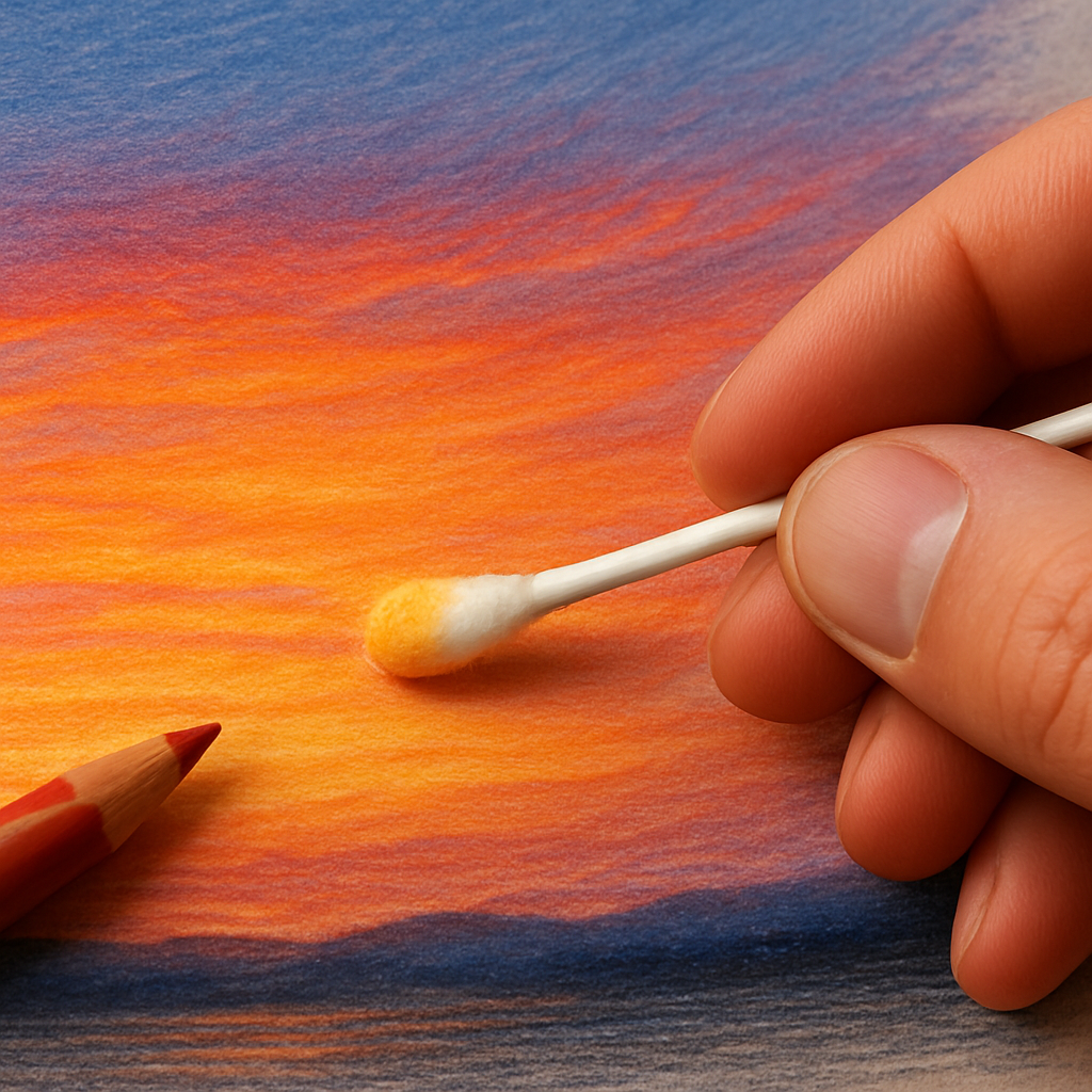
Step 4: Using Solvents and Blending Tools
Alright, you’ve layered the colors and you’re staring at a patch that’s still a little stubborn. That’s where solvents step in – they let you melt pigment together without grinding the paper into a grainy mess.
First thing’s first: never, ever splash a whole bottle onto your drawing. The magic happens when you dampen a tiny area just enough to let the wax or oil binder loosen. Think of it like adding a splash of milk to coffee – enough to swirl, not enough to drown.
Choosing the right solvent
If you’re based in the UK or Europe, citrus‑based options like Zest‑It are a popular pick. They’re derived from d‑Limonene, a natural terpene from orange peels, and they evaporate cleanly, leaving no sticky residue according to Pencil Topics’ guide on citrus solvents. The scent is pleasant, but keep a window open if you’re sensitive.
For artists who prefer a petroleum‑distilled product, refined solvents such as Gamsol or Winsor & Newton’s Sansodor work well too. They’re stripped of the harsh aromatics you’d find in regular mineral spirits, so the fumes are milder. Just remember: they’re still flammable and should be handled with care.
Safety first – the two golden rules
Rule 1: test, test, test. Grab a scrap piece of the same paper you’ll use for the final artwork, apply a light layer of your chosen colour, then dab a whisper of solvent with a cotton bud. Watch how the pigment reacts. If it smears into a muddy pool, you’ve used too much or the paper isn’t thick enough.
Rule 2: work in a well‑ventilated space. Even low‑odor solvents release volatile organic compounds (VOCs) that can irritate lungs over time. Open a window, use a small fan, and consider a basic respirator if you’ll be blending for more than a few minutes as the safety section recommends. Keep a pair of safety glasses handy – a rogue splash is annoying enough without hurting your eyes.
Step‑by‑step solvent blending
1. Build a solid base. Before you reach for any liquid, lay down at least three thin layers of colour. Solvent needs pigment to move; bare paper will just soak up the liquid and warp.
2. Prep your tool. Pour a few drops of solvent into a small glass jar – never dip a brush straight into the main bottle. This protects the bottle from contamination and gives you better control.
3. Apply sparingly. Dip a soft cotton bud, a tiny felt tip, or a clean blending stump into the jar. Gently press the damp tip onto the area you want to blend, using circular motions that follow the shape of your subject. You should see the colour start to glide together within seconds.
4. Watch, don’t scrub. Resist the urge to rub hard. The solvent does the heavy lifting; you’re just guiding it. If the blend looks too watery, blot with a clean paper towel and let it dry.
5. Let it dry. Depending on the solvent, drying can take 30 seconds to a minute. Once dry, you can add another thin pencil layer or a second solvent pass for extra smoothness.
Real‑world examples
Imagine you’re drawing a sunset sky. You’ve layered a pale peach, then a deeper orange, but the transition still feels “banded.” A quick dab of Zest‑It across the edge lets the two hues melt, producing that buttery gradient you see in a photograph.
Or picture a portrait where the cheek has a subtle pink blush. After laying down a light rose, you add a tiny amount of a cool violet for shadow. A solvent‑blended stroke softens the line between them, making the skin look three‑dimensional without any harsh edges.
Tools that make solvent work easier
Blender pens (like the Prismacolor Colorless Blender Marker) are essentially a built‑in applicator. The pen’s alcohol‑based solvent releases just enough moisture to move pigment, and the tip gives you pinpoint control for tiny areas such as eyelids or flower petals.
A simple plastic card or a clean old credit card works wonders for lifting excess pigment after a solvent pass. Swipe gently; you’ll see the wet pigment lift without disturbing the underlying layers.
Don’t forget a small spray bottle of water‑based fixative. After you’ve achieved the perfect blend, a light mist locks the pigment in place and restores a bit of tooth to the paper, preventing future smudging.
So, what’s the next move? Grab your favorite citrus solvent, test it on a scrap, and give that stubborn colour a gentle kiss of liquid. You’ll be amazed at how quickly the “how to blend colored pencils” mystery melts away.
Step 5: Creating Texture and Depth
Now that you’ve got your colors layered and the solvent working its quiet magic, it’s time to think about texture. Texture is what makes a flat sky feel breezy or a stone surface feel gritty – it’s the subtle lift that tells the viewer, “I’m real.”
Why texture matters
Ever looked at a portrait where the skin looks like polished plastic? That’s a missing texture cue. By adding tiny variations in pressure, direction, and tool choice, you give the eye cues to read depth without adding more pigment.
So, what’s the easiest way to start? Grab the same pencil you’re already using and turn it on its side.
Using the side of the pencil for a softer blended feel
When you press the flat side of a colored pencil against the paper, you spread pigment over a broader area. The result is a smoother transition that still retains a hint of grain – perfect for skin, clouds, or soft foliage. The shading guide from Drawing with Pri notes that using the side of the pencil creates a softer blended feel while still building up color. Give it a light circular motion and watch the colors melt together like butter on toast.
Tip: keep the pressure feather‑light at first. You can always go back and darken later, but a heavy hand can crush the paper’s tooth and make the texture feel flat.
Cross‑hatching for controlled darkness
If you need a darker, more defined texture – say the bark of a tree or a deep‑shadowed crease – cross‑hatching is your friend. Draw a set of parallel lines, then layer another set perpendicular to the first. The density of the intersecting lines determines how dark the area becomes.
Because each line still shows a tiny gap, the surface keeps a bit of “breathability.” That breathability is what makes the eye think the material is three‑dimensional.
Stippling and short dashes for gritty surfaces
For rough textures like sand, stone, or a weathered brick wall, try stippling – tiny, controlled dots – or short dashes that follow the object’s contour. The closer the marks, the darker the value. This technique is forgiving; you can always add more dots or dash until the texture feels just right.
Remember, you don’t have to commit to one method. Mix stippling with a light cross‑hatch in the same area to suggest both grain and shadow. The eye loves that kind of visual “conversation.”
Blend, then lock in the texture
Once you’re happy with the texture, give it a gentle pass with a colorless blender or a clean white pencil. This step smooths any harsh edges that may have formed during stippling or hatching, while still preserving the overall grain.
After the blend, a light mist of fixative (water‑based is best) can help lock the texture in place. The fixative restores a tiny bit of tooth to the paper, so later layers won’t look slick.
Quick checklist for texture and depth
- Use the flat side of the pencil for soft, buttery areas.
- Apply cross‑hatching when you need controlled darkness.
- Stipple or dash for gritty, rough surfaces.
- Blend with a colorless blender to unify transitions.
- Finish with a light spray of fixative to preserve tooth.
Give these tricks a spin on a scrap sheet before you commit to your final piece. You’ll notice how a few extra texture steps turn a flat gradient into something that feels almost tactile. And the best part? All of this works with the same colored pencils you already have – no extra tools required.
Ready to add that extra dimension? Pick a simple object – a apple, a stone, or a cloud – and experiment with at least two of the texture methods above. You’ll see the “how to blend colored pencils” guide transform into a full‑blown texture toolkit.
Step 6: Finishing and Preserving Your Artwork
You’ve spent hours layering, burnishing, and coaxing those colors to melt together, and now you face the quiet moment when the piece is technically done—but is it really finished?
The truth is, without a proper finishing routine the hard‑worked gradients can dull, get smudged, or even attract dust, and all that effort can disappear faster than a coffee stain on a napkin.
So, what should you actually do to lock in that buttery blend?
Why finishing matters
Finishing does two things: it protects the pigment from environmental wear, and it restores a tiny bit of tooth to the paper so the surface still feels alive under a light touch.
Artists who skip this step often report that their once‑vibrant sky turns matte after a week, especially in humid Indian climates where paper loves to gulp moisture.
Does that sound familiar?
Essential tools for a lasting finish
Here are the three tools you’ll reach for most often: a fixative spray, a powder‑blender dry lubricant, and a final varnish or sealant if you plan to display the work.
The fixative—usually a water‑based, non‑acidic formula—creates an invisible skin that keeps wax‑based pigments from rubbing off. A light mist is enough; over‑spraying can make the paper feel plastic.
If you want to speed up blending while also adding a protective layer, the new Powder Blender works like a dry oil that loosens wax cores and leaves a faint texture that takes countless layers without getting gritty. Lisa at Lachri swears by it, noting that a tiny dab on non‑absorbent surfaces lets you cover large areas fast and still keep the blend smooth according to her first‑impressions review.
For artists who prefer pure wax‑based pencils, Jasmina points out that they’re naturally soft and blend easily, which means you often need less fixative to keep the surface from becoming too slick as she explains in her pencil guide.
But how do you actually apply these goodies without ruining your work?
Step‑by‑step finishing workflow
Follow this quick checklist each time you finish a drawing:
- Give the artwork a final light dusting of a water‑based fixative; hold the can 24‑inches away and spray in a steady back‑and‑forth motion.
- Allow 5‑10 minutes to dry; the surface should feel dry to the touch but still slightly tacky.
- Lightly dust a pinch of Powder Blender over the area you plan to blend further, using a soft sponge or your fingertip wrapped in cotton.
- Blend the powder into the pigment with a clean colorless blender or a soft brush, watching the colors melt like butter.
- If you need deeper shadows, add another thin layer of color, then repeat the powder‑blend step.
- When the overall look is satisfied, seal the piece with a clear, UV‑blocking varnish applied in thin coats.
- Let each varnish coat dry for at least 20 minutes before adding the next; two coats give the best protection.
Let’s walk through a real‑world example: you’ve just finished a portrait of a ripe, peach‑colored apple. After the last burnish, you spray a light mist of fixative, wait ten minutes, then dust a smidge of Powder Blender over the highlight area. Using a soft brush you blend the powder into the orange‑red, turning the harsh edge into a soft, luminous transition. Finally, you seal the whole apple with a clear matte varnish so it can sit on a sunny windowsill without fading.
What if you need to touch up later?
Because most fixatives are reversible with a gentle kneaded eraser, you can lift a stray highlight, re‑blend, and re‑spray without starting from scratch.
If you plan to frame, consider a UV‑blocking spray to guard against fading from sunlight—especially important for Indian homes with bright windows.
Ready to protect your masterpiece?
Take a few minutes now to gather your spray can, a dab of powder blender, and a clean brush. A solid finish not only preserves the buttery gradients you worked so hard to achieve, it also lets your artwork stay vibrant for years to come.
Conclusion
We’ve walked through everything from picking the right paper to sealing the final piece, so you now have a full toolbox for mastering how to blend colored pencils.
Remember, the magic starts with a light hand, a soft core for the base, and a harder core or blender for the finish. A tiny dab of fixative or a whisper of Powder Blender can turn a stubborn edge into a buttery glide.
And if you ever feel stuck, pause, test on a scrap, and let the pigments speak to each other—just like friends sharing a coffee.
So, what’s the next step? Grab your sketch, spray a light mist of water‑based fixative, dust a pinch of Powder Blender, and blend with a clean colorless blender. Watch the colors melt together and lock in place.
When the surface feels smooth and the colors feel alive, give it a final protective coat of UV‑blocking varnish. That extra layer keeps your artwork vibrant even on a sunny Indian windowsill.
Take a minute right now to gather those finishing supplies. A few simple actions will preserve the buttery gradients you worked so hard to achieve, and your drawing will stay fresh for years.
Ready to put the finishing touches on your masterpiece? Dive back into your studio and let the blend do the talking.
FAQ
What’s the simplest way to start blending colored pencils for a smooth gradient?
Begin with a light hand and the softest core in your palette. Lay down a thin, even wash of the lightest hue using the side of the pencil, not the tip. Once the paper shows a faint veil, gently overlap the next shade by a couple of millimetres, keeping the motion circular. The key is to stay thin and let each layer breathe before you reach for a blender.
How many layers should I apply before I reach for a colorless blender?
Most artists find three to four thin layers give enough pigment for the blender to work without turning the paper soggy. After the first two layers the paper still has plenty of tooth, so a soft brush or a colorless pencil can lift and spread the wax. If you notice the surface getting sticky, stop adding pencils and let the blender do the smoothing.
Can I blend colored pencils without using a fixative or powder blender?
Absolutely. A clean cotton swab, a piece of tissue, or even a plain plastic card can be used to press and merge pigments. The trick is to apply just enough pressure to meld the waxes together without crushing the paper’s texture. Many beginners prefer this “dry‑blend” method until they’re comfortable with spray fixatives, which add an extra protective layer later.
Why do my blends sometimes look muddy, and how can I fix that?
Mud typically shows up when you mix too many hues in one spot or press too hard, forcing the wax into the paper’s pores. To rescue a muddy area, lift the excess with a kneaded eraser, then re‑layer the colors one at a time, starting with the lightest. Adding a tiny dab of powder blender can also re‑introduce slip, letting the colors glide back to clarity.
What paper texture works best for blending colored pencils?
Hot‑pressed (HP) paper gives a smooth surface that’s perfect for buttery blends, while cold‑pressed (CP) or textured boards add tooth that holds pigment longer. If you’re aiming for seamless gradients, go for a fine‑grained HP sheet; if you want more control over layering and a bit of grip, a medium‑tooth CP surface is a solid choice. Test both on a scrap to see which feels right for your style.
Is it safe to use solvents on all types of colored pencils?
Most wax‑based pencils respond well to citrus‑based solvents, but oil‑based or water‑soluble sticks can react differently. Always do a quick test on a scrap piece of the same paper: dab a tiny amount of solvent with a cotton bud and watch how the pigment moves. If the colour runs or the paper warps, back off or switch to a milder, water‑based blending fluid.
How often should I clean my blending tools to keep colors pure?
Give your blender, brush, or plastic card a quick wipe after each color change. A soft cloth or a piece of white paper works wonders for removing residual wax. If you’re using a colorless blender, a gentle swipe with a dry tissue prevents unwanted hues from seeping into the next area. Regular cleaning keeps each transition crisp and avoids accidental colour contamination.
