
Ever opened a fresh sheet of toned paper and felt that rush of possibilities, only to stare at a blank surface because you aren’t sure which graphite pencil will give you the depth you crave?
That moment is all too familiar for students in Indian art colleges and hobbyists sketching in a Mumbai café. The right lead hardness can mean the difference between a lifelike shadow and a flat smudge. In our experience, the sweet spot for realistic shading on mid‑tone paper usually lies between 2B and 4B, but the exact choice depends on the texture of the paper and the pressure you plan to apply.
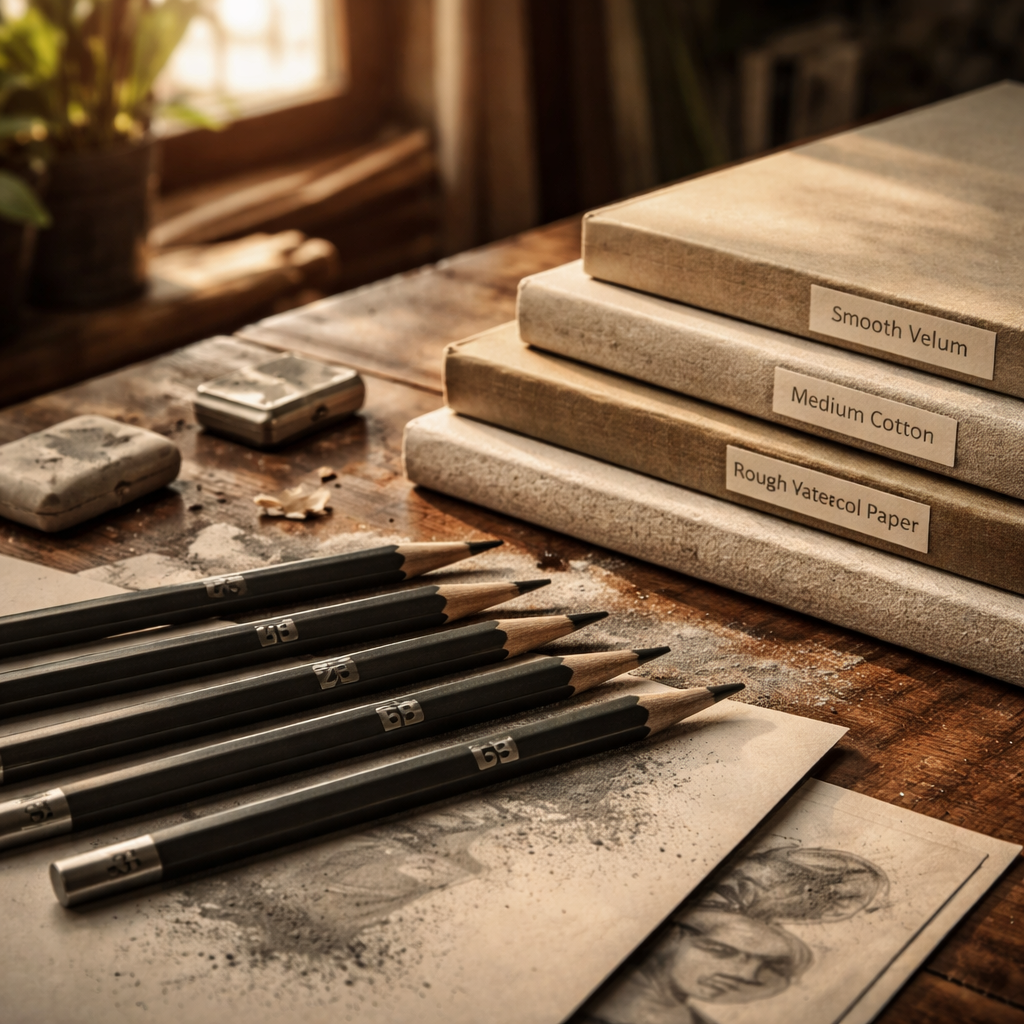
Let’s break it down with three quick scenarios. First, imagine you’re rendering a portrait for a university exam: you need a pencil that holds a rich dark line yet still lets you lift off for subtle skin transitions. A 2B works well on a smooth vellum‑toned pad, while a 4B gives you that buttery darkness on a rougher, cotton‑based surface. Second, think about an Indian street artist who layers graphite to capture the glow of a sunset over a sandstone wall; a 3B provides enough softness to blend without becoming too crumbly. Third, consider a beginner experimenting at home on a pastel‑toned sketchbook – a 2HB offers control for initial outlines before you graduate to softer grades for depth.
Here’s a practical checklist you can run through before you buy:
- Identify your paper’s finish (smooth, medium, rough).
- Match the pencil grade to the paper: smoother paper = harder lead, rougher paper = softer lead.
- Test a few brands in the store; press lightly, then harder, and watch how the graphite lays down.
- Check the lead’s oil content – higher oil means smoother blending, which is crucial on toned backgrounds.
We’ve written a detailed guide that walks you through picking the perfect portrait‑shading pencil, and it’s a great reference when you’re standing in the aisle deciding between Staedtler Mars Lumograph and Faber‑Castell 9000. How to Choose the Right Graphite Pencil for Portrait Shading offers brand comparisons and step‑by‑step tips you can apply right away.
And once you’ve got your pencils, think about how you’ll practice. Long drawing sessions can drain focus, so many art teachers swear by the Pomodoro technique to keep energy high, so a quick read on structuring practice intervals can boost your productivity without sacrificing creativity. Using a Pomodoro timer for focused drawing practice shows you how to set up 25‑minute bursts that keep your hand steady and your mind clear.
By understanding the interplay between paper tone, lead grade, and your own pressure, you’ll choose pencils that bring out the full richness of your shading. Ready to test a few grades on that toned sketchpad you’ve been saving? Grab a 2B, a 3B, and a 4B, and see which one sings with your paper. Let’s get drawing.
TL;DR
Choosing the right graphite pencil for realistic shading on toned paper hinges on matching lead softness to paper texture, testing oil content, and balancing pressure for smooth transitions.
Follow our quick checklist, experiment with 2B‑4B grades, and use short Pomodoro bursts to keep focus while you build depth and confidence.
Step 1: Understand Graphite Grades and Their Impact on Toned Paper
Ever picked up a 2B and wondered why it looks great on a smooth sketchpad but feels muddy on a rough, mid‑tone board? That’s the crux of graphite grades meeting paper texture. The softer the lead, the more graphite it deposits, which can either give you buttery shadows or just a greasy smudge, depending on the surface.
Think about the moment you first tried to render a portrait on a toned Bristol pad in a Mumbai art studio. The paper felt a little grainy, the lead seemed to cling, and the shadows just didn’t pop. What you were really feeling was a mismatch between the paper’s texture and the pencil’s hardness.
Hard vs. Soft: The Basics
Hard leads (2H, HB) are like a fine‑pointed pencil in a tight‑rope act—they stay crisp on smooth vellum‑toned paper and let you carve delicate lines. Soft leads (2B‑6B) are the opposite: they lay down a thick veil of graphite, perfect for rough, cotton‑based pads where you need that depth without pressing too hard.
Here’s a quick mental test: grab a 4B and drag it across a smooth toned sheet. If the mark looks glossy and spreads easily, you’ve got a soft‑lead‑friendly surface. Swap to a 2H; if it squeaks and leaves a faint line, the paper is holding up well to a harder grade.
Why Oil Content Matters
Not all graphite is created equal. Some pencils have a higher oil binder, which makes the graphite glide smoother and blend better—especially useful when you’re building up layers on a mid‑tone background. In our experience, Indian‑market brands like Camlin and Staedtler often label oil content on the barrel, so keep an eye out.
When the oil level is low, you’ll notice a dry, crumbly texture that can flake off the paper. That’s a red flag if you’re after realistic skin tones or subtle gradients.
Practical Checklist for Your Next Sketch Session
- Identify the paper finish: smooth, medium, or rough.
- Match the grade: harder leads for smooth, softer leads for rough.
- Test oil content: a quick swipe on a scrap piece will reveal glossiness.
- Adjust pressure: softer leads need lighter pressure for subtle tones, harder leads need more force for depth.
And here’s a little habit that many art teachers swear by: set a timer for 25 minutes, sketch a simple form, then switch grades and see how the tonal quality changes. It’s a fast way to train your eye.
Notice how the video demonstrates the same 3B on both a smooth and a rough pad? The difference is stark, and that visual cue is worth a thousand words.
Now that you’ve got the theory down, it’s time to put it into practice. Grab a 2B, 3B, and 4B, and lay down a gradient on a toned sketchbook. Observe which grade gives you the richest dark without sacrificing control. That hands‑on experiment is the fastest way to internalise the grade‑paper relationship.
Finally, remember that the right combination isn’t static. As you move from a quick portrait study to a detailed architectural rendering, you might switch from a 2H for crisp edges to a 6B for deep shadows. Flexibility is the secret sauce.
Step 2: Select the Right Paper Tone and Texture
Now that you’ve gathered a hard, a medium and a soft pencil, the paper you choose becomes the stage on which they’ll perform. It’s a bit like setting the lighting for a photo shoot – the right backdrop lets the subject shine, the wrong one flattens everything.
Think about the last time you tried to shade on a glossy sketchbook page. Did the graphite slide off like water on a windshield? That feeling tells you the surface is too smooth for the depth you’re after. Conversely, a paper that’s overly rough will grind the lead into the fibers and leave you with a gritty texture you didn’t ask for.
Know your paper’s surface
Strathmore breaks paper down into three basic families: smooth, medium‑texture and heavy‑texture. A smooth vellum feels almost like glass; it’s perfect for fine lines but makes it hard to build a rich, even shade. A medium‑texture surface, like their 400 Series drawing paper, offers just enough “tooth” for the graphite to catch without tearing the fibers. Heavy‑texture boards give you dramatic valleys that can hold a soft 4B or 5B like a sponge.
The same guide notes that a medium or textured surface will produce a more even, luminescent shade than a smooth one (“medium‑surface drawing paper“). In other words, if you want that buttery depth on a portrait, aim for a paper that has a subtle bite.
Match the paper tone to your palette
Paper isn’t just about texture – its colour matters, too. A warm, cream‑toned pad will lift the mid‑tones of skin, while a cool gray can make shadows feel colder and more dramatic. When you work on a mid‑tone pad, a 2B will give you the soft transition you need for highlights, and a 4B will let you plunge into the darkest shadows without forcing the lead.
Here’s a quick rule of thumb: the lighter the paper, the more you’ll rely on softer pencils to create depth; the darker the paper, the harder you can stay in the mid‑range (2B‑3B) and still get contrast. If you’re sketching in a Mumbai café on a cheap pastel‑toned sketchbook, start with a 2HB for the initial outlines – the paper’s tone will already give you a warm base.
Quick at‑the‑studio test
Grab a scrap of the paper you plan to use and run each pencil across it with three levels of pressure: light, medium, firm. Observe three things:
- How much of the lead settles into the texture (does it sink or just sit on top?)
- Whether the line stays crisp or smudges immediately
- If the colour of the paper shifts the perceived darkness of the stroke
Mark the results in a tiny table on the back of the sheet. The pencil that feels like it’s “sinking just enough, without gouging” is your go‑to for that particular pad. This tiny experiment only takes a minute, but it saves hours of frustration later.
Practical checklist before you buy
- Identify the paper’s finish: smooth, medium, or rough.
- Decide on a tone: light (cream), mid (warm gray), dark (deep gray).
- Match the pencil grade: harder lead for smooth or light‑toned paper; softer lead for textured or dark‑toned paper.
- Do the three‑pressure test on a scrap – note which grade feels right.
- Consider the oil content of the lead; higher oil helps blend on textured surfaces.
When you’ve checked those boxes, you’ll have a paper‑pencil combo that lets you move from a whisper of a line to a roar of shadow without fighting the surface.
In our experience at Drawing Pencils Guru, students who skip this step often end up over‑sharpening their pencils or constantly switching brands, which stalls progress. A little bit of paper scouting at the start keeps your workflow smooth and your sketches looking polished.
So, next time you reach for that sketchpad, pause, glance at its tone, run a quick test, and let the paper guide your pencil choice. You’ll find that realistic shading on toned paper becomes less of a mystery and more of a natural conversation between lead and surface.
Step 3: Match Pencil Lead to Desired Depth and Contrast
What depth actually feels like on toned paper
When you press a 2B on a warm gray pad, the line sits like a soft whisper; a 4B, on the other hand, sinks deeper, pulling a richer, almost velvety shadow into the paper’s tiny valleys.
Do you ever wonder why some sketches look flat even though you’ve used a soft pencil? It’s usually because the lead’s darkness isn’t matching the paper’s tone, so the eye can’t tell where the shadow stops and the background begins.
Test the lead before you commit
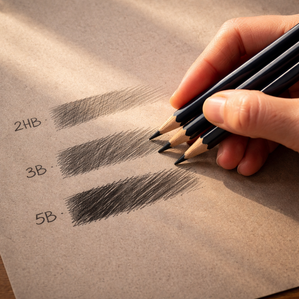
Grab a scrap of the exact paper you plan to work on. Draw three short strokes with light, medium, and firm pressure using the same pencil.
Notice three things: how deep the graphite settles, whether the stroke blends into the paper’s colour, and if the line stays crisp or smudges right away.
Now repeat the exercise with a harder grade, say 2H, and a softer one, like 5B. Which pencil gives you that sweet spot where the darkness is visible but still lets the paper’s tone breathe?
Build a depth palette that talks to your subject
Think of a portrait: the skin’s highlights need a light touch, the mid‑tones a medium grade, and the deepest shadows a soft, oily lead.
In practice, many Indian art students find a 2B works well for catching the subtle blush on a cream‑toned sketchbook, while a 4B handles the dramatic cheekbones on a cooler gray pad. A 5B or 6B can be saved for the darkest hair or background elements where you want the paper to disappear entirely.
We’ve seen beginners reach for the softest pencil in their box and end up with a muddy mess because the paper can’t hold that much oil. The trick is to layer: start with a harder grade for structure, then gently overlay a softer one for depth.
Practical checklist for matching lead to depth
- Identify the tonal goal: light‑lift, mid‑tone, or deep shadow.
- Pick a lead that’s one or two grades softer than the darkness you need – softer leads give you more contrast, but they also require more control.
- Test pressure levels on a scrap: light = subtle shading, firm = full‑tone shadow.
- Watch the paper’s response – does the graphite blend smoothly or leave a chalky residue?
- Adjust oil content: higher oil pencils (often labelled “soft” or “extra soft”) blend better on textured surfaces.
So, what should you do next? Grab your favourite medium‑texture sketchpad, lay out a 2HB, 3B, and 5B, and run the three‑pressure test we just described. The pencil that feels like it’s sinking just enough without grinding the fibers is the one you’ll reach for when you need that realistic depth.
Remember, depth isn’t just about darkness; it’s about contrast against the paper’s colour. A 3B on a dark gray pad can look almost as light as a 2B on a cream pad because the background does half the work for you.
When you’ve nailed the right combination, you’ll notice how the graphite seems to glide, almost like you’re drawing with the paper’s own shadows rather than fighting against them.
Step 4: Test and Compare Pencil Sets – A Quick Comparison Table
Now that you’ve gathered a hard, a medium and a soft graphite, it’s time to put them side‑by‑side and see which one sings with your toned paper. Think of this as a mini‑audition: each pencil gets a few seconds of stage time, and you decide who earns the starring role.
Grab a scrap of the exact paper you’ll be working on – the same tone, the same texture – and draw three short strokes with each pencil. Use three pressure levels: a feather‑light line, a comfortable middle, and a firm press that feels like you’re really digging into the surface. Jot down what you notice about darkness, smoothness, and how the graphite interacts with the paper’s tooth.
What to look for in each test
First, does the line stay crisp at low pressure? If it smudges instantly, the lead might be too oily for that paper. Second, at medium pressure, does the shade deepen without turning grainy? Finally, at firm pressure, does the graphite settle into the valleys without crushing the fibers?
These three observations give you a quick “feel‑score” that you can translate into a decision matrix. It’s the same logic we use at Drawing Pencils Guru when we compare whole sets – we want a balanced palette that works across smooth vellum, medium‑texture sketchpads, and heavier boards.
A quick comparison table
| Pencil Set | Hardness Range | Ideal Paper Texture | Notes |
|---|---|---|---|
| Starter Trio | 2HB – 3B – 5B | Medium‑texture (e.g., Strathmore 400) | Great all‑rounder for beginners; 5B gives depth, 2HB holds detail. |
| Soft‑Focused Kit | 3B – 4B – 6B | Heavy‑texture or dark‑toned paper | High oil content blends silky; watch for chalky residue on very smooth paper. |
| Hard‑Control Pack | HB – 2H – 4H | Smooth vellum or glossy sketchbook | Excellent for fine lines and light lifts; may need a softer pencil for true shadows. |
Take a moment to scan the table. Which row matches the paper you own? Which set gives you the range you need for light, mid‑tone and deep shadow? That simple visual check saves you from buying a whole box that never quite fits.
Now, turn the test into a habit. Every time you pick up a new brand – whether it’s Staedtler, Faber‑Castell, or a local Indian manufacturer – repeat the three‑pressure sketch on a spare piece of your chosen paper. Record the results in a tiny notebook or a digital note. Over a few weeks you’ll notice patterns: some brands stay smooth at firm pressure, others start to break down after a dozen strokes.
Does this feel like extra work? Not really. The whole exercise takes less than five minutes, and the payoff is huge – you’ll stop guessing, start trusting your tools, and spend more time actually drawing.
One last tip: after you’ve settled on a set, give each pencil a dedicated sharpening routine. A sharp tip gives you better control at low pressure, while a slightly rounded tip helps you lay down richer tones at higher pressure. It’s a tiny tweak that makes the comparison table feel like a living document rather than a static list.
So, ready to run your own test and fill in the table with real numbers? Grab your pencils, your favorite toned pad, and let the paper tell you which lead truly belongs in your toolbox.
Step 5: Maintain and Sharpen Your Pencils for Consistent Results
You’ve figured out which grades sing on your toned pad, but if the tip is dull or the lead is splintered, that perfect match goes out the window. Consistency starts with a pencil that’s ready to deliver the same line every time you press.
So, how do you keep your graphite tools in top shape without turning your studio into a workshop? Below is a down‑to‑earth routine that works for art students in Delhi, hobbyists sketching in a Mumbai café, and anyone who wants reliable results when they answer the question of how to choose graphite pencils for realistic shading on toned paper.
Why a Sharp Pencil Matters
A fresh point does two things: it gives you control at the lightest pressure and it lets the graphite sit snugly in the paper’s tooth. When the tip is rounded, the lead spreads too much, turning a delicate lift into a blurry patch. When it’s overly pointy, the graphite can dig into a soft medium‑texture pad and leave a gouge that’s hard to erase.
In our experience, the sweet spot is a tip that’s just sharp enough to lay a clean line but still retains a tiny bevel. That bevel helps the lead catch the paper’s texture without crushing the fibers – the exact balance you need for realistic shading.
Choosing the Right Sharpener
Not every sharpener is created equal. A cheap handheld plastic model often produces a blunt, uneven point and can even break the lead in softer grades like 4B. A quality metal knife or a rotary sharpener with adjustable angle gives you more control.
For most Indian artists, a simple metal hand‑knife (think a small artist’s craft knife) works wonders. It lets you set the angle by eye and feel the resistance of the wood. If you prefer a mechanical solution, look for a rotary sharpener that offers a 15‑degree setting – that’s the angle most graphite experts recommend for medium‑texture paper.
Sharpening Technique for Toned Paper
Start with a clean, dry pencil. Hold the pencil at about a 15‑degree angle to the blade and give a light push. Rotate the pencil a few degrees after each pass; this creates a micro‑bevel that helps the lead glide over the paper’s subtle grain.
Don’t over‑sharpen. Stop when you see a fine, conical point about 2‑3 mm long. If you keep going, you’ll expose too much wood, and the lead will break the next time you press hard. A quick test: draw a thin line on a scrap of your toned pad. If the line feels smooth and the graphite sits evenly, you’ve hit the right length.
When you’re working with a softer lead (4B‑6B), give the tip a slightly rounded finish by gently rolling it on a piece of fine sandpaper. That tiny radius softens the edge just enough to lay richer shadows without tearing the paper.
Maintaining the Lead Between Sessions
Even the best‑sharpened pencil can lose its edge after a few strokes. Keep a small brass or wooden pencil case that protects the tip. If you’re away from a sharpener, a quick swipe on a piece of clean cardstock can revive a dull point enough for a quick sketch.
For students who carry a sketchbook to class, a tiny tin of graphite‑friendly eraser (soft kneaded eraser) doubles as a lead preserver – gently pat the tip to pick up loose fragments instead of sharpening after every break.
Quick Maintenance Checklist
- Check the tip before each drawing session – does it feel crisp or blunt?
- Use a metal hand‑knife or a 15‑degree rotary sharpener; avoid cheap plastic models.
- Sharpen at a 15‑degree angle, rotating the pencil a few degrees each pass.
- Stop when the point is 2‑3 mm long; no more.
- For soft leads, finish with a light sandpaper roll to create a micro‑bevel.
- Store pencils in a protective case; tap a stray tip on cardstock if you’re in a hurry.
Stick to this routine and you’ll notice the same depth and smoothness night after night, no matter which brand you tested in the earlier steps. Consistent sharpening turns your comparison table from a one‑time experiment into a living guide you can rely on for every portrait, still‑life, or street‑scene you tackle.
Now that your pencils are always ready, grab your toned pad and let the graphite do the talking. The only thing left to worry about is which subject you’ll bring to life next.
Frequently Asked Questions
What factors should I consider when learning how to choose graphite pencils for realistic shading on toned paper?
First, look at the paper’s texture – smooth, medium, or heavy – because it dictates how much bite the lead needs. Then match the lead hardness: harder grades (2H‑HB) work best on slick surfaces, while softer grades (2B‑5B) shine on textured or dark‑toned pads. Finally, check the oil content; a slightly oily lead blends smoother, which is essential for subtle skin tones on mid‑tone paper.
Is a 2B pencil really enough for most portrait work on a warm‑gray pad?
In most Indian art classrooms, a 2B gives you that light‑to‑mid range you need for outlines and soft shadows on a warm‑gray sketchbook. It’s hard enough to stay crisp when you’re doing fine detail, yet soft enough to layer a darker 4B for deeper shadows. If you find the 2B too light, just add a 3B or 4B – think of it as building a mini‑palette rather than swapping tools.
How often should I sharpen my pencils while shading on toned paper?
We recommend checking the tip before each session. If the point feels dull or the line starts to feather, give it a quick touch‑up with a metal hand‑knife or a 15‑degree rotary sharpener. Stop once the tip is about 2‑3 mm long – any longer and you risk gouging the paper’s tooth, any shorter and you lose control. A brief sandpaper roll on soft leads adds a micro‑bevel that helps the graphite sit nicely in the paper’s valleys.
Can I use a mechanical pencil for realistic shading on toned paper?
Mechanical pencils give you consistent line width, but the lead is usually too hard for deep shadows on medium‑texture pads. If you prefer the convenience, pair a 0.5 mm 2B mechanical lead for sketches, then switch to a traditional wood‑cased 4B for the richer tones. The wood‑cased pencil lets you adjust pressure and create those subtle feathered edges that a fixed‑diameter lead can’t replicate.
What’s the best way to test a new pencil brand before buying it?
Grab a scrap of the exact toned paper you’ll be using and draw three strokes: light, medium, and firm pressure. Observe three things – darkness, smoothness, and how the graphite settles into the texture. If the soft grade looks chalky at firm pressure, it probably has too low an oil binder for that paper. Jot down the results; a quick spreadsheet helps you remember which brands play nicely with your favorite pads.
Do I need a special eraser for toned paper work?
A soft kneaded eraser is your best friend. It lifts graphite without tearing the paper’s surface, which is crucial when you’re working on a medium‑texture toned sheet. Press gently and roll the eraser to shape it; you can even use it to preserve a dull tip between sessions by patting the tip gently – a tiny trick we see students in Delhi and Mumbai use all the time.
How can I keep my shading consistent across multiple drawings?
Consistency comes from a repeatable routine: choose the same three‑grade set (hard, medium, soft), sharpen to the same 15‑degree angle, and use the same pressure test on a spare strip before you start. Document the pressure level you consider “medium” – maybe it’s the weight of a single coin on the tip. When you repeat that exact pressure, the tonal values will stay uniform, making your series of sketches feel cohesive.
Conclusion
After all the testing, the secret to mastering tonal paper is simple: match the pencil’s softness to the paper’s bite, and let your hand do the talking.
So, how do you choose graphite pencils for realistic shading on toned paper? Grab a 2B, 3B, and 4B, run the three‑pressure test on a scrap, and note which grade settles just enough without gouging. That’s your core palette.
Remember the little tricks we’ve shared – use a 15‑degree sharpening angle, keep a kneaded eraser handy, and repeat the same pressure routine each session. Consistency turns a handful of strokes into a believable portrait.
Does any of this feel overwhelming? It isn’t. Think of it as a quick habit you build before every sketch, like brewing a cup of chai before you sit down to draw.
In our experience at Drawing Pencils Guru, artists who stick to this routine see smoother transitions and fewer frustrated erasures. It’s not magic; it’s just a systematic approach.
Ready to put it into practice? Pick up your favorite toned pad, line up those three pencils, and let the paper guide you. The next time you sit down, you’ll already know which lead will sing.
Give it a try today and watch your sketches come alive.
