
You’ve probably spent a good chunk of time picking out the perfect pencil, but when it comes to paper, that choice can feel like a gamble.
In 2026, the graphite market has exploded with options that promise silky smoothness, archival stability, and a surface that lets you build layers like a painter with watercolors.
We’ve spent months scratching, sketching, and, honestly, a fair bit of crying, testing everything from rough rice paper to premium newsprint. The result? A clear map of what really matters when you’re looking for the best paper for graphite drawing.
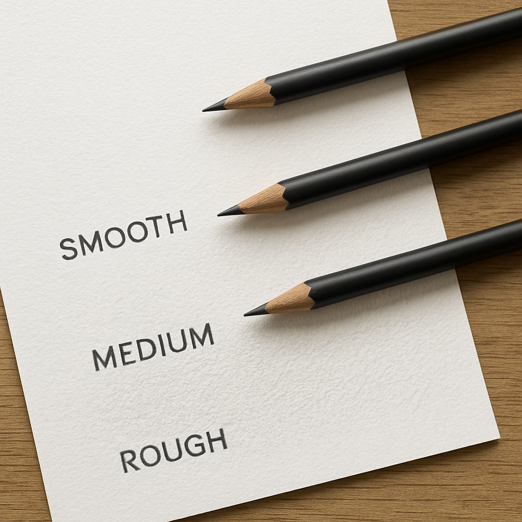
First, texture. If you love that subtle grit that makes graphite cling, go for a light to medium tooth. If you’re chasing deep smears without paper tearing, a smoother feel is your best friend.
Second, weight. A heavier paper (around 70-90 gsm) will hold more graphite and resist crumpling, making it ideal for heavy shading sessions that take you through the night.
Third, archival quality. Look for acid‑free, lignin‑free paper if you want your drawings to stay vibrant for decades—especially if you’re in India where humidity can be a relentless foe.
So, what should you try first? Grab a small pack of a mid‑to‑high grade sketchbook paper—something like the ones we reviewed on our site—and let your hand decide.
Remember, the right paper isn’t a secret; it’s a conversation between you, your graphite, and the surface. Start experimenting, keep notes, and you’ll soon know the paper that lets your lines breathe and your ideas take shape. And trust the feel; a good paper will guide you.
TL;DR
If you’re hunting for the best paper for graphite drawing, focus on texture, weight, and archival quality—light-to-medium tooth for grip, 70–90 gsm for heavy shading, and acid‑free paper to keep colors vibrant over time. Grab a sketchbook, test each feel, and let your pencil’s journey decide—your surface is a touch away.
Choosing the Right Paper Texture for Graphite
Let’s talk texture. When you’re starting a graphite piece, the surface you choose does a lot of the heavy lifting—not just in how your lines look, but in how you feel while you work.
First, texture, or tooth. A light to medium tooth helps graphite cling just enough to build layers without tearing the page. If you crave crisp, controlled lines, a smoother surface can be your ally. The trick is to match your technique: for soft blending and broad shading, tooth is your friend; for tight cross-hatching, smoother surfaces can keep edges clean.
Texture and tooth: what they do
Think of tooth as the grip on a tennis racket. Too rough, and your lead slows under pressure; too smooth, and you fight for every stroke. Start with a pad that feels balanced—not sandpaper rough, not glassy slick. You’ll notice the difference when you switch from a light wash of graphite to a dense, multi-layered build.
Weight matters, too
Paper weight isn’t about dressing up your pages; it’s about endurance. Mid-weight papers in the 70–90 gsm range strike a practical balance: they take heavy shading without buckling under a heavy hand. If you’re experimenting with erasers and lift, a sturdier surface helps you recover quickly without crumpling the sheet.
We’ve learned that weight interacts with texture. A soft lead on a rough sheet digs into fibers, while on a smooth surface the same lead slides and requires more pressure to achieve the same darkness. Your results hinge on dialing in both together.
Archival quality you can trust
Look for acid-free and lignin-free papers if you want drawings that age gracefully. That matters more when you’re stacking sheets or planning long-term storage. For artists in humidity-prone climates, like parts of India, longevity means choosing papers designed to resist yellowing and warping over time. A simple test: draw a small patch, seal it in a folder, and note how the tone holds after a couple of weeks.
Now, practical testing—this isn’t guesswork. Build a tiny survey of textures: smooth bristol for precise lines, a vellum-style paper for mid-to-high tooth, and a lightly rough surface for bold shading. Draw a short value scale on each, then compare how your graphite lands, how easy it is to blend, and how clean the edges stay as you layer.
Does this really help you choose? It’s about rhythm as much as texture. If you can, test a few sheets side by side, in the order you’d work on a real piece. You’ll notice how your hand relaxes when the surface “speaks” your language, and that’s when you know you’ve found your texture match.
So, what should you do next? Start with a small selection of mid-quality papers in the 70–90 gsm range and make a tiny, controlled set of tests. Record your impressions, then pick a surface you can rely on for the next big graphite project.
Analyzing Paper Weight and Its Impact on Graphite Detail
When you lift a graphite pencil from your hand, the paper’s heft can make or break the line you’re about to lay down. It’s not just about how heavy a sheet feels under your fingers; it’s about how that weight interacts with the graphite’s soft core, the tooth of the surface, and your own pressure.
Think of weight like a mattress. A lighter mattress feels airy but can sag when you press hard; a denser mattress keeps you supported but can feel stiff. In the same way, a light paper (around 70 gsm) will let graphite glide easily, but it’s prone to feathering or tearing when you erase. A heavier paper (90‑110 gsm) holds the lead’s pigment better, keeping darker tones deeper and reducing the chance of paper fatigue.
In practice, most artists who do detailed studies end up favoring the 90‑110 gsm range. It gives enough resistance to hold multiple layers of 6B graphite without the paper buckling or lifting. That’s why professional‑grade brands like Strathmore 500 Series or Arches 300 Series fall into that sweet spot.
But weight isn’t a one‑size‑fits‑all metric. If you’re sketching quick outlines or working in a high‑pressure environment where you need to erase a lot, you might benefit from a lighter, more forgiving paper that won’t tear. Conversely, if you’re creating large portraits or landscapes with heavy shading, a heavier paper is essential.
How Weight Influences Graphite Detail
The heavier the paper, the more surface area the graphite can cling to. This means you can apply the same amount of pressure and get a richer, more saturated line. On lighter stock, you’ll notice the graphite spreads more, creating a softer, more diffused effect.
Another subtle effect is the “push‑back” of paper when you eraser‑work. A paper that’s too thin can buckle under a kneaded eraser, causing your graphite marks to lift or even tear. A sturdy, 90‑gsm sheet offers a stable base that resists that push‑back, making your erasing clean and predictable.
Real‑World Example: The Portrait Studio in Mumbai
In a studio in Mumbai, an artist named Riya layers 6B graphite to render the depth of a portrait’s shadows. She starts with a 70 gsm pad for the first pass, but soon finds the paper warps when she presses hard. Switching to a 100 gsm sheet from Strathmore’s 400 Series, she notices the graphite stays put, and the shadows look deeper and more convincing. That simple switch saves her time and frustration.
Practical Checklist for Choosing Weight
1. Identify your main medium—soft or hard lead. 2. Consider the volume of layering you plan. 3. Check the paper’s gsm range. 4. Test a few sheets under your typical lighting and humidity. 5. Keep a small batch of heavier paper on hand for final dark passages.
Table: Weight vs. Use Case
| Weight (gsm) | Texture | Ideal Use | Pros | Cons |
|---|---|---|---|---|
| 70–80 | Light to medium tooth | Quick sketches, underdrawing, low erasing | Lightweight, affordable, flexible | Susceptible to feathering, less hold for deep values |
| 90–110 | Medium tooth | Layered shading, portraits, detailed studies | Good pigment retention, less paper fatigue | Heavier, may crinkle when cut |
| 120–140 | Heavy tooth | Large studies, mixed media, heavy erasing | Excellent support, resists tearing | Bulkier, harder to store, costlier |
In short, paper weight is a silent partner that can amplify or diminish your graphite’s detail. Keep your workflow in mind, and don’t be afraid to experiment with a few weights before committing to a full pad. For more in‑depth guidance on how different papers handle shading techniques, check out the Strathmore Artist Papers FAQ on graphite shading Strathmore Artist Papers.
Demonstration: Testing Paper Smoothness with Graphite
Start with a quick test that will let you feel the paper like you feel a friend—warm, slightly rough or slick, like a breeze. You’ll be surprised how a few strokes can tell you everything you need to know about surface texture before you commit a single layer of graphite.
Why a Tactile Test Matters
When you slide a 6B into a new sheet, do you feel the lead cling, or does it slide and smear? That instant feedback is your paper’s personality. A surface that grips holds pigment and lets you build depth without smearing; a slick surface forces you to use more pressure, which can lead to feathering or over‑exposure on the next pass.
Step‑by‑Step Demo
- Gather three paper types. Pick a smooth, a medium‑tooth, and a heavy‑tooth option. A Strathmore 400 Series, a Canson Classic Cream, and a Arches Hot‑Press sheet are good defaults.
- Lay out a 5 cm square. On each sheet, draw a line with a 2H, a medium 4H, and a soft 6B. Keep the strokes parallel and of similar length.
- Observe the bite. On the smooth paper the line sits flat; the medium tooth grips the lead a bit more, and the heavy tooth shows the most resistance—your graphite will stay where it’s placed.
- Blend a stroke. Using a blending stump or a piece of tissue, feather the 6B line. Notice how the graphite spreads on each surface. On smooth paper it blurs quickly; on medium tooth it stays contained; on heavy tooth it resists even with a hard push.
- Erasing test. Grab a kneaded eraser, lift the line, and feel the paper. Does it tear, lift, or stay intact? The smooth paper may show little resistance, while the heavy tooth will hold its shape.
That quick routine is a cheat sheet that lets you pick a paper in minutes, especially handy when you’re traveling or working in a cramped studio.
Real‑World Examples from the Field
A portrait artist in Mumbai uses a 90 gsm Strathmore 400 pad for her first pass, but when she needs the darkest shadows, she switches to a 120 gsm Arches sheet that keeps the 6B from feathering. The heavier weight gives the graphite a firm anchor, so her charcoal‑like blacks look more dramatic.
Meanwhile, a landscape student in Bangalore prefers the slick feel of a 70 gsm Canson Classic. The paper lets her draw fine detail with a 2H without the lead catching, but she layers a second sheet underneath to protect against feathering when she later adds a 4B shading.
Practical Checklist to Keep in Your Toolkit
- Always test under your usual lighting—bright LED may exaggerate grain, while warm lamps can hide subtle texture.
- Measure the paper’s GSM if you’re buying in bulk; 70–90 gsm works for most sketching, 90–110 gsm for portrait depth.
- Keep a small batch of heavier paper on hand for those “wow” dark passages you want to nail.
- Write down the feel: “slick,” “medium,” or “heavy.” This quick label will help you pick the right pad in future projects.
- Archive your test sheets in a flat folder—your own personal reference guide.
For a curated list of recommended papers, check out our Best Paper for Graphite Drawing guide. It dives deeper into brand‑specific strengths and real user experiences.
If you’re looking for finished graphite‑inspired landscape art to spark ideas, this gallery might inspire you: Gratitude Studios.
Selecting Paper for Portrait vs Landscape Graphite
Picture this: you’re ready to sketch a portrait, but the paper feels like a rough road. Or you’re chasing a landscape and the sheet just can’t handle the layers. The trick? Pick the right paper for the job—portrait or landscape—and you’ll never wrestle with grit again.
Portraits Need a Strong Grip
Portraits thrive on depth. You need a paper that holds graphite tightly so you can stack 6B, 4B, even 2B without the sheet giving up. A heavier weight, around 90–110 gsm, is the sweet spot. It resists feathering and keeps darker values solid.
In practice, the same pad that works for quick sketches may buckle when you hit the darkest shadows. That’s why many portrait artists, especially in India’s humid climate, lean toward acid‑free, lignin‑free options that stay flat and firm. The surface should feel slightly toothy—just enough to grip but not so rough it shows grain in the subtle tones.
Real‑World Example: Mumbai Portrait Studio
A local artist started with a 70 gsm pad for the first pass but saw warping under pressure. Switching to a 100 gsm Strathmore 400 Series immediately gave her the confidence to lay down deep values. The paper stayed steady, and the shadows looked deeper without the paper creaking.
Landscapes Call for Flexibility
When you’re sketching skies or sweeping hills, you want a sheet that can stretch and bend with your hand. A lighter weight—70–90 gsm—offers that flexibility. It’s less prone to tearing when you erase a lot, which is common in landscape work.
But remember: a paper that’s too light can feather when you layer soft 6B strokes. That’s why many landscape artists add a second sheet underneath to give the graphite a firm base. The trick is to balance lightness for ease of movement with enough heft to hold the layers.
How to Test for Landscape Use
Grab a pad of 70 gsm Canson Classic, a 90 gsm Strathmore 400, and a 120 gsm Arches. Lay down a 6B line, blend with a stump, then erase. Feel how the paper reacts. The heavier sheet should feel more stable, but the lighter one will let you shift your hand more freely.
Weight, Texture, and Your Own Style
The decision boils down to three quick questions: What weight fits your layering needs? Does the surface hold graphite or does it slip? Will you be erasing a lot? If you answer “yes” to the last, lean toward a heavier pad for portraits. If “yes” to flexibility, go lighter for landscapes.
And don’t forget the tooth. A slightly toothy surface gives you bite for fine line work, while a super‑smooth sheet is great for blending but may need a second layer to support heavy graphite.
Checklist to Keep Handy
- Portrait: 90–110 gsm, slight tooth, acid‑free.
- Landscape: 70–90 gsm, medium tooth, flexible.
- Always test under your studio light.
- Mark a feel: slick, medium, heavy.
- Store test sheets flat for future reference.
So, what’s the best paper for graphite drawing when you’re switching between portrait and landscape? It’s the one that feels right for each project. Test a handful of pads, note the feel, and you’ll build a library that never fails.
Need a deeper dive into paper options that work for pet portraits? Our pet portrait drawing paper guide shows how a 200 gsm sheet can hold up under heavy shading while still allowing fine detail.
Finishing Techniques and Paper Care for Graphite Works
We’ve already talked about choosing the right surface, but the last strokes and the way you protect what you’ve built are just as crucial. Think of it like baking: the flour is great, but how you finish the cake determines whether it stays fresh and looks stunning.
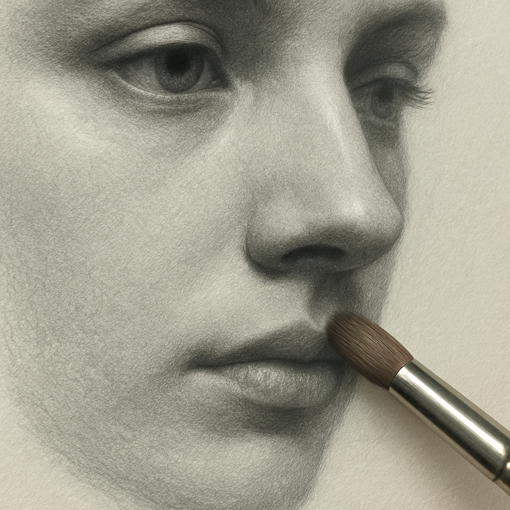
First, let’s tackle the finishing touch for graphite layers. After you’ve stacked your 6B and 4B values, you’ll notice that the graphite can soften or smear if you press too hard or if the paper is too slick. The trick is to blend lightly with a clean, fluffy brush or a tissue before the graphite dries fully.
Do you remember the first time you tried a “softening” stroke and ended up feathering the entire sheet? That’s why a subtle, circular motion with a light touch is the sweet spot. It lifts the surface slightly, keeping the graphite in place while smoothing the grain.
Now, think about erasing. A good eraser can rescue a composition, but a rough paper can tear. A kneaded eraser is your best friend because it’s forgiving and doesn’t chip the paper. When you lift graphite, do it in small, gentle strokes, not a sweeping swipe that pushes the fibers apart.
What about when the paper starts to show tiny nicks after repeated erasing? That’s a sign the surface is losing its integrity. In our studio, we keep a small stack of fresh, acid‑free sheets on hand, and we replace worn ones mid‑project. It’s a small cost for a clean finish.
In India’s humid climate, paper can warp or absorb moisture, making graphite spread unexpectedly. A practical solution is to keep your workspace in a climate‑controlled area or use a dehumidifier. If that’s not possible, try placing a lightweight cardboard between the paper and a stack of notebooks; it adds a protective barrier that keeps the sheet flat.
Here’s a quick checklist for finishing and care:
- Blend with a soft brush or tissue immediately after layering.
- Use a kneaded eraser in small, circular motions.
- Keep a backup pad handy for worn sheets.
- Store finished drawings in a flat, acid‑free folder.
- Control humidity with a dehumidifier or silica gel packs.
We’ve seen students in Mumbai finish a portrait in one sitting because they had a spare sheet ready for the final dark passages. The difference was that the fresh paper held the graphite better, so the shadows didn’t feather when they applied the last 6B stroke.
When you’re ready to store a finished piece, the best practice is to place it face‑down on a clean, flat surface, then slide a sheet of acid‑free paper over it. The result is a protective layer that keeps dust and oils out. If you’re planning to frame the work, use a UV‑protective glass; it preserves the graphite’s depth for years.
For a deeper dive into how to keep your paper looking pristine, check out this paper care guide from Toad Hollow Studio. It covers everything from spotting cleanup to the best eraser techniques.
In our experience at Drawing Pencils Guru, the most common mistake artists make is ignoring the “last touch.” A quick, gentle blend and a mindful eraser session can transform a rough draft into a polished masterpiece.
So, what should you do next? Grab a clean brush, a kneaded eraser, and a spare pad of your favorite paper. Finish your layers with soft, circular motions, protect the surface with an acid‑free folder, and watch your graphite shine like never before.
FAQ
What are the key factors to look for when choosing the best paper for graphite drawing?
When hunting for the best paper for graphite drawing, start with texture, weight, and archival quality. A light‑to‑medium tooth gives you bite without a gritty feel, while a 70–90 gsm sheet holds graphite well without warping. And make sure the paper is acid‑free and lignin‑free so your values stay vibrant for years. Skipping any of these is like missing the beat of your own sketch and keep your creative flow steady.
Does paper tooth matter more than weight for shading?
Paper tooth often wins when you’re chasing smooth gradients. A medium tooth feels like a gentle roughness, letting graphite glide while still giving it some bite. Weight matters for durability—heavy paper resists tearing under a kneaded eraser, but a lighter 70 gsm pad lets you erase freely without fatigue. So, for pure shading, pick a medium tooth in a 70–80 gsm range; for heavy layering, bump the weight up to 90–110 gsm today.
Can I use cheap student paper for professional portraits?
Student paper can be a decent starting point, but it often lacks the archival qualities that protect a portrait over time. Cheap stock tends to be acidic, so the graphite can yellow or the paper will buckle in humid climates like India’s monsoons. If you’re aiming for a show‑ready piece, go for a 70–90 gsm, acid‑free pad—it’s a small extra cost for long‑term preservation and keep your art fresh for years.
What maintenance tips help keep paper quality during long sessions?
Keep your workspace dust‑free and at a stable 60–70% humidity—too dry and the fibers crack, too moist and the paper swells. Use a soft, clean brush to sweep stray graphite, and always store finished sheets in an acid‑free folder to prevent yellowing. If you notice any warping, press the paper between two clean boards while it’s still warm to flatten it back to shape and keep your lines sharp.
How does paper thickness affect eraser work?
A thicker sheet holds up to a kneaded eraser’s pressure without buckling. With a thin 70 gsm pad, the fibers can push back and lift graphite, creating a faint lift that looks like smearing. If you’re constantly erasing, a 90–110 gsm paper keeps the surface level, letting you lift cleanly and avoid accidental tearing of the paper edges and keep your workflow smooth and confident throughout the session.
Is there a difference between hot‑press and cold‑press papers for graphite?
Hot‑press papers are smooth and let graphite glide like a quiet river, ideal for fine lines and detailed shading. Cold‑press papers have a subtle tooth, giving a little more grip—great for blending darker values or when you need a bit of texture to mimic skin or fur. Most artists use hot‑press for portraits and cold‑press for landscapes, but it ultimately depends on your personal comfort and the look you want.
Resources
Ever wondered where the best paper for graphite drawing actually comes from? It’s usually a mix of trusted guides, seasoned artists, and a few handy tools. Start with the classic “The Art of Sketching” book—its chapter on paper selection is a quick cheat sheet.
Online, a handful of communities keep the conversation alive. The r/ArtFundamentals subreddit, for instance, has threads where hobbyists post side‑by‑side comparisons. It’s a living lab where you can see real‑world feedback without the hype.
Local art supply shops are gold mines, too. Most cities in India have a specialty store that offers sample sheets. Take a quick run to a nearby shop, ask for a 90‑gsm strip, and feel the grain. That tactile test beats a dozen glossy product pages.
When you’re ready to buy, check the packaging for “acid‑free” and “lignin‑free.” These terms guarantee archival stability—critical if you want your drawings to stay vibrant for decades.
Another tip: keep a small notebook for paper notes. Write down texture, weight, and how it reacts to different pencils. Over time, you’ll build a personal reference that saves hours on future projects.
Finally, remember that practice trumps perfection. Even the best paper can feel off if you’re not comfortable with it. Keep experimenting, stay curious, and let the paper guide your hand.
Conclusion
Let’s wrap this up by revisiting what makes the best paper for graphite drawing a game‑changer. It’s not just about texture or weight; it’s about the confidence you get every time you lift a pencil.
Think of the first sheet you tried—did it feel like a handshake or a slip‑stream? That tactile cue is the first clue to the right choice.
From students in Chennai to professional illustrators in Mumbai, the common mantra is the same: acid‑free, lignin‑free paper that holds graphite without warping, paired with a tooth that matches your style—smooth for fine lines, medium for depth, heavy for bold strokes.
Your next move? Grab a small pack of each grade, do a quick test, and keep a notebook of notes. Those pages become your personal cheat sheet for years.
Remember, the best paper isn’t a mystery—it’s a conversation. When you feel the grain, you’re listening to the paper’s personality. Let that conversation guide your next sketch, and watch your drawings breathe.
So, if you’re ready to elevate your graphite game, pick a paper that speaks to you, test it, and let your hand find its rhythm—your art will thank you.
Happy drawing, and enjoy every stroke today.
