
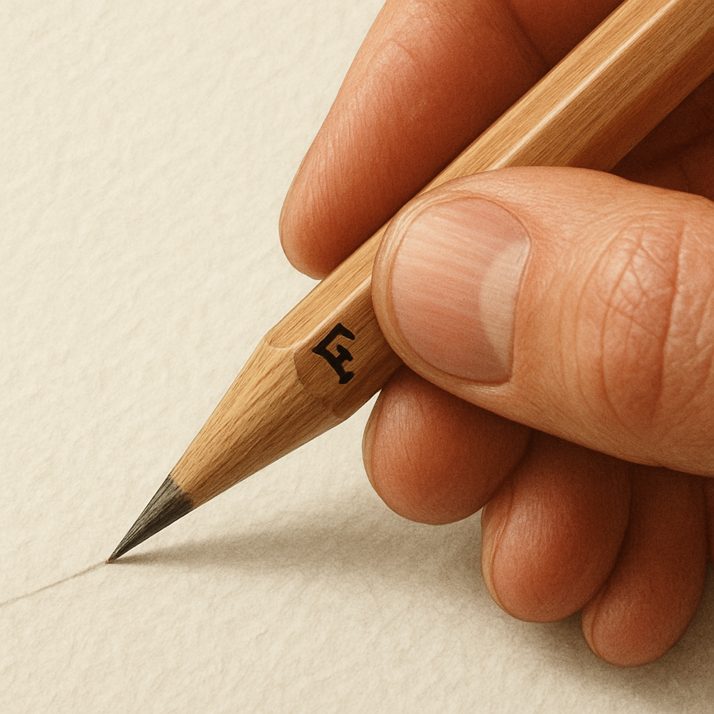
Ever picked up a pencil labeled “F” and wondered what the letter actually stands for? You’re not alone. Most artists in India, whether they’re sketching a quick concept in a college classroom or refining a detailed illustration for a client, have stared at that mysterious grade and felt a twinge of uncertainty.
Here’s the thing: “F” stands for “Fine.” It’s the sweet spot between the hard, light‑touch H grades and the soft, dark‑rich B grades. Think of it as the Goldilocks of pencil hardness – not too hard to break, not too soft to smudge uncontrollably. In our experience at Drawing Pencils Guru, beginners often start with an F because it offers enough bite for clear lines while still letting you blend gently.
Imagine you’re drafting a technical drawing for an engineering project in Mumbai. You need crisp, precise lines that won’t wear down after a few strokes. An F pencil holds its edge longer than a HB, letting you maintain consistency across the whole sheet. On the other hand, a portrait artist in Delhi might use the same F to sketch initial outlines before switching to a softer 2B for deep shadows – the F gives a clean foundation without the harshness of an H.
So, how do you make the most of that “F” grade? Try this quick three‑step routine: 1️⃣ Test pressure – press lightly and notice the light gray line; press harder and see a richer tone. 2️⃣ Sharpen to a fine point using a metal rotary sharpener; a sharp tip gives you control for intricate details. 3️⃣ Pair it with a quality eraser like a kneaded one to lift excess graphite without tearing the paper. These habits instantly boost line quality and reduce the need for constant re‑sharpening.
Curious about the deeper mechanics? Our What Does F Mean on a Pencil? Full Guide breaks down the graphite composition and shows you side‑by‑side comparisons with H and B grades, so you can see exactly why “Fine” feels just right for many drawing scenarios.
And once you’ve nailed those fine details, you might be thinking about how to showcase your work. A great next step is printing your finished pieces on high‑quality canvas – it brings out the subtle gradients you achieved with that F pencil. Check out this inspiring article on canvas prints that could be the perfect way to display your art: How Nature Inspired Canvas Prints Transform Your Living Space.
Bottom line: the F pencil isn’t just another grade; it’s a versatile workhorse that bridges precision and smooth shading. Experiment with pressure, keep it sharp, and pair it with the right eraser – you’ll quickly see why it’s a favorite among students, professionals, and hobbyists alike.
TL;DR
The F pencil is the ‘Fine’ grade, sitting between hard H and soft B leads, giving you crisp lines that stay sharp while still allowing smooth shading.
Use a metal rotary sharpener and a kneaded eraser to keep the tip precise, and experiment with light‑to‑heavy pressure for versatile sketches that work in classrooms, studios, or freelance projects.
What Does the “F” Mark on a Pencil Indicate?
Ever caught yourself squinting at the tiny “F” stamped on a pencil and wondered if it’s some secret code? You’re not alone. That little letter actually tells you a lot about how the graphite will behave on paper, and understanding it can save you countless frustrating eraser‑smears.
In short, “F” stands for “Fine.” It sits right between the hard H grades and the soft B grades, delivering a line that’s crisp enough for technical work but still soft enough to blend when you need a touch of shading.
Think about drawing a floor plan for an engineering project in Pune. You need lines that stay sharp after dozens of revisions. An F pencil holds its point longer than an HB, meaning fewer trips to the sharpener and a cleaner drawing overall. Now picture a budding illustrator in Bengaluru sketching a character’s outline before moving into deeper shadows – the same F lead gives a clean skeleton without the harsh bite of an H.
So, what does that mean for you on a day‑to‑day basis? Here are three practical ways the “Fine” grade changes the game:
1. Consistent Line Weight
Because the graphite is medium‑hard, a light hand produces a fine, almost gray line, while a firmer press yields a richer, darker stroke. It’s like having two pencils in one – perfect for artists who like to experiment with pressure without swapping tools.
2. Sharper, Longer‑Lasting Point
F leads are less prone to crumbling than softer B pencils. When you use a metal rotary sharpener, you’ll notice the tip stays pointy longer, which translates to smoother contour work and fewer interruptions.
3. Easy Transition to Shading
Because the lead isn’t as hard as H, you can still blend gently with a tortillon or a soft blending stump. It’s the sweet spot for those who want a line that can both define edges and melt into subtle gradients.
Now, you might be thinking, “How do I make the most of this fine grade in my own studio?” First, test pressure on a scrap sheet – notice how the tone deepens. Second, keep a kneaded eraser handy; it lifts graphite without tearing the paper, preserving the delicate lines you worked so hard to get. Third, store your F pencils in a dry, temperature‑stable spot – extreme humidity can soften the lead over time.
One tip we often share with students in Delhi’s art colleges is to pair the F pencil with a slightly harder H for the final line‑work, then go back to the F for any nuanced shading. It creates a subtle contrast that makes the drawing feel more three‑dimensional without looking over‑processed.
Watching the short video above can help you visualize the pressure differences we just described. Notice how the artist switches from a light touch to a firmer hand, and how the line quality changes in real time.
When you start feeling comfortable with the F pencil, you’ll notice it becomes a go‑to for quick sketches, architectural renderings, and even preliminary comic panels. Its versatility makes it a staple in any artist’s toolbox, from the classroom bench in Kolkata to a freelance studio in Mumbai.
Bottom line: the “F” isn’t just another grade; it’s a reliable middle ground that gives you control, consistency, and a touch of flexibility. Embrace its fine nature, experiment with pressure, and let it become the quiet workhorse behind your most confident sketches.
Historical Origins of the F Grading System
Ever wonder why the mysterious “F” sits between the hard H and the soft B grades? The answer takes us back to the very first graphite sticks that shepherds in 16th‑century Cumbria used to mark their flocks.
Back then the mineral was mistaken for lead – a mistake that gave the pencil its misleading name for over two hundred years. It wasn’t until the early 1700s that artisans started shaping pure graphite into wooden‑cased sticks, but those early tools were still just lumps of carbon, with no way to control darkness or hardness.
The Conté‑Hardtmuth Revolution
Enter Nicolas‑Jacques Conté, the French chemist who, in 1795, mixed graphite with clay, baked the blend in a kiln, and encased it in wood. Almost simultaneously, Austrian inventor Joseph Hardtmuth was experimenting with the same formula. Both men filed patents (Conté in 1795, Hardtmuth in 1803) that unlocked a simple but powerful idea: the more clay you add, the harder and lighter the mark; the more graphite, the softer and darker the line.
That ratio‑tweaking created the first graded leads. By the early 19th century a rough “HB” system emerged, standing for “Hard / Black” – a middle ground that felt familiar to writers and artists alike.
The Birth of the “F” Grade
So where does the “F” fit? Historical records show that Japanese markets preferred slightly softer pencils for calligraphy, but the local “HB” felt too soft for everyday writing. Pencil makers responded by inserting a half‑step between HB and H, branding it “F” for “Fine” (sometimes “Firm”). This tiny adjustment added just enough extra clay to sharpen a finer point without sacrificing the smoothness writers expected.
In other words, the F pencil is a compromise – a “Goldilocks” grade that lets you draw crisp outlines yet still hold a point longer than a standard HB. That’s why you’ll still see it in artist tins today, even though it originated as a writing tool.
Real‑World Examples Then and Now
Imagine a London‑based portrait artist in 1820 using a Conté‑style 2F pencil to sketch a client’s cheekbones before switching to a soft B for shadows. Fast‑forward to modern Mumbai classrooms: students reach for an F pencil to draft geometry diagrams that stay legible after dozens of erasures.
Another vivid case comes from Japanese calligraphers who still favor the “F” for its ability to produce clean, fine strokes on rice paper – a practice that survived the transition to modern graphite.
Actionable Steps to Explore the History
- Visit a local art supply store and ask the staff which brand still lists “F” as a distinct grade – many Indian retailers stock Staedtler Mars Lumograph “F” pencils.
- Grab a vintage‑style pencil (often marketed as “2F”) and compare its line on smooth Bristol board to an HB; notice the slightly darker tone and the sharper tip retention.
- Read the detailed timeline on Anna Bregman’s grading article, which walks through the Conté‑Hardtmuth patents and the Japanese adoption of the half‑grade.
These hands‑on checks let you feel the historical nuance rather than just reading about it.
Expert Tip from Drawing Pencils Guru
When you’re building a starter set, include an “F” alongside a hard H and a soft B. That trio mirrors the original three‑step workflow invented in the 1800s: lay down precise construction lines with the F, deepen shadows with the B, and reserve the H for ultra‑light hatching. By honoring the original grading logic, you’ll find your sketches become more balanced and less “guess‑work”.
So, next time you pick up a pencil labeled “F”, remember you’re holding a piece of 18th‑century chemistry, a dash of Japanese market savvy, and a tool that’s helped artists from London to Bangalore stay precise for more than two centuries.
How to Identify Authentic “F” Graded Pencils
Ever held a pencil that felt a bit too soft for precise lines, or a bit too hard to keep a fine tip? That’s the moment you start wondering if it’s truly an “F” grade or just a marketing gimmick. Let’s walk through a simple, hands‑on process that lets you spot a genuine F‑graded pencil without needing a lab.
1. Check the branding and stamp
Most reputable manufacturers still mark the grade right on the barrel. Look for a crisp, embossed “F” next to the brand name. In India, you’ll often see this on Staedtler Mars Lumograph or Faber‑Castell lines. If the lettering looks fuzzy or the grade is printed in a tiny font, that could be a red flag.
2. Feel the lead hardness
Grab a piece of smooth Bristol board – it’s cheap and gives a consistent surface. Lightly draw a line. An authentic F should lay down a medium‑gray mark that’s darker than HB but not as rich as B. Now press a bit harder; the line should deepen without becoming black. If the lead feels either too brittle (like an H) or smudges instantly (like a B), you’re probably not holding a true F.
Why does this matter? The mix of graphite and clay determines hardness. Faber‑Castell explains that adding a bit more clay makes the lead harder, while more graphite softens it. The F sits right in the middle – firm enough for a fine point, soft enough for smooth shading.Faber‑Castell hardness scale
3. Test tip retention
Sharpen the pencil with a metal rotary sharpener – it gives a clean, consistent angle. Sketch a few quick lines, then flip the pencil and repeat. An authentic F will keep its point longer than an HB, which tends to dull after a dozen strokes. If you need to re‑sharpen every few lines, you might have a softer B or a fake grade.
4. Look for the “half‑step” label
Historically, the F was introduced as a half‑step between HB and H. Some brands still label it as “F” or “Firm”. If you see “2F” or “2½F”, those are vintage‑style variations that still follow the same hardness principle – just a touch darker. Compare a 2F to a regular F on the same paper; the 2F should produce a slightly richer line.
5. Verify the packaging
Authentic pencils usually come in sealed tins or boxes with clear grading charts. Check the printed scale – you should see the full range from 6H down to 6B, with F placed between HB and H. If the packaging only mentions “soft” or “hard” without the full scale, it might be a low‑cost imitation.
6. Trust the source
Buy from reputable art‑supply stores or online shops that specialize in professional grades. Local Indian retailers often carry genuine F pencils from Staedtler, Faber‑Castell, and Camlin. If a seller can’t tell you the exact brand or provide a batch number, walk away – authenticity is worth a little extra cost.
7. Quick checklist
- Barrel shows a clear, embossed “F”.
- Medium‑gray line on smooth paper; darkens with pressure.
- Tip stays sharp for 10+ strokes using a rotary sharpener.
- Packaging includes a full hardness chart.
- Source is a trusted art‑supply retailer.
By running through these steps, you’ll feel confident that the pencil in your hand really lives up to the f pencil meaning – a balanced, “fine” grade that bridges precision and smoothness. And once you’ve verified authenticity, you can start experimenting with that perfect line quality in your sketches, whether you’re drafting a technical diagram in a Mumbai classroom or sketching a portrait in a Delhi studio.
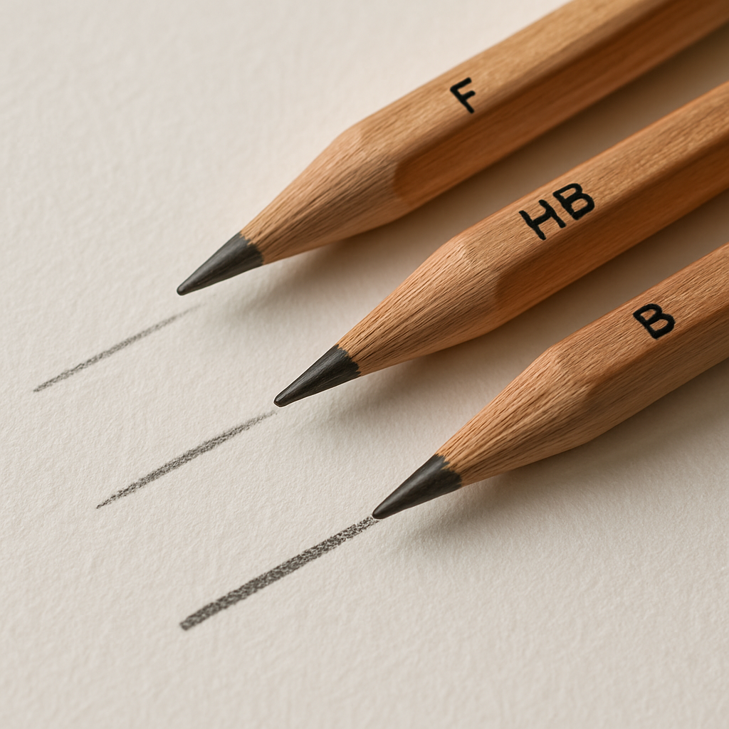
Comparing “F” Grade Pencils to Other Grades (HB, B, etc.)
Ever wonder why you sometimes reach for an “F” and other times grab a “B” without even thinking about it? It’s not magic – it’s the subtle language of graphite hardness that tells your hand what kind of line to lay down.
At its core, the f pencil meaning is “Fine” – a sweet spot that leans just a touch harder than the classic HB, yet stays softer than a straight‑up H. Think of it as the Goldilocks of the pencil world: not too hard to snap, not too soft to smudge.
How the grades stack up
When you compare grades, picture a ladder of pressure and darkness. On one end you have the ultra‑hard H series, perfect for razor‑thin technical lines that barely leave a mark. On the opposite end sits the soft B series, delivering deep, velvety shadows with barely a touch.
The “F” lives right in the middle, giving you a medium‑gray line that darkens nicely when you press harder, but still holds a crisp point for hours. That’s why many art teachers in Mumbai and Delhi keep an F in the front row of every student’s pencil case.
What the manufacturers say
Faber‑Castell, the world’s largest pencil maker, explains that the hardness of each grade is dictated by the graphite‑to‑clay ratio. More clay = harder lead; more graphite = softer lead. Their official hardness scale shows the F sitting between HB and H, confirming the “fine” balance we feel in the hand.
Practical side‑by‑side
Let’s break it down with a quick real‑world test. Grab a smooth Bristol sheet, draw a light line with an F, then a line with an HB, and finally a B. You’ll notice three things:
- The F line is slightly darker than the HB but lighter than the B.
- The F tip stays sharp longer than the HB, yet it won’t wear down as fast as a B when you apply pressure.
- The F feels just firm enough to control intricate details without the jitter you sometimes get with an H.
That little experiment is the secret sauce behind why architects prefer F for hatch marks, while portrait artists reach for B when they need rich shadows.
Choosing the right grade for your project
If you’re drafting a geometry diagram for a college exam, you probably want the crisp consistency of an F – it won’t blur after a dozen erasures, and you won’t waste time re‑sharpening every few strokes.
Working on a charcoal‑style sketch? A B will give you that buttery darkness without fighting the paper. And when you need ultra‑fine lines for a technical blueprint, an H or even 2H steps in, but you’ll miss the slight gray tone that makes the drawing readable at a glance.
So, how do you decide? Ask yourself three quick questions:
- Do I need a line that stays sharp for many strokes? → F or H.
- Do I want a darker, expressive stroke? → B or softer.
- Am I drawing on a rough surface that will wear down the lead? → Harder grade like H.
Answering those will guide you straight to the grade that matches the f pencil meaning you’re after.
And here’s a handy cheat sheet you can keep on your desk:
| Grade | Hardness | Typical Use |
|---|---|---|
| F | Medium – between HB and H | Precise outlines, technical drawings, balanced shading |
| HB | Balanced soft‑hard | General writing, everyday sketching |
| B | Soft, darker | Shading, expressive illustration, portrait work |
Notice how each row tells a story about pressure, darkness, and durability. Keep this table in mind next time you stand in front of the art‑supply aisle in Delhi or Pune – the right grade will save you time, eraser dust, and a lot of frustration.
Bottom line: the “F” isn’t just another letter; it’s a purposeful middle ground that bridges the precision of H with the richness of B. When you understand that, every line you draw feels intentional, and you’ll spend less time guessing and more time creating.
Ready to put this into practice? Pull out your favorite F pencil, run that three‑grade test, and watch how your sketches suddenly feel more controlled. You might just discover a new favorite grade for the next project.
Practical Uses: When to Choose an F Pencil
Ever stood in front of a cluttered pencil case and wondered, “Which one actually earns my time?” If you’ve felt that tug of indecision, you’re not alone. The f pencil meaning – a “Fine” grade that lives right between HB and H – is the quiet workhorse many artists and students swear by, but it only shines when you match it to the right task.
Architectural and technical drafting
Picture a bustling design studio in Mumbai, where an architect needs crisp, repeatable lines for a floor plan. An F pencil holds a point longer than an HB, so you can lay down a hundred hatch marks without constantly re‑sharpening. The medium hardness also means the lines stay light enough to erase cleanly if dimensions shift.
Tip: Use a metal rotary sharpener and a ruler‑guided hand. You’ll notice the F’s line stays uniform, even on heavier tracing paper.
Portrait and figure sketching
When you’re sketching a friend’s face in a Delhi coffee shop, you want a line that’s dark enough to define cheekbones but not so bold that it ruins subtle shading. The F pencil gives you that middle‑gray tone – perfect for the initial contour before you reach for a softer 2B to deepen shadows.
Try this: draw the outline with an F, then press a touch harder on the same stroke. The line deepens without turning black, letting you build tone gradually.
Classroom note‑taking and exam prep
Students often battle with pencils that either smudge too fast or break at the slightest pressure. In a fast‑paced lecture, an F pencil provides a legible, medium‑gray line that survives a few erasures – ideal for geometry diagrams or quick mind maps.
Quick check: after writing a paragraph, lightly shade over the line. If it darkens without turning harsh, you’ve got the right grade.
Mixed‑media sketchbooks
Many hobbyists love combining graphite with ink or watercolor. The F’s balanced hardness means it won’t gouge heavy watercolor paper, yet it lays down enough graphite to serve as a reliable guide for later ink work.
Pro tip: sketch your layout with an F, then wet‑brush over the lighter areas. The graphite lifts gently, leaving clean white spaces for color.
Rapid concept ideation
Ever need to dump a flurry of ideas onto a page before a client meeting? The F pencil’s “fine” nature lets you sketch fast, adjust pressure on the fly, and keep the lines readable. You won’t waste time switching pencils every few seconds.
One trick: keep a small sandpaper block nearby. If the tip gets a tiny nub, a quick rub restores that razor‑sharp point without losing the F’s characteristic tone.
When an F pencil isn’t the best fit
It’s okay to admit that not every job calls for a “middle” grade. Ultra‑light architectural hatching on a rough vellum might need a harder H, while deep, expressive charcoal‑style shading benefits from a soft B. Knowing the limits of the F helps you avoid frustration later.
So, how do you decide? Ask yourself three quick questions: Do I need a line that stays sharp for many strokes? Do I want a medium‑gray tone that can be darkened with pressure? Is the paper surface relatively smooth? If you answered yes to most, the F pencil is probably your go‑to.
And if you’re still unsure, the Faber‑Castell hardness scale breaks down exactly why the F sits where it does in the 19‑degree system, confirming its sweet spot between hardness and darkness.Faber‑Castell hardness scale
Bottom line: the f pencil meaning isn’t just a label on a barrel; it’s a practical decision‑maker. Whether you’re drafting a structural plan, sketching a portrait, or jotting down a quick concept, the F gives you control, consistency, and just enough darkness to keep your work looking intentional.
Additional Resources and Tools
When you finally nail the f pencil meaning, the next question is: what else can help you get the most out of that “Fine” grade? Here are a few low‑cost tools that we’ve seen work wonders in Mumbai studios and Delhi classrooms.
Sharpening gear
A metal rotary sharpener keeps the tip at the perfect angle, so you don’t waste time re‑sharpening after every line. A quick rub with a fine‑grain sandpaper block can rescue a stubborn nub without dulling the lead.
Erasers and blends
We love a kneaded eraser for lifting graphite gently; it lets you correct mistakes without tearing the paper. Pair it with a soft blending stump for those subtle gradients that make the F grade shine.
Reference guides
If you want a quick visual reminder of where the F sits in the whole 19‑degree system, the Winsor & Newton guide on understand pencil grades breaks it down in a clean chart.
Digital checklists
Grab a simple spreadsheet and note three things every time you test a new F pencil: line darkness on smooth Bristol, tip retention after ten strokes, and how it reacts to pressure. Seeing the data side by side makes it easy to spot the perfect brand for your workflow.
Give one of these tools a try during your next sketch session and notice how much smoother the whole process feels. The right accessories turn the f pencil meaning from a neat fact into a reliable part of your daily creative routine.
Conclusion
We’ve walked through everything that makes the “F” grade tick, from its historic roots to the tiny nuances you feel when the tip meets paper. If any part of that felt fuzzy, take a moment to picture the smooth, medium‑gray line you get when you press just a bit harder–that’s the f pencil meaning in action.
At its core, f pencil meaning is simple: a balanced, “Fine” lead that sits right between the hard H series and the soft B family. It gives you a line dark enough for confident outlines yet firm enough to stay sharp through dozens of strokes.
Why does that matter for you, whether you’re drafting a geometry diagram in a Mumbai classroom or sketching a portrait in a Delhi studio? Because it removes the guesswork – you know the pencil will hold a point longer than an HB and won’t smudge as quickly as a B.
One quick habit to lock in that consistency is to test pressure on a scrap sheet before every session. Light stroke, then a medium press – notice the tonal shift and keep that sweet spot in mind as you work.
Remember, the best way to internalize f pencil meaning is to use it. Grab an F, draw a quick shape, erase, and repeat. Those few minutes of tactile feedback turn theory into muscle memory.
Our team at Drawing Pencils Guru sees the same pattern in students and professionals alike – the moment they trust the F grade, their line quality jumps up and the need for constant re‑sharpening drops.
So, what’s the next step? Pick up an authentic F pencil today, run the pressure test, and let the balanced lead do the heavy lifting for your next sketch. Happy drawing!
FAQ
What does the “f” in pencil grading actually stand for?
Short answer: the “f” means “Fine.” In the graphite‑to‑clay formula it sits right between the classic HB and the harder H grades. That tiny half‑step gives you a lead that’s hard enough to keep a razor‑sharp point but soft enough to lay down a medium‑gray line without looking washed out. When you hear people talk about the f pencil meaning, they’re really pointing to that sweet spot of precision and tone.
How does the f pencil meaning differ from HB and B grades?
Think of the three grades as a traffic light. HB is the yellow – balanced but not extreme. B is the red – soft, dark, great for deep shadows. F is the green – a medium‑gray that stays darker than HB when you press harder, yet it retains a crisp tip longer than HB. In practice that means you can outline with confidence and then deepen the line without swapping pencils every few strokes.
Is the f grade suitable for technical drawing or architectural work?
Absolutely. Technical drafts need lines that stay consistent after dozens of hatch marks, and the f pencil meaning delivers just that. Because the lead holds its point, you waste less time re‑sharpening and more time focusing on dimensions. Pair it with a metal rotary sharpener and a ruler, and you’ll notice the lines stay uniform on tracing paper or vellum – a small but huge productivity boost for architects and engineers.
Can I use an f pencil for shading in portrait sketches?
Yes, and many portrait artists swear by it for the initial contour. The medium hardness lets you press a little harder to get a richer gray without jumping straight to black. That gradual darkening is perfect for building subtle skin tones before you reach for a softer 2B or 4B. In our experience, the f pencil meaning gives you enough tonal range to sketch the outline and add light shading in one go.
How often should I sharpen an f pencil to keep the tip fine?
Because the lead is a bit harder than HB, you’ll get roughly 10–12 solid strokes before the tip dulls. A quick test: draw ten light lines, then check the point. If it’s looking a tad nubbed, give it a brief spin in a metal rotary sharpener. That quick touch restores the fine tip and preserves the consistent line weight that defines the f pencil meaning.
What should I look for when buying an authentic f‑graded pencil in India?
First, check the barrel for a clear, embossed “F” next to the brand name – fuzzy lettering is a red flag. Next, feel the lead on smooth Bristol board; an authentic F will lay down a medium‑gray that darkens with pressure but never turns jet‑black. Finally, buy from reputable art‑supply stores or trusted online retailers that list the full hardness chart in the packaging. Those three checks help you avoid cheap imitations and get the true f pencil meaning you need.
