
Ever stared at a fluffy cat sketch and thought, “I wish I could capture that softness with my colored pencils?”
You’re not alone – most artists hit that wall before they discover the little tricks that turn a flat scribble into realistic fur.
In this guide we’ll walk through how to draw fur with colored pencils step by step, from choosing the right paper to layering the final highlights.
First, pick a paper that has a bit of tooth; it grabs the pigment and lets you build texture without tearing the surface.
We recommend a mid‑weight sketchpad with a slightly rough finish – it’s cheap enough for practice and sturdy enough for heavy layering.
Next, grab a core set of pencils: a light yellow, a warm brown, a cool gray, and a deep black. These four shades give you the entire value range you need for most animal coats.
Start by laying down a light base using the yellow or a very soft tan. Keep the pressure feather‑light; you’re only mapping the direction of the hair, not the final value.
Then, follow the natural flow of the animal’s fur with short, overlapping strokes. Think of each stroke as a single hair strand, not a solid block.
When you’re happy with the direction, begin layering the brown and gray, pressing a bit harder each time. This builds depth and mimics the way shadows pile on a real coat.
Don’t forget the highlights – a quick flick of the white or a bright yellow on the tips makes the fur look caught in light, just as you’d see on a sunny afternoon.
Finally, blend everything gently with a blending stump or even a clean cotton swab. The goal is to soften harsh edges while preserving the individual hair texture.
Now you have a fluffy, believable patch of fur that you can expand into an entire animal drawing. Ready to try it yourself?
TL;DR
Learn how to draw fur with colored pencils by mastering light base layers, directional strokes, layered shading, and gentle blending for realistic, fluffy texture.
We break down each step, share insider tips on pencil selection and pressure control, and show you quick fixes so your animal sketches look alive in minutes.
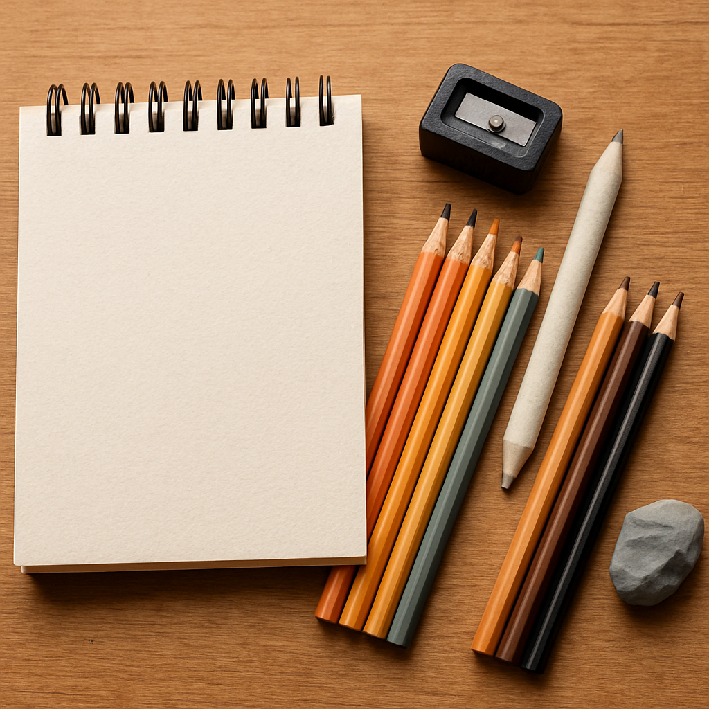
Materials & Tools
Alright, before you dive into those fluffy strokes, you need a little toolbox that actually helps you. It’s tempting to grab whatever’s on hand, but the right mix of paper, pencils, and accessories makes the difference between a rough sketch and a coat that looks ready to be petted.
Paper is the foundation. A mid‑weight sketchbook with a slightly rough (cold‑press) surface gives the pigment something to bite into without tearing. If you prefer loose sheets, look for 140‑200 g m² drawing paper labelled “cold press” or “rough.” It’s cheap enough for practice sessions and sturdy enough for heavy layering.
When it comes to colored pencils, softness is key. Soft‑core cores lay down colour smoothly and let you blend without fighting the lead. A core set that includes a light tan or warm yellow, a medium brown, a cool gray, and a deep black covers most animal coats. Brands like Prismacolor Premier or Faber‑Castell Polychromos are favourites among our students in India and art colleges.
Sharpness can’t be ignored. A dull tip spreads pigment and blurs those tiny hair edges you’re after. We recommend a handheld rotary sharpener that lets you set a 30° angle, or a quality metal hand‑sharpener with a fine hole. Keep that point razor‑sharp for clean, single‑hair strokes.
Blending tools are the silent heroes. A simple blending stump (tortillon) works wonders for smoothing transitions while preserving individual hair texture. Some artists also use a clean cotton swab or a piece of soft tissue for a softer finish. If you love a subtle shine, a colorless blender or a white pencil can add that glossy whisper you see in real fur.
Don’t forget a kneaded eraser. It’s pliable, lifts stray pigment without damaging the paper, and can be shaped into a point to pull out highlights on single strands – it’s like pulling a stray thread from a sweater, only it adds sparkle.
Here’s a quick checklist you can tape to your studio wall:
- Rough‑tooth sketchpaper (140‑200 g m²)
- Soft‑core colored pencils (tan, brown, gray, black)
- Rotary or metal hand sharpener
- Blending stump or cotton swab
- Kneaded eraser
- Colorless blender (optional)
Staying focused while you layer can be a challenge. One trick our community swears by is using a timer that encourages single‑task work sessions – it keeps your mind on the pencil, not your phone. Learn how timers can boost your focus and turn practice blocks into productive mini‑marathons.
After you’ve set up, try a quick study: draw a small fur patch on a scrap sheet using only three colours. Notice how the paper’s tooth catches the pigment, how the sharpened tip defines each hair, and how the blending stump smooths the transition without erasing texture. This tiny experiment tells you whether you need a softer paper or a sharper point before tackling a full‑size portrait.
Even the best tools need a little mental fuel. Many creators rely on focus‑enhancing supplements to keep energy steady during marathon sessions. If you’re looking for a clean boost, Great Bite Supplements offers nootropic gummies designed for mental clarity – perfect for those long, detailed drawing days.
When you’ve gathered the right paper, pencils, and accessories, the rest of the process – layering, directional strokes, and gentle blending – becomes far less intimidating. In our experience, the combination of proper tools and a focused mindset turns a hesitant doodle into a fur‑rich illustration you’ll be proud to share. Ready to start? Dive into our full tutorial on how to draw realistic fur with colored pencils for step‑by‑step guidance, and watch your sketches come alive.
Step 1: Sketch the Basic Outline
When you sit down with your pencils, the first thing most artists skip is the humble outline. And that’s the part that can save you hours of re‑working later.
Grab a hard‑core pencil – a 2H or 4H works great – and start by lightly blocking in the silhouette of the animal. Think of it as drawing a simple silhouette cut‑out you might see on a greeting card. You’re not trying to capture texture yet, just the overall shape and the major direction of the fur flow.
Why start with a hard lead? It leaves barely any pigment, so you can erase or adjust without staining the paper. In our experience teaching art students across India, a faint outline lets you experiment with pose before committing any colour.
Here’s a quick checklist for the sketch stage:
- Identify the main axis of the body – a line that runs from the head through the spine.
- Mark the widest points (shoulders, hips, tail) with simple ovals.
- Sketch the head and ears as basic shapes – circles or triangles – then connect them with gentle curves.
- Use short, directional strokes to hint at the hair growth pattern. For a cat’s back, those strokes should arc slightly upward; for a dog’s flank, they’ll run more horizontally.
Now, pause and look at your reference photo. Does the outline feel like it respects the animal’s weight and posture? If something feels off, erase a little, shift a line, and try again. This iterative habit is what separates a sketch that looks “off” from one that feels alive.
One real‑world example comes from a student in Mumbai who was trying to draw a golden retriever. She first traced the silhouette with a 2H, then stepped back and realised the tail was too low. By adjusting the tail curve before any colour entered the paper, she saved herself from repainting a whole section later.
After the outline feels solid, it’s time to map out the light‑to‑dark zones. Lightly shade the areas that will stay bright with a soft‑core yellow or a very light tan. This “base layer” is essentially a roadmap for where you’ll pile on darker values later.
For a more detailed walkthrough, check out this step‑by‑step guide that shows how an artist tackles a black‑fur shepherd on tinted paper. It explains why drawing the whitest hairs first makes it easier to pull back darkness later. Ewelina’s tutorial is a great reference.
Tip: keep a scrap piece of your chosen paper right beside your work. Lightly test a single stroke of your hard‑core pencil. If the line looks too grey, switch to a harder grade; if it’s too faint, drop down to a softer 2H.
When you feel confident with the outline, give it a final once‑over with a fine eraser. Pull away any stray marks that could confuse the eye when you start layering colour. A clean skeleton lets the later layers of fur shine through without unwanted “ghost” lines.
And that’s it – the sketch is your safety net. With a solid silhouette, the rest of the process – layering, blending, highlighting – becomes a matter of building texture, not fixing shape.
Ready to move on? In the next step we’ll start adding colour, one hair at a time, and watch the fur come alive.
Step 2: Lay Down the Base Colors
Now that your outline is clean, it’s time to whisper the first colours onto the paper. Think of this as laying a soft blanket over the skeleton – you’re not painting the whole animal yet, you’re just telling the eye where the light hits first.
Pick the right base hue
In our experience the lightest part of any coat – whether it’s a sun‑kissed Bengal tiger or a frosty Himalayan cat – is best captured with a warm, slightly muted tone. A pale yellow, a light tan, or even a very soft cream works wonders because it reflects the natural highlight without looking chalky.
Why not jump straight to the dark browns? If you start dark, you’ll end up fighting the paper, and the delicate hair‑stroke texture gets lost. A light base keeps the tooth of the paper alive and lets later layers glide smoothly.
How to apply the base
Grab a soft‑core pencil (Prismacolor Premier or Faber‑Castell Polychromos are favourites among our students in Mumbai and Delhi). Hold it at a 45‑degree angle and use feather‑light pressure – you’re basically tracing the direction of each hair, not shading a solid block.
Start at the area that catches the most light – the top of the head, the ridge of the back, or the belly of a Labrador. Lay down short, overlapping strokes that follow the natural flow you already hinted at in the outline. Imagine you’re drawing tiny pencil‑hair strands; each stroke is a single hair, not a smudge.
Tip: work in sections. Divide the animal into “light zones” and “shadow zones” and finish one zone before moving to the next. This prevents accidental colour bleeding and keeps the paper’s texture intact.
Real‑world example: a Delhi street‑cat
One of our community members tried drawing a stray cat she spotted on a bustling Delhi lane. She started with a creamy ivory base on the cat’s belly and chest, using a soft 2B coloured pencil. The light base let the paper’s tooth show through, so when she later added a muted brown for the back, the fur retained that subtle, sun‑warmed glow that made the sketch feel alive.
She also noticed that the base colour acted like a “safety net” – when a stray stray stroke went too dark, she could lift it with a clean kneaded eraser without damaging the underlying paper because the pigment was so light.
Layering the second colour
Once the base is dry to the touch (a few seconds), introduce the mid‑tone colour. For a gray‑tabby, a cool taupe works; for a golden retriever, a warm light brown does the trick. Apply this colour with slightly more pressure, but still keep the strokes short and directional.
Here’s a quick checklist:
- Test the colour on a scrap piece first – you want a smooth lay‑down, not a gritty patch.
- Use the same stroke direction as the base layer to maintain hair flow.
- Build in layers: two light passes are better than one heavy press.
When you see the mid‑tone start to hug the base, you’ve achieved the subtle depth that makes fur look three‑dimensional.
Common pitfalls and how to avoid them
Ever ended up with a muddy grey patch? That usually means you mixed too many colours at once, or you pressed too hard on the first layer. The fix is simple: step back, wipe the area with a clean cotton swab, and re‑apply the base lightly before adding the next hue.
Another trap is “over‑blending” early on. Resist the urge to blend the base and mid‑tone together with a colorless blender right away – let the individual strokes breathe. Save blending for later when you add the deeper shadows and highlights.
Pro tip from Drawing Pencils Guru
We recommend setting a timer for 20‑minute “base‑color bursts”. In that focused window, you’ll lay down every light and mid‑tone without over‑thinking. It mirrors the Pomodoro technique we teach to art students to keep the mind fresh and the hand steady.
If you’d like a visual walk‑through, check out this short YouTube tutorial that demonstrates exactly how to lay a soft yellow base before moving into darker layers.how to lay down base colours with colored pencils.
When the base feels cohesive – the light zones glowing, the mid‑tones hugging the contours – you’re ready for the next step: building depth with shadow layers. Trust the paper, trust the light, and let each stroke add a little more life to the fur.
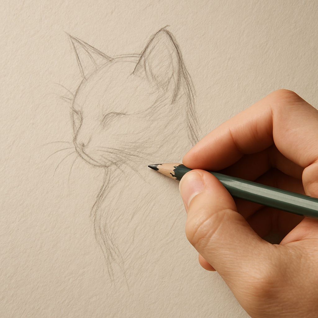
Step 3: Build Texture with Directional Strokes
Now that the light base is in place, it’s time to start giving that fur some real life‑like texture. If you’ve ever stared at a cat’s coat and felt the subtle swirls under your fingertips, you know the difference a good directional stroke makes. Let’s dive into the nitty‑gritty of how to draw fur with colored pencils so each hair feels like it belongs.
Why direction matters
Fur isn’t a flat blanket – it follows the animal’s anatomy, the wind, even the way the light hits it. When you push your pencil in the same direction as the hair growth, the eye reads a natural flow. Go against it and the fur looks stiff, like a row of soldiers.
Think about the way a dog’s back curves when it runs. The strokes on the shoulders should angle upward, then gradually slope down toward the tail. That tiny shift tells the brain the body is moving, not frozen.
Preparing your hand and paper
First, make sure your grip is relaxed. Hold the pencil like you’d hold a pen, but keep a slight wrist hinge so you can pivot easily. A loose grip lets you change angle without breaking the rhythm.
Next, give the paper a quick tilt. Rotate the sheet so the direction you’re about to push becomes “downhill” on the surface. This simple trick forces you to use a pushing motion instead of a pulling one, which, as Kathie Miller points out, creates the most random‑looking hairs in her colored‑pencil fur tutorial.
The push‑stroke technique
1. Position the pencil tip at a 45‑degree angle to the paper.
2. Lightly press and push the lead forward, following the hair’s growth direction. Imagine you’re shaving a tiny patch of fur – the motion should feel like a gentle nudge, not a scrape.
3. Lift the pencil after a short line (about the length of a hair you’d see in the reference). Immediately start the next line slightly overlapping the previous one.
4. Vary the length: short flicks for fine under‑coat, longer strokes for the longer guard hairs on the neck or tail.
If you find your hand getting tired, pause, roll the paper a few degrees and continue. This keeps the strokes fresh and prevents accidental “drag” marks.
Mixing directions for realism
Real fur rarely runs perfectly straight for more than a few millimetres. To mimic that, intersperse occasional “breaks” where a few hairs veer off the main line. One trick is to twist your thumb and fingers as you draw – the natural wobble creates the random texture Kathie mentions.
Here’s a quick real‑world example: a student in Pune was drawing a Himalayan cat. She started with the base, then used push‑strokes that followed the neck’s gentle curve. When she reached the chest, she added a few backward‑angled hairs to suggest the cat was turning its head. The result looked like a living animal rather than a static silhouette.
Common pitfalls and fixes
Over‑pressuring the pencil flattens the paper’s tooth, erasing that lovely grain that gives fur its bite. If a patch looks too smooth, gently lift the area with a clean kneaded eraser and re‑apply a lighter push‑stroke.
Too many strokes in one spot create a “muddy” look. Step back every 15‑20 seconds, scan the area, and thin out where the colour feels heavy.
Forgetting to let the paper colour show through can make the fur look plastic. Remember, the paper is part of the colour palette – especially if you started on a mid‑tone coloured paper.
Quick checklist
- Grip the pencil loosely; keep wrist hinge.
- Tilt the paper so strokes become pushes, not pulls.
- Use 45‑degree angle, vary length, overlap slightly.
- Introduce occasional off‑direction hairs for randomness.
- Step back frequently; erase excess with a kneaded eraser.
- Let the underlying paper colour peek through.
Give these steps a try on a small patch of fur first – maybe the tip of a rabbit’s ear. You’ll see the texture come alive in minutes, and the rest of the animal will follow suit. When you feel confident, expand outward, always listening to the subtle cues of the reference photo.
And if you ever need a visual reminder, this short video walks through the push‑stroke method in real time on YouTube.
Step 4: Add Depth and Highlights
Now the fur is starting to look like a soft blanket, but it still needs that three‑dimensional punch. This is where we add the shadows that give weight and the tiny highlights that make the coat feel alive. If you’ve ever wondered why some sketches look flat even after weeks of layering, the missing piece is usually a thoughtful balance between depth and sparkle.
Why depth matters more than you think
Imagine a cat basking in late‑afternoon sun. The belly is a warm cream, the back a deeper brown, and the whiskers catch a glint of light. Those colour shifts aren’t random – they’re the animal’s own topography. When you replicate that with coloured pencils, you’re basically mapping a tiny landscape on paper.
In our experience, artists who rush to the final highlight often end up with a “cheesy” look. The secret is to build the shadow first, then let the highlights sit on the highest points.
Step‑by‑step: Adding depth
1. Identify the core shadow zones. Use your reference photo and mark the areas where the fur disappears into shadow – usually under the chin, inside folds, or where the body curves away from the light source.
2. Choose a soft‑core pencil. Soft leads (Prismacolor Premier, Faber‑Castell Polychromos) lay down pigment generously, which is perfect for deepening values without over‑pressuring the paper.
3. Apply push‑strokes in the same direction you used for the base colour. Keep the pressure light to medium; you want a rich tone but still see the underlying paper texture. Work in 2‑3 thin layers, stepping back after each pass to judge the overall balance.
4. Blend subtly. A colourless blender or a clean cotton swab can smooth the transition between the new shadow and the mid‑tone layer. Resist the urge to blend everything into a uniform grey – preserve the individual hair strokes.
5. Check the value scale. Hold your sketch up to a window or a bright lamp. The darkest shadow should be about three to four values darker than the lightest highlight. If it feels flat, add another thin pass of soft‑core pigment.
Real‑world example: a Delhi street‑dog
A student from Delhi tried drawing a scruffy mutt lounging on a dusty road. She first laid a warm tan base, then added a soft‑core chocolate shadow along the neck and under the belly. By layering the shadow in short, overlapping push‑strokes, the dog’s fur gained a sense of volume that made the sketch pop off the page.
She also noticed that the shadow needed a tiny bit of cool gray mixed in to mimic the ambient shade from a nearby wall. That tiny tweak turned a flat brown into a believable, three‑dimensional coat.
Step‑by‑step: Adding highlights
1. Locate the highest points. Light‑catching hairs are usually on the top of the head, the tip of the tail, and the outer curve of the back where the sun hits directly.
2. Switch to a hard‑core pencil or a sharpened white/cream lead. Hard leads give you that razor‑thin hair‑line you need for a convincing glint.
3. Use a flicking motion. Lightly tap the tip of the pencil onto the paper, then pull it away in a tiny, controlled flick. The result is a delicate sparkle that looks like a real hair catching light.
4. Don’t over‑do it. A few well‑placed highlights are far more effective than a blanket of white. Think of them as punctuation marks – they guide the eye.
5. Final check. Step back, then glance at the sketch from a distance. The highlights should appear only where the reference shows a bright spot. If you see too many, gently lift the excess with a clean kneaded eraser.
Pro tip: Layer‑by‑layer checklist
- Shadow depth – soft‑core, 2‑3 light passes.
- Mid‑tone transition – medium‑core, follow the base direction.
- Highlights – hard‑core or white, flick‑stroke only on peaks.
- Blend – colourless blender or cotton swab, preserve hair texture.
- Step back every 5‑10 minutes to assess value contrast.
Need a quick visual reference? This short walkthrough shows exactly how a professional adds depth before the final highlights on YouTube. Watching the process can help you internalise the rhythm of building shadow before sparkle.
Quick comparison table
| Layer | Pencil hardness | What it adds |
|---|---|---|
| Shadow depth | Soft‑core (e.g., Prismacolor Premier) | Rich dark values, builds volume |
| Mid‑tone transition | Medium‑core (e.g., Polychromos 2B) | Smooth gradient between light and dark |
| Highlights | Hard‑core (e.g., Derwent Coloursoft 9B, sharpened thin) | Fine hair‑line gleams, keep paper tooth visible |
When you follow these steps, the fur in your drawing will shift from a flat texture to a living coat that seems to move with the wind. Remember, the magic lies in the patience of layering and the precision of tiny highlights. Keep your hand relaxed, your eye observant, and the paper will reward you with a realistic, touch‑able fur surface.
Step 5: Final Touches and Blending
Now the fur on your sketch already feels soft, but if you stare at it long enough you’ll notice a few spots that still look a bit flat. That’s where the final touches come in – subtle tweaks that pull the whole piece together like a finished tapestry.
Why the finishing stage matters
Think about the last time you ran your hand over a real cat’s coat. You feel the difference between the sun‑kissed belly and the shaded side of the neck. In a drawing, those tiny value shifts are what convince the eye that the fur is three‑dimensional. Without them, even the most carefully layered work can end up looking like a flat illustration.
In our experience at Drawing Pencils Guru, artists who skip this step often report having to redo the whole piece later. A few minutes of careful blending now saves hours of re‑work later.
Step‑by‑step final blending routine
1. Assess the value map. Hold your sketch up to a bright window or a lamp. Identify the darkest shadows (usually three to four values darker than the lightest highlight). Mark those zones with a light pencil trace – you don’t have to draw anything, just note the areas.
2. Choose the right blender. A colourless blender works great for soft‑core shadows, while a clean cotton swab is perfect for preserving the texture of individual hair strokes. If you’re using a cotton swab, give it a gentle twist before you start – it helps control the amount of pigment you lift.
3. Light, circular motions. Place the tip of the blender on the darkest spot and move in tiny circles, gradually expanding outward. The goal is to smooth the transition without erasing the directional strokes you spent so much time creating.
4. Preserve hair‑line detail. When you reach the edge of a highlight, pause the blending motion. Use a hard‑core pencil (like Derwent Coloursoft 9B) to re‑sharpen the hair‑line sparkle. A quick flick restores that crisp edge that makes the fur look alive.
5. Step back often. Every 5‑7 minutes, step away and look at the drawing from a distance. Your brain picks up value relationships better when you’re not glued to the page. If something feels too smooth, add a few extra push‑strokes with a soft‑core pencil to bring texture back.
Real‑world example: a Mumbai street cat
One of our students in Mumbai was working on a ginger cat sitting on a balcony. After the initial layers, the cat’s side‑profile looked a bit muddy. She lifted the darkest shadows with a colourless blender, then re‑added a few soft‑core strokes on the whisker area. The result? The fur suddenly had a “glow‑around‑the‑edges” feel that made the cat look like it could leap off the paper.
Quick checklist for the final pass
- Identify shadow zones – 3‑4 values darker than the highlight.
- Use colourless blender for soft transitions, cotton swab for texture preservation.
- Blend in small circles, not sweeping strokes.
- Re‑sharpen highlights with a hard‑core pencil after each blending pass.
- Step back every 5‑7 minutes to judge value contrast.
- Finish with a light “hair‑catch” flick on the highest points.
Does it feel a bit overwhelming? Don’t worry – you can break the routine into two short sessions. First, blend all the shadows; then, after a short break, go back and reinforce the highlights. Your hand stays fresh, and the paper stays crisp.
Expert tip: the “paper‑peek” method
Because coloured pencils are essentially pigment on a paper base, the underlying paper colour can act as a natural highlight. After you’ve blended, use a clean kneaded eraser to gently lift pigment from the very tip of a few hairs. You’ll see the paper’s tooth pop through, adding an almost‑imperceptible sparkle that even digital artists struggle to replicate.
If you want a visual cue for this technique, check out this quick walkthrough on YouTube. The video demonstrates how a few light lifts can turn a dull patch into a gleaming strand.
Bringing it all together
When the final touches are done, you should feel a subtle shift in the drawing – like the fur just breathed a little. The shadows now sit comfortably beneath the highlights, and the texture remains visible thanks to those careful, directional strokes.
Take a moment to compare the before‑and‑after. Does the coat now have that “soft‑but‑defined” look you were after? If you’re still missing a bit of depth, repeat step 3 with a lighter hand – a little more blending never hurts.
And that’s it – the finishing stage is really just a series of tiny, intentional actions. With practice, you’ll start to do them instinctively, and every fur drawing will feel a touch more lifelike.
Conclusion
We’ve walked through every stage of how to draw fur with colored pencils, from a clean outline to the final sparkle that makes the coat breathe.
So, what does it all come down to? In short, it’s about patience, direction, and respecting the paper’s tooth. When you let each push‑stroke follow the hair’s natural flow, the fur starts to look less like a drawing and more like a living texture.
Remember the little tricks we mentioned: use a kneaded eraser to lift just enough pigment for that subtle highlight, and step back every few minutes to see the value balance. Those tiny habits separate a decent sketch from a piece that feels almost touchable.
For anyone in India juggling art school deadlines or a home‑based hobby, the same principles apply – you don’t need expensive supplies, just the right approach and a bit of focused practice.
What’s the next step? Grab your favourite soft‑core pencil, set a timer for a quick 20‑minute “fur burst,” and let the layer‑by‑layer process unfold. You’ll be amazed at how quickly the paper transforms.
Keep experimenting, stay curious, and trust that each stroke brings you closer to mastering realistic fur. Happy drawing! And if you ever feel stuck, revisit these steps – the answer is usually a softer hand and a fresh look at the light.
FAQ
How do I start drawing fur with colored pencils if I’ve never sketched an animal before?
First, pick a simple reference – maybe a cat curled up on a windowsill. Sketch the silhouette with a hard 2H pencil, just enough to capture the shape and the direction the hair grows. Keep the lines light so you can erase without staining the paper. Once the outline feels right, lay a thin, pale base colour (a creamy yellow or soft tan) using a soft‑core pencil, following the hair direction. This gives the paper tooth something to cling to and makes the later layers blend more naturally. From there, build up mid‑tones and shadows in short, overlapping strokes. The key is to work in sections and step back often; you’ll see where the fur needs more depth.
What grade of colored pencil is best for the first layer of fur?
For the base layer most artists recommend a soft‑core lead like Prismacolor Premier or Faber‑Castell Polychromos in a light hue. Soft leads lay down pigment with very little pressure, letting the paper’s texture show through. That “tooth” is what gives fur its airy feel. If you’re on a budget, a 2B coloured pencil works fine – just test it on a scrap piece first to make sure it isn’t too dark. Remember, the first layer should be almost translucent; you’ll be adding richer colours on top, not trying to cover the paper completely.
How can I make the fur look three‑dimensional without over‑blending?
Think of each hair as a tiny line that carries its own value. Instead of smudging everything together, apply push‑strokes in the direction of the hair growth, varying the pressure for light, mid and dark tones. When you reach a shadow zone, add a soft‑core brown or gray in two or three thin passes, then use a colourless blender or a clean cotton swab to smooth the transition just enough to keep the individual strokes visible. After blending, go back with a hard‑core pencil or a sharpened white tip to place the brightest highlights on the highest points. This contrast‑plus‑texture trick creates depth without turning the fur into a flat grey blob.
My paper is getting too smudged – how do I keep it clean?
Paper fatigue is a common issue, especially on cheaper sketch pads. Try a heavier textured paper like a 100‑gsm watercolor block; it holds the pigment better. When you feel the surface starting to look muddy, lift a little colour with a kneaded eraser – press gently and roll the eraser to pull up pigment without tearing the paper. Another tip is to work in short sessions: lay down a few strokes, step back, then give the paper a quick wipe with a clean cloth before continuing. This habit keeps the tooth alive and prevents that greasy look.
Do I need special tools for drawing fur on coloured paper?
Not necessarily, but coloured paper can give you a built‑in mid‑tone that saves a step. If you start on a warm tan paper, use a light cream for the highlights and a deeper brown for shadows; the paper itself acts as a subtle base. Just be mindful of contrast – a very dark paper will swallow light strokes, so you may need a white or pastel pencil for the brightest highlights. In our experience teaching students across Delhi and Mumbai, a simple switch to a mid‑tone paper cuts the layering time in half while still delivering that realistic texture.
How often should I step back and assess my fur drawing?
Every 5‑10 minutes is a good rule of thumb. When you’re close to the paper, it’s easy to miss where the value scale is off or where strokes are too dense. Take a quick step back, or even glance at the sketch from across the room. Your brain picks up the overall light‑to‑dark relationship better from a distance. If something looks flat, add another thin push‑stroke in a darker pencil. If it feels too heavy, lift a bit with a kneaded eraser. This habit turns a good drawing into a great one.
