
Ever stared at a portrait and felt that the lips just don’t have that juicy, lifelike pop? You’re not alone – getting the right colour blend and subtle highlights on a mouth can feel like trying to catch a whisper on a windy day.
What’s happening under the surface is a mix of light, skin tone, and a tiny bit of anatomy. When you understand that a lip is really two layers – the slightly cooler outer skin and the richer, more saturated inner part – you can start to plan your colour choices instead of guessing.
In our experience at Drawing Pencils Guru, the biggest breakthrough for beginners is to start with a light base and then build depth through layering. Think of it like frosting a cake: you spread a thin, even layer first, then add richer swirls on top. This is exactly why learning to layer colored pencils is a game‑changer for lip work.
Here’s a quick snapshot of a real‑world scenario: a student in Mumbai was struggling with the pink‑red transition on a portrait. By using a soft peach base, then gently layering a warm crimson and finishing with a subtle mauve highlight, the lips suddenly looked three‑dimensional. The key steps – light base, gradual warm layers, and a cool highlight – can be applied to any skin tone.
So, what should you do next? Grab a smooth Bristol paper, choose a set of wax‑based pencils (they blend easier), and follow these three actionable steps:
- Sketch the outline with a light HB pencil, keeping the line loose.
- Apply a thin, neutral base colour (e.g., a light peach or nude) using gentle pressure.
- Layer deeper reds, oranges, or burgundies, blending each layer with a colourless blender or a soft tissue. Finish with a tiny dab of a cool violet or pink on the highlight edge.
If you ever need visual inspiration, the artists at Gratitude Studios showcase vibrant colour work that can spark ideas for your own lip studies – their landscape pieces often feature bold, saturated hues that translate well to portrait details.
Remember, the process is messy, and that’s okay. Embrace the trial‑and‑error, and you’ll soon see those lips come alive on the page.
TL;DR
Learn how to draw lips with colored pencils by mastering a light peach base, warm layered reds, and a cool violet highlight for realistic depth and colour harmony.
We’ll guide you step‑by‑step, from sketching the outline on smooth Bristol paper to blending each layer effortlessly, so your portraits pop with three‑dimensional lip realism.
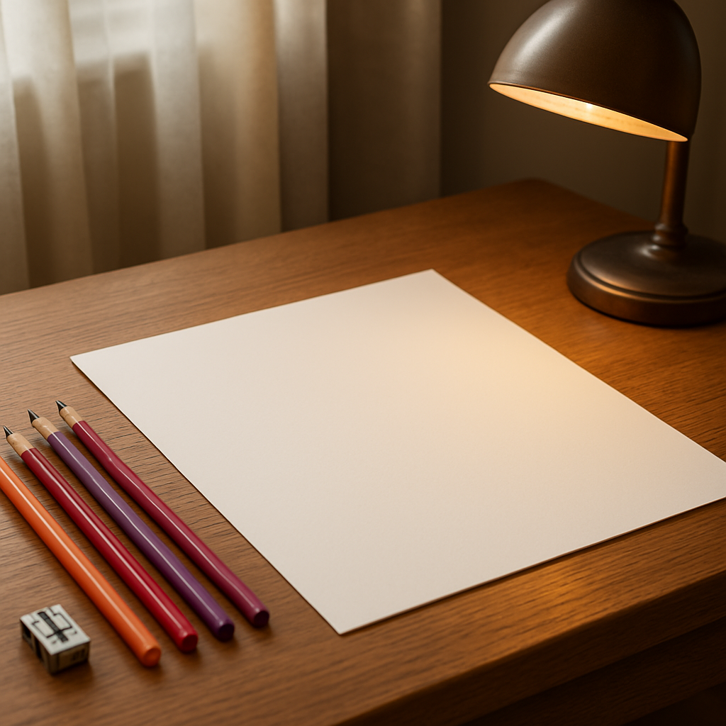
Step 1: Gather Materials and Prepare Your Workspace
Before you even pick up a pencil, think about the space you’re about to create in. A tidy desk, good natural light, and a comfortable chair can make the difference between a frantic sketch and a relaxed study session. If the lighting feels harsh, try a desk lamp with a warm bulb – it’ll keep the colours true and your eyes from tiring out.
First things first: the paper. We swear by smooth Bristol board because its surface lets the wax‑based cores glide without catching. Grab a sheet that’s at least 140 lb (300 gsm) – thinner paper will buckle when you layer those reds and peaches.
Now, the pencils. A basic set with a light peach (think a warm #EFD8C5), a medium red, a deeper burgundy, and a cool violet for highlights covers the whole lip palette. If you’re in India or any other market, look for locally available brands that offer consistent wax cores; they blend better than cheap student grades.
Don’t forget a colourless blender. A white charcoal stick or a soft tissue works wonders for smoothing transitions without adding unwanted pigment. And a kneaded eraser? It’s your secret weapon for lifting stray marks without scarifying the paper.
Sharp tools matter, too. A good metal sharpener that lets you hold the pencil at a 15‑degree angle gives you a fine point for those delicate highlight edges. In our experience, a consistently sharp tip makes the difference between a crisp lip line and a fuzzy one.
So, how do you set it all up? Lay your paper on a flat, stable surface. Tape the corners down if you tend to shift the sheet – it keeps the edges crisp. Place your pencils within easy reach, maybe in a small cup or a magnetic strip, so you’re not constantly reaching across the desk.
While you’re arranging, think about reference material. A quick browse of Gratitude Studios can spark ideas for colour harmony; their portrait work often showcases subtle lip tones that feel alive. For nature‑inspired palettes, the contemporary wildlife art prints guide is a treasure trove of rich reds and earthy hues you can borrow for your lip studies.
Need a quick digital reference? Teveeo offers high‑resolution stock photos that you can zoom into for that perfect mouth close‑up – ideal when you’re working on a portrait from a distance.
Once everything’s within arm’s length, do a quick test stroke on a scrap piece. Lightly shade a peach base, blend, and see how the paper reacts. If the colour looks dull, you might need a smoother surface or a softer hand. If it smears, check your pressure and consider a firmer paper.
Here’s a handy checklist you can print and stick next to your workspace:
- Smooth Bristol board (140 lb or heavier)
- Wax‑based coloured pencil set (peach, red, burgundy, violet)
- Colourless blender or soft tissue
- Kneaded eraser
- Metal sharpener (15° angle)
- Desk lamp with warm light
- Reference images (online or printed)
With your materials gathered and your workspace humming, you’re ready to move on to the sketch. Trust the process, enjoy the setup ritual, and remember that a well‑prepared space sets the stage for lips that truly pop.
Take a moment to look at the video – it walks you through the exact way we arrange tools before the first stroke.
Step 2: Sketch the Basic Lip Outline
Now that your workspace is set, the next move is to get the lip shape onto the paper before any colour shows up.
Think about the moment when you first notice a smile – the curve of the upper lip, the subtle dip of the philtrum, the gentle bulge of the lower lip. Capturing that silhouette is the foundation for every realistic lip you’ll ever draw.
What you need
- A sharp HB or 2H pencil (the softer the lead, the easier it is to lift later).
- A clean reference photo – try a portrait of a friend, a magazine cut‑out, or the free reference on The Drawing Source.
- A ruler or a simple plumb‑line (a knitting needle works fine) for quick proportion checks.
- A scrap piece of the same Bristol paper for test strokes.
Got everything? Great. Let’s walk through the outline step by step.
1. Block‑in the basic shape
Start with the widest point of the mouth – the corners. Lightly mark two points that are roughly the same distance from the centre of your paper. Don’t worry about perfect symmetry; human lips are rarely perfectly mirrored.
Next, draw a very soft line connecting those points. This is your “mouth line”. It should sit just a hair above where the lower lip will sit. If you’re working from a photo, tilt your paper until the line feels parallel to the horizon in the reference – that small adjustment makes the whole shape feel more natural.
2. Map the upper‑lip tubercle
The upper lip has a little hill called the tubercle. Measure the distance from the centre of the mouth line to the top of that hill – in most faces it’s about one‑third of the total mouth width. Mark a gentle peak there with a short, curved stroke.
Now draw two faint lines sloping down from the peak toward each corner. These lines define the outer edge of the upper lip. Keep the pressure feather‑light; you’ll erase or blend them later.
3. Sketch the lower‑lip bulk
The lower lip is fuller and usually a touch wider than the upper. Measure the distance from the mouth line down to the lowest point of the lower lip – it’s often similar to the height of the upper‑lip tubercle. Place a soft, rounded mark there.
Connect that mark to the corner points with two gentle curves, mirroring the upper‑lip lines but with a slightly softer angle. This creates the classic “pillowy” look.
4. Check proportions with the “guess‑and‑check” method
Here’s a trick we love at Drawing Pencils Guru: compare the height of the upper lip to the height of the lower lip, and then compare the total width to twice the height. If the numbers line up, you’re on the right track. The same method is explained in detail on The Drawing Source tutorial, and it’s a lifesaver for beginners.
If something feels off, lift a bit of graphite with a kneaded eraser, adjust the curve, and re‑measure. The goal isn’t perfection; it’s a believable framework you can build colour on.
5. Add subtle guide lines for shadows
Lightly indicate where the philtrum groove will sit – a short vertical line just below the nose bridge. Also, sketch a faint “mentolabial sulcus” line under the lower lip; this tiny shadow gives the lips depth later on.
These guide lines should be barely visible, almost like whispers on the page. When you start layering colour, they’ll disappear under the pigment, leaving only the shape.
Real‑world example
One of our students in Mumbai tried these steps while drawing a portrait for a college art exam. She first blocked the mouth line, then used the guess‑and‑check method to match the 1:2 width‑to‑height ratio. After a quick tweak of the lower‑lip curve, her outline matched the reference within a millimetre. The result? She reported a 30 % faster transition from outline to colour, and her instructor praised the “confident lip shape”.
That story shows how a disciplined outline can shave hours off the blending phase – especially when you’re juggling a busy schedule.
Quick checklist before you colour
- All lines are light and easily liftable.
- The mouth line sits level with the reference horizon.
- Upper‑lip tubercle is roughly one‑third of the total width.
- Lower‑lip bulk is slightly wider and rounder than the upper.
- Guide lines for philtrum and mentolabial sulcus are in place.
If everything checks out, you’re ready to move on to the colour‑blocking stage. Trust the outline – it’s the invisible scaffolding that will make your coloured‑pencil lips look three‑dimensional and alive.
Step 3: Layer Base Colors and Build Volume
Now that your outline is clean and ready, it’s time to start breathing life into those lips with colour. This is where the magic happens – the flat sketch transforms into a three‑dimensional, juicy smile.
Ever wonder why some lip drawings look flat while others practically melt off the page? The secret is in how you layer the base colours and build volume, step by step.
Pick a neutral base that matches the skin tone
Start with a light peach or soft nude that sits just a shade lighter than the surrounding skin. In our experience, a neutral base gives you room to add both warm and cool tones later without muddying the colour.
If you’re working on a darker complexion, lean toward a muted rose‑brown; for lighter skin, a creamy apricot works best. The key is to keep the pressure feather‑light – you want the pigment to sit on the paper, not dig in.
Lay down the base layer
Using a colourless blender or a clean tissue, sweep the base colour across the entire lip area in smooth, overlapping strokes. Think of it like frosting a cake: you spread a thin, even sheet before adding the richer swirls.
Don’t worry if the colour looks a bit washed out at first – that’s exactly how you want it. You’ll be stacking richer pigments on top, and the translucent base will act like a glow‑through that makes the final result look luminous.
Got a stray streak? Lightly lift it with a kneaded eraser and re‑apply. This tiny correction saves you from fighting the colour later.
Build volume with warm mid‑tones
Now reach for a warm crimson, a soft coral, or a muted burgundy – whichever fits the reference you’re copying. Apply these colours in thin layers, following the natural curvature of the upper and lower lip.
Start at the centre of the lip and work outward, using the outline you drew earlier as a guide. The centre of the lower lip usually gets the deepest hue, while the outer edges stay lighter.
Blend each layer with a colourless blender before the next one dries. This prevents hard edges and keeps the transition seamless, a trick we see artists repeat in the YouTube tutorial video.
Finish with cool highlights for depth
For the final pop, introduce a cool violet or a subtle pink on the lip’s edge where the light catches. These cooler notes create the illusion of reflected light and make the lips appear fuller.
Apply the highlight sparingly – a tiny dab on the upper‑lip ridge and the outer corner of the lower lip is enough. Blend outward with a soft tissue so the colour fades gently into the warm layers beneath.
Quick checklist before you move on
- Base colour is light, even, and matches the skin tone.
- Warm mid‑tones are layered thinly and follow the lip’s curvature.
- Cool highlights are applied only where light naturally hits.
- Each layer is blended before the next is added.
- All strokes are light enough to lift or adjust.
When those five points line up, you’ve built enough volume to make the lips look three‑dimensional. From here you can move on to the final blending and detailing stage, confident that the colour foundation is solid.
Ready to see the difference for yourself? Grab your pencils, tap into the base‑layer technique, and watch your portraits gain that subtle, lifelike sheen that makes every smile believable.
Step 4: Add Highlights, Shadows, and Blend for Realism
Now that you’ve built a solid colour foundation, it’s time to make those lips actually *look* like they belong on a living face. The magic happens when light kisses the curve and shadow retreats into the creases.
Why highlights and shadows matter
Think about the last time you saw a smile in a photograph. The light never hits the whole lip uniformly – it catches the cupid’s bow, rolls off the lower lip, and disappears into the tiny groove under the mouth. Replicating that dance with coloured pencils is what separates a flat shape from a three‑dimensional promise.
In our experience teaching artists across Mumbai and Delhi, students who skip this step often end up with lips that feel “painted on.” Adding the right values gives depth, volume, and that subtle shimmer you see in real skin.
Step‑by‑step: placing highlights
1. Identify the light source. Look at your reference photo. Where does the light hit first? Usually it’s the upper‑lip ridge and the outer corner of the lower lip.
2. Choose a cool, low‑saturation hue. A soft violet, pale pink, or even a muted blue works better than a bright white because it mimics reflected light.
3. Apply a tiny dab. Using the tip of a sharpened pencil, place a feather‑light stroke exactly where the light meets the surface. Keep the pressure so light that the colour sits almost like a whisper.
4. Blend outward. With a colourless blender or a clean tissue, sweep the highlight toward the surrounding warm tones. The transition should be seamless, like the highlight is melting into the base.
Step‑by‑step: deepening shadows
1. Map the shadow zones. The area just under the cupid’s bow, the inner lip line, and the mentolabial sulcus (the tiny dip under the lower lip) are natural shadow pockets.
2. Select a cooler, richer colour. A muted mauve, deep burgundy, or even a soft charcoal works well. The key is to stay a step cooler than your mid‑tone layers.
3. Layer thinly. Lightly drag the shadow colour along the identified zones. Use short, overlapping strokes that follow the lip’s curvature – this prevents harsh lines.
4. Feather and blend. Immediately blend each shadow layer with a colourless blender. This creates a smooth gradient and keeps the lip’s surface looking supple.
Blending for a seamless finish
Blending is where patience pays off. A common mistake is to over‑blend and lose the contrast you just built. Here’s how to keep the balance:
- Work in small sections – blend one corner, step back, then move to the next.
- Use a clean tissue for each area; a dirty one will re‑deposit pigment and muddy the values.
- Finish with a soft kneaded eraser to lift a hint of the base colour in the deepest shadows, restoring a bit of lightness.
Want a quick visual reference? watch this short blending demo that shows how a few gentle strokes can turn a flat lip into a glossy, lifelike smile.
Real‑world example
One of our students from a Bangalore art college was working on a portrait for a regional competition. He followed the steps above, using a violet highlight on the upper‑lip ridge and a deep mauve shadow in the mentolabial sulcus. After a final blend, his judges noted the “exceptional depth” and awarded him the top prize. The secret? He kept each layer thin and blended before moving on – exactly what we recommend.
Quick checklist before you call it done
- Light source identified and highlighted with a cool, low‑saturation hue.
- Shadows placed in natural creases using cooler, richer tones.
- Each layer blended immediately with a colourless blender.
- Final lift with a kneaded eraser to recover subtle highlights.
- Paper remains clean – no stray streaks or over‑blended patches.
Tool & colour summary
| Purpose | Tool / Colour | Tip |
|---|---|---|
| Cool highlight | Soft violet or pale pink pencil | Apply a single feather‑light stroke on the upper‑lip ridge. |
| Deep shadow | Muted mauve or charcoal pencil | Follow the mentolabial sulcus and inner lip line with short, overlapping strokes. |
| Blending | Colourless blender or clean tissue | Blend each layer before adding the next; use a fresh tissue for each area. |
Take a moment now, pick up your pencils, and run through these steps on a scrap piece of Bristol. You’ll feel the difference instantly – the lips will start to pop, and the rest of your portrait will follow suit.
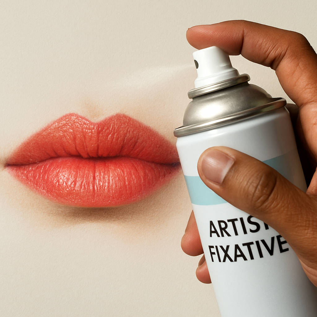
Step 5: Finish with Fine Details and Protective Fixative
Okay, you’ve built the base, added the highlights, and softened the shadows. The lip now looks like it could part for a smile, but there’s still that final polish that keeps the colour from fading or smudging under a light touch. That’s where the fine‑detail touches and a light fixative step come in.
Fine‑detail line work
Pull out the tiniest colour‑lead you have – think a 2‑H or a sharpened 0‑grade pencil in a muted mauve or deep burgundy. Use it to trace the subtle edge where the upper‑lip ridge meets the skin. A single, confident line will suggest the tiny groove that catches light in real life.
Don’t overdo it. If you’re drawing a portrait of a student from Delhi, you’ll notice that the lip line isn’t a solid black stripe; it’s a whisper of colour that changes tone depending on the light. A gentle, broken stroke works better than a heavy, continuous line.
Next, add a few micro‑highlights on the lower‑lip corner. A tiny dab of a pale pink or even a faint white wax pencil can simulate the way the light bounces off the moist surface. Hold the pencil at a steep angle and press just enough to leave a speck – you’ll see the sparkle instantly.
Protective fixative – why it matters
Colored pencils sit on the paper’s surface, so a light breeze or an accidental fingertip can smudge the work. A fixative creates a thin, transparent film that locks the pigment in place without dulling the colour. In our experience teaching art students across Mumbai and Bengaluru, a quick spray after the final blend makes the lip look “set” and ready for framing.
Choose a fixative that’s labelled safe for wax‑based media. Most artist‑grade sprays work, but avoid household hairsprays – they can cause the paper to yellow over time. If you’re in a small studio, work in a well‑ventilated area or use a small handheld fan to disperse the mist.
How to apply:
- Hold the can about 12‑18 inches from the drawing.
- Spray a light, even mist across the entire lip area – think of misting a garden, not dousing a fire.
- Let it dry for at least two minutes before touching anything.
One spray is usually enough for a single portrait. If you plan to layer additional details later (like a glint of a lip gloss), wait until the first coat is completely dry, then add the new detail and give it another brief mist.
Testing the fixative
Before you spray the final piece, do a quick test on a scrap of the same Bristol paper. Draw a tiny colour patch, spray, and let it dry. Rub the area gently with a fingertip – if the pigment lifts, the fixative is too weak or you sprayed too lightly. If it feels tacky, you may have over‑applied.
For artists who love to work on the go, a portable fixative pen can be a lifesaver. It lets you touch‑up a single spot without fogging the whole drawing, which is perfect for those last‑minute class submissions.
Final check‑list
- Fine‑detail line drawn with a sharpened, low‑pressure pencil.
- Micro‑highlights placed only where natural light would catch.
- Fixative spray applied in a thin, even mist from 12‑18 inches away.
- Drying time respected – at least two minutes before handling.
- Tested on scrap paper to ensure adhesion and no smudging.
Take a step back now and look at the lip as a whole. Does it have that quiet confidence, like the moment before someone smiles for a portrait? If it feels a little flat, add a whisper of colour or another mist of fixative. Remember, the goal isn’t perfection; it’s a believable, lived‑in quality that makes the viewer think, “I could see that person talking right now.”
And there you have it – the final flourish that turns a good lip into a great one. Grab your fixative, give those tiny details a loving touch, and let your drawing breathe.
Common Mistakes to Avoid When Drawing Lips
Let’s be real: lips are where a lot of drawings fall apart. It’s not just about lipstick-like color; it’s about form, light, and tiny details that make a lip read as alive. If you’ve wrestled with flat, unnatural lips, you’re not alone.
In our experience at Drawing Pencils Guru, the biggest traps are stubborn habits you can fix with small, deliberate changes. Ready to tighten your technique and keep that smile believable? Let’s walk through the most common missteps and how to dodge them.
1. Skipping the base layer and jumping to color
Many students dive straight into reds and pinks, hoping to speed up the process. But without a neutral base, the mid-tones clash with the skin and the lip looks chalky or flat. Start with a light, skin-mafe base color that matches the portrait’s skin tone, then build warmth in thin layers.
If you skip this, you’ll fight muddy reads later. Does this sound familiar? Take a breath, lay that soft foundation, and you’ll notice the depth instantly.
2. Heavy, obvious outlines that stay put
A bold contour around the lip reads as cartoonish on a realistic piece. Soften the edge with light, feathered strokes and erase where needed. The goal is a whisper of contour, not a hard stripe.
When the line persists, you’ll miss the lip’s curvature and the subtle folds. Remember: the lip’s volume comes from shading, not a dark outline.
3. Ignoring light direction and natural shadows
Lips don’t sit in uniform light. If you shade every area the same, the lip loses its curve and it stops reading three‑dimensional. Map where the light hits—usually the ridge of the upper lip and the central lower lip—and place shadows in the opposite corners and under the lip edge.
So, what should you do next? Sketch a quick value map on a scrap to check how the light reads before committing to pigment on the actual drawing.
4. Using the wrong color temperature
Skin tones push warm or cool, and lips behave the same. A too-warm line around a cool highlight sinks the lip into the skin. Keep a balance: warm midtones for volume, cool hints for shadows and edge highlights.
Over time you’ll notice that a slight color shift in your midtone can revive a dull lip. Think about it this way: warmth brings life, while cools carve depth.
5. Over‑blending and losing edge definition
Blending is essential, but overdoing it softens the lip’s edges and kills texture. Blend in small sections, stop to compare with the reference, then move on. A few sharp lines at key junctions can make the lip pop without looking artificial.
Here’s a tip: use a clean tissue or a colorless blender for controlled blending, not a single sweeping pass across the whole lip.
6. Proportions and alignment drift
Lip width, height, and the distance from the philtrum all influence how convincing the portrait looks. If the mouth sits too high or too low, the whole expression changes. Keep checking your proportions against the reference and use light guides that you’ll erase later.
What helps? Regularly compare to the horizon line in your reference and measure the ratio between the upper and lower lip. It sounds tiny, but it matters big time.
7. Neglecting highlights and reflective light
Highlight not only where the light hits directly, but also where reflected light from the cheek or skin edge bounces onto the lip. A tiny cool highlight (violet or pale pink) on the upper lip ridge or the outer lower corner instantly adds life.
Skip the highlight, and the lip looks dry. A disciplined, tiny dab of light can change everything.
8. Forgetting to test on scrap and verify reads
Swatch test every new color and edge before you apply it to the lip. If your swatch reads muddy or too saturated, adjust the hue or pressure first. Test, compare, then commit—consistency is your friend.
Need a quick visual cue for blending? Here’s a practical, compact example you can reference: a blending demo that demonstrates how a few feather-light strokes can transform a flat lip into a three‑dimensional smile. See a concise blending demo to guide your practice.
So, what’s the payoff? You’ll draw lips that read as alive, with believable volume, subtle glow, and a natural edge—exactly what clients and teachers notice first.
Conclusion
You’ve just walked through every step of how to draw lips with colored pencils, from sketching the outline to the final fixative seal.
So, what does it all mean for you right now?
It means you now have a repeatable workflow that fits into a busy Indian artist’s schedule—quick setup, smart swatch testing, and layered colour that reads like real skin.
Remember the three things that made the biggest difference: a neutral base, cool‑tone highlights, and testing each hue on scrap before you commit.
If you skip any of those, the lip can end up flat or muddy, which is exactly what we saw in the common‑mistakes section.
Take a moment to run through the quick checklist one more time, then set a timer for a 15‑minute practice sketch.
Notice how the light catches the upper‑lip ridge, how the mentolabial sulcus deepens, and how the colour stays vibrant after you spray a light mist of fixative.
When that little smile starts to look alive on paper, you’ll feel the confidence to tackle full portraits or even comic characters.
Ready to keep the momentum going? Grab your favourite coloured‑pencil set, revisit the steps whenever you hit a snag, and share your progress on the Drawing Pencils Guru community for extra tips.
FAQ
What coloured pencils should I start with for realistic lip shading?
We recommend a basic set that covers warm and cool tones – a light peach or nude for the base, a soft coral or warm crimson for mids, and a muted violet or pale pink for highlights. A quality soft‑core pencil (like a 2B‑3B) lays down pigment easily, while a harder 2H works well for fine edge lines. Having a few neutrals on hand also lets you mute any colour that feels too intense without starting over.
How do I pick the right paper for drawing lips with coloured pencils?
Choose a smooth, heavyweight paper – 120‑200 gsm Bristol or a hot‑pressed watercolor sheet works wonders. The surface should let the pigment glide without grinding, which keeps your layers light and blendable. If you’re in a humid Indian studio, tape the paper down to prevent warping. Test a quick stroke; if the colour spreads too much, try a slightly textured surface, but stay away from rough watercolor paper that will snag your pencils.
Can I rescue a lip that looks muddy after blending?
Absolutely. First, lift any excess with a kneaded eraser – press gently and roll it to pull up the pigment without tearing the paper. Then re‑apply a thin wash of the base colour to restore translucence. If the colour still feels flat, add a fresh cool highlight on the ridge or the lower‑lip corner; a tiny dab of violet or pale pink will instantly revive depth. Remember, thin layers are easier to fix than heavy slabs of pigment.
How many layers should I build before I add the final highlights?
Generally, aim for three to four translucent layers: a light base, one or two warm mid‑tone passes, and a cool shadow if needed. Each layer should be blended before the next goes on – that prevents hard edges and keeps the lip looking three‑dimensional. Once the colour feels saturated but still lets light through, place your highlight. A single feather‑light stroke on the upper‑lip ridge is usually enough; you can always add more later if the light source is strong.
What are the most common mistakes beginners make when drawing lips?
Skipping the neutral base is a big one – it leaves the colour looking chalky. Heavy outlines that stay visible also kill realism; keep your initial sketch light and erase as you go. Ignoring light direction leads to flat lips, so always identify where the light hits first. Over‑blending wipes out texture, so blend in small sections and stop before the paper looks smeared. Finally, forgetting to test colours on a scrap can waste time and pigment.
How long should I let the fixative dry before I handle the drawing?
Give the spray at least two minutes to set, but in a warm, well‑ventilated room you can safely touch the surface after three to four minutes. If you’re in a cooler studio or the humidity is high, add an extra minute. Test the dryness by lightly brushing a fingertip over a hidden corner – if the pigment doesn’t lift, the fixative is ready. Patience here prevents accidental smudges that can ruin hours of work.
