
Ever opened your sketchbook and stared at a blank page, wondering whether to reach for the charcoal pencil or the trusty graphite stick? That moment of indecision is something every artist in India—whether a college student, a hobbyist, or a professional illustrator—knows all too well.
The truth is, charcoal and graphite each have their own personality, and choosing the right one can change the mood of your drawing from gritty and dramatic to soft and precise.
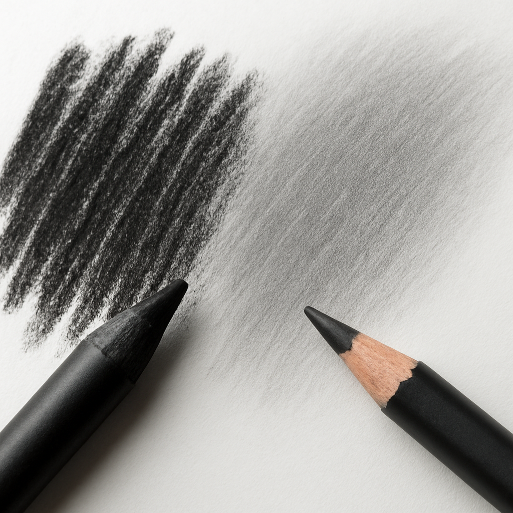
When you grip a charcoal pencil, you’re holding a bundle of compressed carbon that loves to lay down deep, velvety blacks with just a light touch. It’s perfect for expressive sketching, quick tonal studies, or any piece where you want the paper to breathe.
Graphite pencils, on the other hand, are made from finely milled graphite mixed with clay, giving you a range from hard H grades to soft B grades. The softer the lead, the richer the line, but you also get more smudging – a blessing for smooth gradients, a curse if you’re trying to keep edges razor‑sharp.
So, which one should you reach for first? If you’re sketching a bustling Mumbai street scene and need to capture the raw energy of traffic and crowds, charcoal’s bold strokes let you work fast and stay loose. If you’re rendering a delicate architectural study for an exam, graphite’s controllable pressure gives you the precision you need.
A practical tip we keep in our studio: start your drawing with a light graphite base to map out shapes, then switch to charcoal for the dark shadows and dramatic contrast. This combo lets you enjoy the best of both worlds without having to choose one over the other.
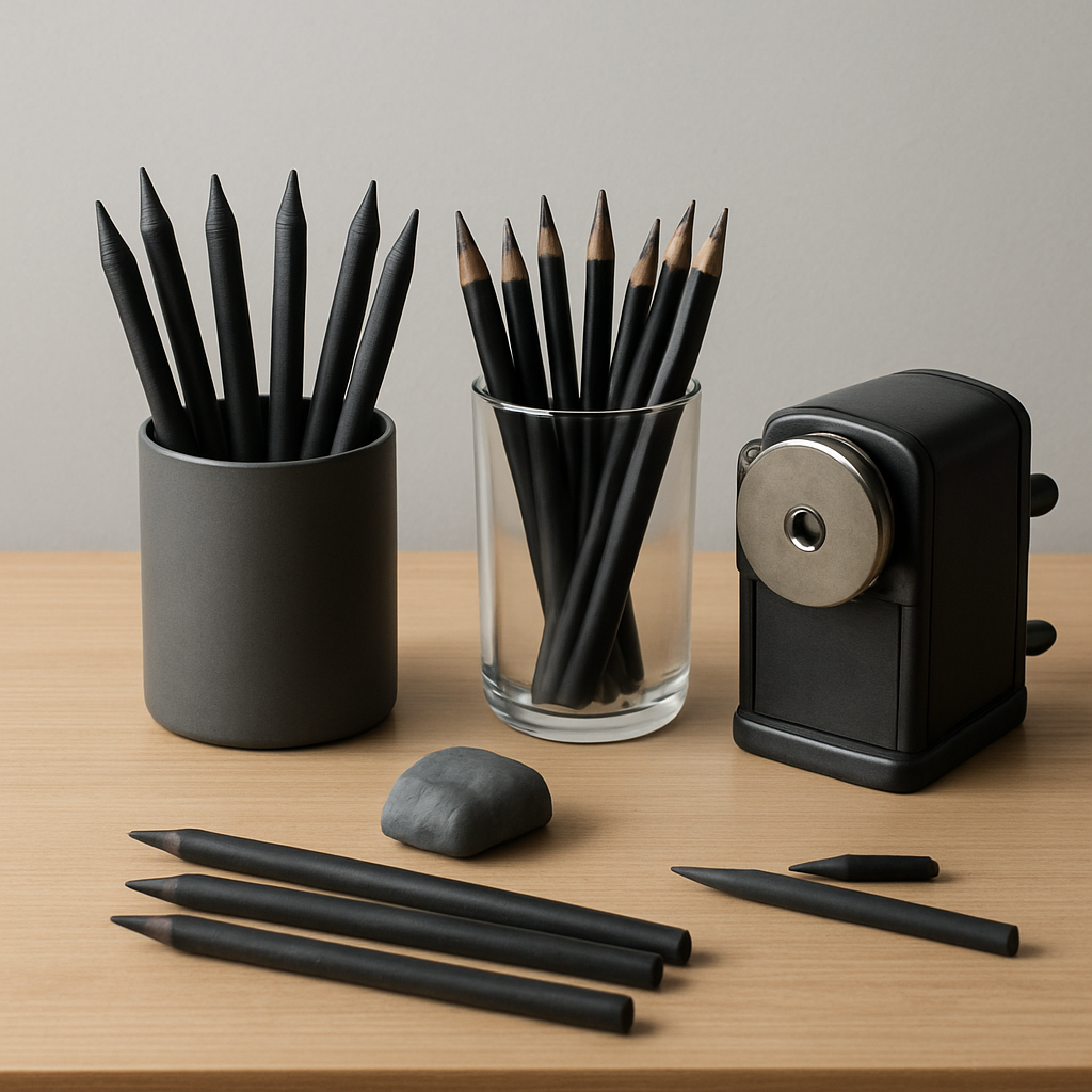
And don’t forget the tools that keep your leads happy – a good quality sharpener for charcoal, a softer kneaded eraser for graphite, and a smooth bristol paper that responds well to both. Mastering charcoal pencils vs graphite pencils is less about buying the “right” brand and more about understanding how each behaves in your hand.
TL;DR
Choosing between charcoal pencils vs graphite pencils changes how your art feels—charcoal delivers bold, dramatic darkness, while graphite offers precise, controllable lines for detailed work. We suggest starting with a light graphite sketch, then deepen shadows with charcoal, and keep a sharpener, kneaded eraser, and smooth Bristol paper handy for best results.
Understanding the Materials: Charcoal vs Graphite
There’s a small, honest moment every artist knows: you pick up a pencil and it already feels like a mood is forming. Charcoal and graphite aren’t just tools, they’re temperaments.
In this section we’ll look under the skin of each: what they’re made of, how they behave, and how that affects the marks you make.
What’s inside the stick?
Charcoal is basically carbon from burnt wood or vine, compressed into sticks or pencils. It’s porous and powdery, so it grabs paper and gives that velvety black you see in dramatic studies.
Graphite, by contrast, is a crystalline form of carbon mixed with a clay binder. That clay determines the hardness scale you’re used to — H for harder, B for softer.
How they behave on paper
Charcoal lays down quickly and richly. One light sweep can change the whole mood of a sketch. But that speed comes with mess: smudging, dust, and fewer razor-sharp edges.
Graphite offers control. You can press for a dark line or hold back for a faint hairline. It also has a shiny sheen in darker values, which can look unwanted under studio lights unless blended carefully.
Paper matters too. Toothier papers hold charcoal better; smooth papers make graphite sing. Don’t ignore paper choice — it’s the partner that decides how both materials look.
So, which one for what job?
Use charcoal when you want atmosphere, big values, and expressive texture — think life studies, moody portraits, and gestural street scenes. Use graphite for precision, academic drawings, and fine architectural detail.
What about blending and erasing?
Charcoal blends easily with fingers, stumps, or cloth, and a kneaded eraser will lift tones without harsh edges. Graphite blends too, but it can smear into a greasy look if you overwork it; a soft rubber eraser and light pressure usually work best.
And sharpening? Charcoal pencils need broader tips for rich strokes; graphite can be sharpened to a fine point for details. Keep a separate sharpener and guard against cross-contamination, because stray graphite dust on charcoal pieces throws the values off.
In our experience, pairing both is the sweet spot for many artists in India and beyond: start light with a harder graphite to map proportions, then bring in charcoal for shadows and atmosphere. It’s a simple workflow that saves time and keeps your drawing readable.
Want a quick checklist?
– For sketches: medium charcoal, kneaded eraser, textured paper.
– For studies needing detail: HB to 4B graphite, sharp point, smooth paper.
– For mixed work: map with H or HB graphite, finish with soft charcoal for depth.
If you plan to keep charcoal work long-term, consider a light spray of workable fixative applied from a distance, and always test on a scrap first. Small protective steps save heartbreak later.
Try this short practice: spend ten minutes mapping proportions with an H or HB graphite, then spend ten minutes building values with a soft charcoal. Record one note after the session about what felt easier and what got messy — that tiny habit speeds up learning more than you think.
So, what should you do next? Try that 20-minute study using both tools — a two-step process that teaches you where each material shines. You’ll notice the difference immediately.
Performance Comparison: Lightfastness, Smudge, and Blendability
When you’re choosing between charcoal pencils vs graphite pencils, the first thing that pops up in most artists’ minds is how the medium will hold up over time. Will the deep blacks fade in a sunny studio? Will the smudges ruin a crisp architectural line? And can you blend both without turning your paper into a muddy mess?
Let’s break it down. Lightfastness is basically the UV‑resistance of the pigment or carbon particles. Charcoal, being pure carbon, is inherently stable – it doesn’t chemically break down under light the way some dyed graphite does. In a review of Derwent Tinted Charcoal pencils, the author notes that the range uses the Blue Wool scale, with many colors rated 8 (the highest) and several at 7, which translates to LF1 on the ASTM standard. That means even a sun‑baked sketch in a Mumbai balcony will stay as dark as the night it was drawn for years.
Graphite, on the other hand, varies wildly by grade and brand. A hard H‑grade from a reputable manufacturer can sit at a 6 or 7 on the Blue Wool scale, but cheaper student‑grade graphite often lands in the 4‑5 range, meaning it will start to yellow or lose contrast after a few months of exposure. If you’re preparing work for an academic portfolio or an exhibition, it pays to check the pencil’s lightfast rating – a quick glance at our HB Pencil Meaning Explained: A Clear Guide for Writers and Artists can give you the grading basics you need to interpret those numbers.
Smudge Factor: When Is a Smudge a Feature?
Smudging is love‑hate for both media. Charcoal loves to glide across a toothy surface, creating soft gradients with almost no effort. That’s why it’s a go‑to for atmospheric skies or the gritty texture of a Mumbai street market. But the same property can become a nightmare when you need razor‑sharp edges. A simple tip: work on a slightly roughened watercolor block for charcoal – the texture catches the carbon particles and keeps them where you want them.
Graphite’s smudge‑resistance is tied to its clay content. A hard HB or H lead leaves a faint, almost powdery mark that you can lift with a kneaded eraser without tearing the paper. Softer B‑grades, especially 2B‑4B, will smudge more like charcoal, but they also give you the buttery blendability you need for subtle skin tones. The trick many Indian art students swear by is to layer a hard HB over a soft B to “lock in” the smudge‑prone areas while still retaining the deep darks.
Blendability: Tools and Techniques
Both charcoal and graphite respond well to blending tools, but the choice of tool changes the outcome. A blending stump (or tortillon) works like a soft brush for graphite – it pushes the plate‑like particles together, creating a smooth transition without adding extra material. Charcoal, being larger particles, can become compacted if you press too hard, leading to a gritty, uneven tone. The secret is to use a light circular motion and, if you need extra softness, dab a bit of a tissue or even a piece of cotton to lift some carbon before you blend further.
One real‑world example comes from a wildlife illustration class in Pune. The instructor asked students to render a tiger’s fur using only charcoal. The students who started with a light 2B graphite base, then added charcoal for the darkest stripes, reported the cleanest blend – the graphite provided a “grip” for the charcoal, preventing it from spreading too far. Conversely, a student who tried to blend charcoal directly with a stump ended up with a patchy, uneven surface that required a fixative mid‑process.
Actionable Checklist for Artists
- Check the Blue Wool lightfast rating of any pencil you buy. Aim for 7‑8 for archival work.
- Match paper texture to medium: rough watercolor block for charcoal; smooth bristol for hard graphite.
- Use a hard HB layer under soft B or charcoal to lock down smudge‑prone zones.
- Blend with a stump for graphite; use light circular motions and occasional cotton dabs for charcoal.
- Finish charcoal work with a matte fixative to lock in the carbon and improve lightfastness.
By keeping these nuances in mind, you can decide when charcoal pencils vs graphite pencils will give you the performance you need – whether that’s a dramatic, light‑fast black for a night‑scene or a precise, smudge‑controlled line for a technical drawing.
Side‑by‑Side Feature Table
Okay, let’s get real for a second. You’ve probably stared at two pencils side by side and thought, “Which one will actually make my sketch look the way I imagine?” The answer lives in the details – the little quirks that turn a decent line into a striking one.
Below is the table that sums up the biggest deal‑breakers when you’re weighing charcoal pencils vs graphite pencils. It’s not a fancy sales sheet; it’s the kind of cheat‑sheet we keep on our studio desk.
| Feature | Charcoal Pencils | Graphite Pencils |
|---|---|---|
| Lightfastness | Pure carbon, typically Blue Wool 7‑8 (archival black). Works great on sunny balconies in Mumbai. | Varies by grade; HB often 6‑7, cheap student grades can drop to 4‑5. Check the rating before you commit. |
| Smudge & Blendability | Very soft, loves to glide on toothy paper. Use a light circular motion or a cotton dab for smoother transitions. | Harder grades (H, HB) leave a powdery mark that lifts cleanly; softer B‑grades blend like butter with a stump. |
| Value Range & Control | 6‑grade sets (e.g., General’s 6B‑2H) give you pitch‑black to light gray in one box. The soft end creates deep shadows instantly. | Hard‑soft spectrum from 9H to 9B. Soft B‑grades give rich darks, but you need more pressure to hit true black. |
| Erasability & Fixative Use | Generally less erasable; a kneaded eraser lifts highlights, but you’ll likely need a matte fixative to lock the carbon. | Easily lifted with a kneaded eraser; optional spray for archival work, but often unnecessary. |
| Comfort & Consistency | Often a bit heavier and thicker; some brands feel “chunky” (see our notes on General’s vs. Conte Pierre Noire). | Usually slimmer, balanced weight. Consistency across grades is high if you stick to a reputable brand. |
Notice anything surprising? For many Indian art students, the biggest headache is smudging on a smooth Bristol sheet. A quick fix? Switch your paper texture. A medium‑rough watercolor block will catch charcoal fibers, while a smooth Bristol gives graphite a clean line.
So, what should you actually do when you pick up a new box?
Three‑step decision checklist
1. Identify the end goal. Need a dramatic night‑scene? Go charcoal for that velvety black. Need crisp architectural lines? Grab a hard HB graphite.
2. Match the paper. Rough watercolor paper for charcoal; smooth bristol for graphite. If you’re mixing, start on a slightly toothy surface, then finish details on a smoother area.
3. Test the lightfastness. Look for Blue Wool 7‑8 on the packaging or product page. Our own tests (see the charcoal pencil brand criteria guide) show that the higher‑rated pencils stay true for years, even on a sun‑baked balcony.
Here’s a real‑world scenario you might recognize: a Mumbai college student prepping for a final exam on architectural drawing. She starts with a 2H graphite to lock the grid, adds a 2B for mid‑tones, and finishes the darkest shadows with a 4B charcoal on a rough sheet. The result? Sharp edges where they belong, plus deep, atmospheric depth where the charcoal shines.
Another example from a Pune wildlife illustration class: the instructor had students lay down a light 2B graphite base, then layer charcoal for the tiger’s darkest stripes. The graphite “grip” kept the charcoal from spreading too far, eliminating the need for a mid‑process fixative.
Feeling stuck on how to blend without turning your paper into a muddy mess? Try this: after applying a charcoal 2B, dab a soft cotton ball lightly over the area before you reach for a stump. The cotton lifts just enough carbon to soften the edge without flattening the value.
And if you’re worried about erasing charcoal, remember that a kneaded eraser can pull off highlights, but for any heavy dark areas you’ll want a quick spritz of matte fixative – it locks the carbon and boosts lightfastness.
Bottom line: there’s no one‑size‑fits‑all answer. The magic happens when you align the pencil’s natural strengths with the paper’s texture, the project’s lighting, and your own comfort. Play with the combos, note what feels right, and you’ll develop a personal workflow that makes “charcoal pencils vs graphite pencils” feel less like a debate and more like a toolbox.
Want a quick visual recap? Scan the table above while you set up your next sketch. It’s your go‑to reference when the studio gets noisy and you need to decide fast.
Choosing the Right Pencil for Different Art Styles
Ever stared at a blank canvas and wondered if a charcoal pencil or a graphite stick will better capture the mood you’re after? That split‑second hesitation is the first clue that the medium you pick shapes the whole piece.
Loose sketching and expressive studies
If you love quick gesture drawings, street scenes in Mumbai, or loose animal studies, charcoal pencils often win. Their carbon grains lay down deep, matte blacks with barely any pressure, letting you sketch fast without worrying about breaking a delicate line. The soft bite also means you can sweep across the paper, creating atmospheric gradients in a single stroke.
But don’t write off graphite entirely. A hard HB or 2H graphite can give you a light, controllable base for those same sketches. When you start with a faint graphite outline, the charcoal later “grabs” onto the tooth you’ve already created, keeping the darks where you want them and preventing unwanted smudging.
Detail‑heavy illustration and technical drawing
When you need razor‑sharp edges—think architectural elevations, product renders, or intricate mandala work—graphite pencils shine. The clay in the lead holds its shape, so a 4H or 2H will render crisp lines that stay clean even when you erase. Because the marks are less oily than charcoal, you can lift highlights with a kneaded eraser without tearing the paper.
Still, a touch of charcoal can add drama to those same technical pieces. Imagine a cityscape rendered in graphite, then deepen the shadows of a night‑time window with a soft 4B charcoal. The contrast jumps, and you keep the precise lines where they belong.
Portraiture and tonal depth
Portrait artists often juggle both media. Soft B‑grade graphite (2B‑4B) provides buttery smoothness for subtle skin tones, while charcoal excels at rendering deep hair shadows or the glint in an eye. The trick we’ve seen work in art colleges across Pune is to lay down a light graphite underlayer, then build the darkest values with charcoal, finishing with a gentle kneaded eraser to pull out highlights. This layered approach lets you keep the delicate gradations without the charcoal turning the whole face into a smudge.
Mixed‑media and experimental styles
For those who love to blend ink, watercolor, or pastel with dry media, think about the paper’s texture first. Rough watercolor blocks hold charcoal fibers, giving you a gritty, expressive feel. Smooth bristol, on the other hand, lets graphite glide and stay sharp. If you’re switching between the two on the same sheet, start on the rough side with charcoal, then flip to the smooth area for fine graphite details.
And here’s a little secret: using a mechanical pencil with a 0.5 mm lead for graphite can give you consistent pressure, while a traditional wood‑cased charcoal pencil offers a heavier hand that many artists find more “organic.” Experiment with both to see which weight feels natural for your style.
Choosing based on your workflow
- Identify the dominant visual goal: bold contrast → charcoal; precise line work → graphite.
- Match paper texture: toothy paper for charcoal, smooth paper for graphite.
- Consider your erasing habits: if you erase a lot, keep a soft kneaded eraser handy for graphite and a matte fixative for charcoal.
- Test pressure: hold the pencil lighter for charcoal to avoid overly heavy blacks; press a bit more with graphite to achieve dark values without sacrificing control.
So, which pencil should you reach for next? Ask yourself what you want the viewer to feel first. If it’s raw energy, grab the charcoal. If it’s meticulous detail, the graphite is your ally. And remember, you don’t have to choose forever—most Indian artists we work with keep both in their studio, swapping as the piece evolves.
Next time you set up your sketch, lay out a quick “style checklist” on a scrap of paper. Write the art style, the desired mood, and the pencil that best serves that mood. You’ll find the decision becomes almost automatic, and your drawings will start to carry that confident, intentional feel you’ve been chasing.
Tips for Maintaining and Storing Charcoal and Graphite Pencils
Ever notice how a freshly sharpened charcoal pencil can feel like a magic wand, but the moment you put it back in the drawer it gets dull or leaves a dusty trail? That tiny frustration adds up, especially when you’re juggling a tight deadline for an art exam or a commission in Mumbai. Let’s walk through the practical stuff that keeps both charcoal pencils and graphite pencils performing at their best, without turning your studio into a mess.
Sharpening without breaking the lead
Charcoal is softer than graphite, so a regular metal sharpener can crush the tip or create a splintered edge. We recommend a hand‑crank or rotary sharpener with a medium‑size hole (around 5 mm). Give the pencil a gentle turn, stop, and rotate the pencil a few degrees before you continue – this prevents the charcoal from grinding into a paste.
For graphite, a standard metal sharpener works fine, but a wooden or plastic model with a larger opening preserves the thin HB or H leads. If you’re using very soft B‑grades, a sandpaper block or a dedicated sand‑paper pad (the same one Jordan Swain’s charcoal supplies guide suggests for cleaning charcoal sticks) can gently shape the point without breaking it.
Cleaning and dust control
Carbon dust loves to settle on everything – your hands, the table, even the ceiling fan. Keep a small, zip‑locked container of a soft brush or a hand‑held vacuum nearby. After each session, give the pencils a quick sweep; it removes loose particles that would otherwise smudge your next drawing.
A kneaded eraser is a must‑have for both media. It lifts stray charcoal without tearing the paper, and it works like a sponge on graphite, cleaning the tip and restoring a nice point. When the eraser itself gets saturated, roll it flat and cut off the dirty side – a cheap trick we see students use in art colleges across Pune.
Protecting against humidity and temperature swings
India’s monsoon season can be brutal on wood‑cased pencils. Excess moisture makes the wood swell, which can cause the lead to break or the pencil to warp. Store your pencils in a dry cabinet or a simple zip‑lock bag with a silica‑gel packet. If you don’t have a cabinet, a drawer with a small towel rolled inside works surprisingly well.
Graphite is less prone to humidity, but the clay binder can become brittle in extreme heat. Keep your graphite stash away from direct sunlight or a radiator. A shallow tray with a lid (like a small craft box) keeps the temperature stable and stops the graphite from drying out.
Organizing your workspace for quick access
Separate the two families of pencils. A divided pencil cup with one side for charcoal (often a bit heavier) and the other for graphite prevents accidental mixing. Label the sections if you share the studio with classmates – it saves the awkward “who took my 2B?” moments.
Think about a “ready‑to‑draw” kit: a few selected grades (HB, 2B for graphite; HB, 6B for charcoal), a sharpener, a kneaded eraser, and a small bottle of matte fixative for charcoal. Keep that kit in a portable tote so you can move from your dorm room to a rooftop sketch spot in Delhi without hunting for tools.
Maintenance routine you can stick to
Set a timer for five minutes at the end of each drawing session. In that time, sharpen any dulled pencils, wipe down the work surface, and refill your dust container. It feels like a tiny ritual, but it builds consistency – you’ll notice fewer broken leads and smoother shading over weeks.
And if you ever wonder whether you’re over‑maintaining, remember this: a well‑kept pencil lasts longer, gives you more control, and ultimately lets the charcoal pencils vs graphite pencils debate focus on creative choices, not on tool failures.
So, what’s the next step? Grab a sand‑paper pad, a zip‑lock bag, and give your pencils the TLC they deserve. Your future sketches will thank you.
Common Mistakes and How to Avoid Them
Ever found yourself staring at a fresh sheet, reach for a charcoal pencil, only to end up with a smudgy mess that looks like a foggy morning in Mumbai? That’s a classic rookie slip that many of us in the Indian art scene make.
The first mistake is treating charcoal and graphite as interchangeable tools. They might both be ‘dry media,’ but their cores react to pressure, paper texture, and erasing in totally different ways.
When you grab a soft 6B charcoal on smooth bristol, the carbon slides right off, leaving a patchy gray instead of the deep black you were after. The fix? Switch to a toothy watercolor block or add a light graphite underlayer to give the charcoal something to grip.
Another frequent error is over‑sharpening the lead. A charcoal tip that’s been whittled down to a needle often crumbles, while a graphite that’s been thinned too much becomes brittle and snaps mid‑stroke. Our studio routine is simple: stop sharpening when you see a tiny flat shoulder on the tip, then roll the edge on a sand‑paper pad for a smooth finish.
Does it ever feel like you’re erasing more than you’re drawing? That’s mistake number three – using a regular rubber eraser on charcoal. The rubber pulls carbon into the paper fibers, creating stubborn gray stains that are nearly impossible to lift. Instead, keep a kneaded eraser on hand; it presses and lifts without tearing the surface.
And what about smudging? Many artists think a bit of smudge equals atmospheric depth, but uncontrolled smudging turns a crisp portrait into a muddy blob. The trick is to set boundaries: work from dark to light, and use a piece of tissue or a cotton ball to soften edges instead of dragging a finger across the whole sheet.
Mistake number four is ignoring lightfastness ratings. Charcoal is naturally stable, but some low‑grade graphite pencils fade under India’s bright sunlight, especially on rooftop sketch sessions. Before you stock up, glance at the Blue Wool rating on the packaging – aim for 7 or higher if the work will sit in a bright studio.
A subtle slip that trips up even seasoned students is mixing media on the wrong paper. Imagine laying down a charcoal base on a slick bristol and then trying to add fine graphite details. The charcoal will smear and the graphite will never stick. Flip the order: start with graphite on smooth paper, then add charcoal on a slightly rougher area, or use a mixed‑media pad that offers both textures.
Now, let’s talk about the dreaded “broken lead” syndrome. It usually happens when you apply too much pressure with a soft B‑grade charcoal while the pencil is still slightly dull. The lead collapses, leaving a stub that refuses to sharpen. The cure is a quick press‑and‑release test: hold the pencil at a 45‑degree angle, press gently, and feel the resistance. If it feels too soft, give it a light twist and sharpen just enough to expose fresh core.
So how do you keep these pitfalls from slowing you down? Here’s a quick checklist you can paste onto your studio wall:
- Choose the right paper texture for each medium.
- Sharpen only until a flat shoulder appears, then sand‑paper the tip.
- Use a kneaded eraser for charcoal, a rubber eraser for graphite only when needed.
- Test lightfastness – look for Blue Wool 7‑8.
- Work dark‑to‑light and use tissue or cotton for controlled blending.
- Keep a separate area for charcoal and graphite to avoid accidental mixing.
By turning these habits into a mini‑ritual, you’ll spend less time fixing mistakes and more time letting the charcoal pencils vs graphite pencils conversation flow naturally in your art. And remember, the goal isn’t perfection; it’s consistent progress that feels satisfying each time you pick up a pencil.
Conclusion
We’ve walked through the quirks of charcoal pencils vs graphite pencils, from lightfastness ratings to the way each medium lives on different paper textures. The big picture? Charcoal gives you instant, velvety darkness and a dreamy blend, while graphite offers surgical control and a cleaner lift.
So, what does that mean for your next sketch? If you want a bold night‑scene or a quick gestural study, grab a soft 4B or 6B charcoal and work on a toothy watercolor block. Need crisp architectural lines or subtle skin tones? Reach for an HB or 2B graphite on smooth bristol and use a blending stump.
Remember the mini‑ritual we built: check the Blue Wool rating, match paper texture, sharpen to a flat shoulder, and keep a kneaded eraser handy. Those tiny habits keep the medium behaving, not the other way around.
And here’s a simple action step: set up a two‑column cheat sheet on your studio wall—one side lists your go‑to charcoal grades, the other your preferred graphite grades, alongside the paper type you pair with each. Every time you sit down, the choice becomes second nature.
Finally, keep experimenting. The more you play with the dialogue between charcoal and graphite, the more confident you’ll feel swapping them mid‑drawing. Need deeper guidance? Our guides at Drawing Pencils Guru are always a click away, ready to help you fine‑tune your pencil toolkit.
FAQ
What’s the main difference between charcoal pencils and graphite pencils?
Charcoal pencils are made from pure carbon particles, so they lay down a deep, matte black that grabs instantly on toothy paper. Graphite pencils contain a mixture of graphite and clay, which gives you a range from hard, light marks (H grades) to soft, dark ones (B grades). In practice, charcoal shines when you need bold shadows or expressive strokes, while graphite excels for precise lines, fine details, and clean erasing. Understanding this core material split helps you match the tool to the visual goal.
Can I use both charcoal and graphite in the same drawing?
Absolutely. Many artists start with a light graphite underdrawing to lock the composition, then switch to charcoal for the darkest values or atmospheric effects. The graphite layer provides a “tooth” that holds the charcoal in place, preventing it from slipping or smudging too far. Just remember to choose a paper that works for both – a medium‑rough watercolor block gives enough grip for charcoal while still allowing graphite to glide smoothly.
Which medium is better for sketching on the go in India’s climate?
When you’re hopping between a Mumbai rooftop studio and a Delhi classroom, charcoal pencils are forgiving – they need less pressure and work well on a quick‑grab watercolor pad that won’t warp in humidity. Graphite, especially harder grades like HB or 2H, is more compact and less dusty, so it’s ideal for tight spaces like a crowded bus or a cramped dorm desk. Pack a small sand‑paper block for charcoal tips and a metal sharpener for graphite, and you’ll be ready for any climate.
How do I prevent charcoal from turning my paper into a mess?
First, pick a paper with enough tooth; a medium‑rough watercolor block catches the carbon fibers and keeps them where you want them. Second, work from dark to light – lay down the deepest shadows, then lift highlights with a kneaded eraser before they spread. Third, use a light cotton ball or tissue to soften edges instead of dragging your finger across the whole sheet. Finally, a quick spritz of matte fixative once the drawing is complete locks the charcoal and reduces accidental smudges.
Is graphite eraser‑friendly or will it damage the paper?
Graphite is generally kinder to paper because the clay binder creates a powdery residue that a kneaded eraser can lift without tearing the surface. Harder grades (H, HB) erase almost like a whisper, while softer B grades leave a bit more texture but still come off cleanly. If you need a firm rubber eraser for stubborn marks, use it sparingly and press lightly – the risk of paper wear is low, especially on smooth bristol or heavy drawing paper.
What light‑fastness should I look for when buying pencils?
For archival work, aim for a Blue Wool rating of 7 or 8. Charcoal pencils are naturally stable, so most reputable brands hit that range. Graphite varies: premium HB or 2B grades often sit at 6‑7, while cheaper student‑grade pencils can drop to 4‑5 and fade over months of sun exposure. When you’re preparing a portfolio for an art college or an exhibition, checking the light‑fast rating on the packaging saves you a future disappointment.
How often should I sharpen my pencils, and does the technique differ?
Sharpen only until you see a flat shoulder on the tip – going beyond that makes charcoal crumble and graphite brittle. For charcoal, a hand‑crank sharpener with a 5 mm opening works best; rotate the pencil a few degrees between strokes to avoid crushing the soft lead. Graphite tolerates a standard metal sharpener, but a larger opening preserves the thin HB or H leads. A quick sand‑paper swipe after sharpening gives both media a smooth, consistent point.
