
Ever stared at a blank sheet, pencil in hand, and felt that mix of excitement and doubt because you want to capture the delicate swirl of a flower but aren’t sure where to start?
We’ve all been there – the moment you imagine a blossom blooming on paper, yet the first line feels clumsy. The good news? Drawing a flower with a pencil doesn’t require magical talent, just a few mindful steps and the right tools.
In our experience at Drawing Pencils Guru, the secret is less about fancy techniques and more about understanding how graphite behaves. A softer lead lets you build gentle shadows for petal folds, while a harder lead is perfect for crisp outlines of stems and leaves.
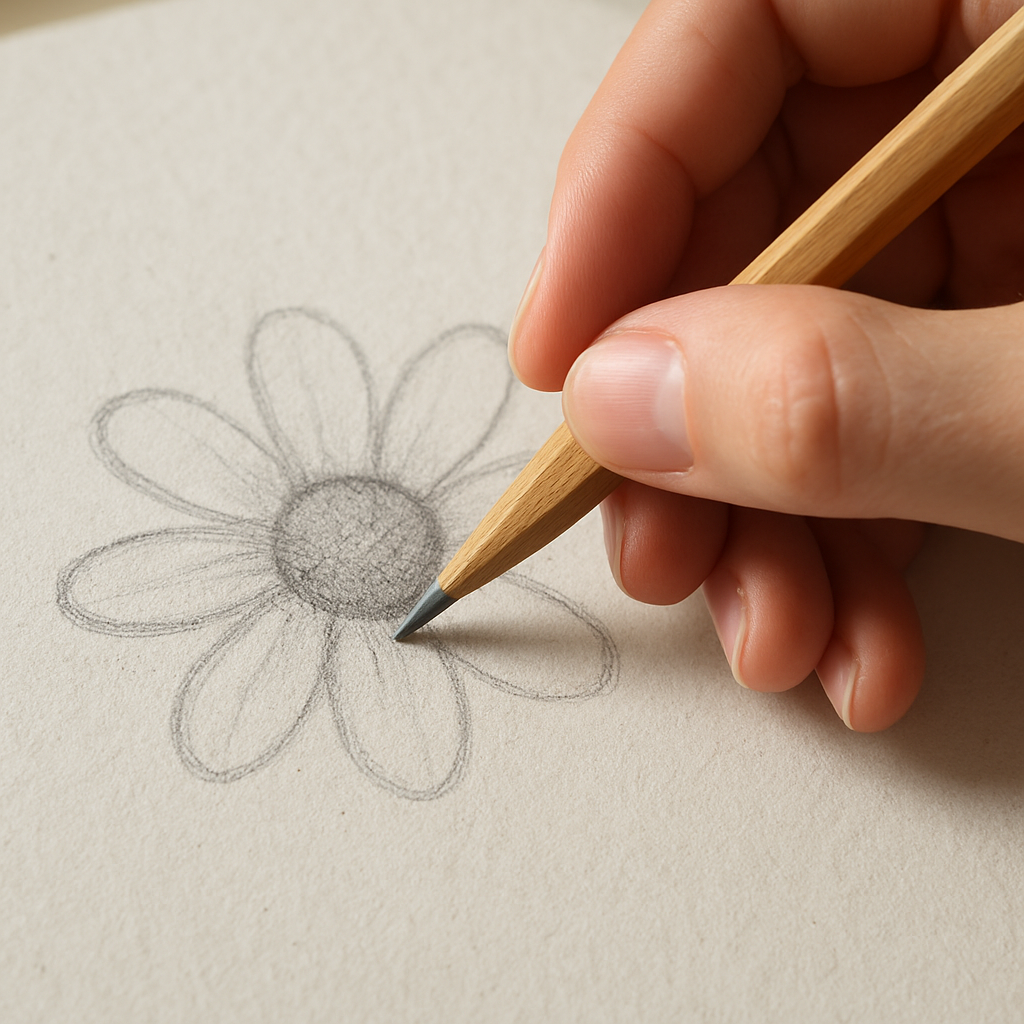
So, what’s the roadmap? First, grab a medium‑hard HB pencil; it gives you enough control to sketch the basic shape without smudging too much. Lightly block in the overall silhouette – think of it as tracing the flower’s silhouette with your mind, not the paper.
Next, break the blossom into simple shapes: a circle for the centre, elongated ovals for the petals. Does this sound too simplistic? Trust me, breaking complex forms into basic geometry is how artists of every level tame detail.
Once the skeleton is set, start layering. Use a softer 2B to add depth to the petal edges, pressing lightly at first and then increasing pressure where shadows naturally gather. Remember, pressure control is like speaking: the softer whisper, the lighter the line; the louder the shout, the darker the mark.
Now, blend. A simple blending stump or even a clean fingertip can smooth transitions, giving those petals that velvety look we all love. And don’t forget the eraser – a kneaded eraser lifts graphite to create highlights, like the sun catching a dew‑kissed petal.
Finally, step back and look at the whole picture. Does the flower feel alive? If a part feels flat, add another subtle layer of tone. The process is iterative, but each loop brings you closer to that satisfying “wow” moment.
Ready to try it yourself? Grab your favorite pencil, set up a clean sheet, and follow this step‑by‑step flow. You’ll be surprised how quickly a simple sketch transforms into a blooming masterpiece.
TL;DR
Want to turn a blank page into a realistic flower? Follow our step‑by‑step guide to sketch, layer, blend, and highlight with pencil, using the exact techniques we recommend at Drawing Pencils Guru.
You’ll learn how to choose the right graphite grade, control pressure, and finish with a polished bloom that looks like it just sprouted from your sketchbook.
Step 1: Gather Materials and Sketch Basic Shapes
Before you even put a line on the page, take a moment to check your toolbox. Do you have a medium‑hard HB for the outline, a softer 2B for the first shadows, a clean blending stump, and a kneaded eraser? If you’re not sure, our How to Draw Flowers for Beginners guide walks you through the essential pencils and paper choices for every Indian artist, student, or hobbyist.
Once the tools are ready, sit at a comfortable desk – the kind you might use while listening to a Pomodoro timer. In fact, many of our readers pair their practice sessions with a structured schedule like the One-Week Pomodoro Plan for Writers. It helps you stay focused for 25‑minute bursts, then step back and review your sketch without losing momentum.
Now, let’s talk about the first line of thinking: the basic shape. Imagine the flower you want to draw as a collection of simple geometric forms. Start with a light circle for the centre – think of it as the heart of the blossom. Then add elongated ovals for each petal, radiating outward like sun‑rays. Don’t worry about perfection; these are just placeholders, not the final art.
While the video walks you through the motion of a light hand, notice how the artist keeps the pressure feather‑light on the initial shapes. That’s the secret – you want the lines to be easy to erase later. If you press too hard, you’ll end up with a dark ghost that’s hard to lift, especially on smoother Indian drawing paper.
After you’ve blocked out the silhouette, step back and ask yourself: does the composition feel balanced? If one petal looks too long, adjust it. If the centre feels off‑center, nudge the circle a millimeter. This is where the “feel” of the sketch matters more than strict measurement.
With the basic skeleton in place, it’s time to add a touch of colour… well, graphite colour. Grab your 2B and start to deepen the petal edges where they fold. Think of the light source you imagined earlier – the side where the sun kisses the flower should stay lighter, the opposite side gets a gentle shadow.
Here’s a little insider tip from Drawing Pencils Guru: use the side of a sharpened mechanical pencil tip to create fine, hair‑like lines for the flower’s stamens. It’s a tiny hack that adds texture without needing a separate tool.
Finally, don’t forget to clean your work area. A quick swipe of a clean cloth removes stray graphite dust, and a brief glance at the sketch from a few feet away helps you spot any uneven lines. When you feel satisfied, give yourself a pat on the back – you’ve just turned a blank page into a living sketch.
Want more inspiration after you finish this step? Check out the gorgeous botanical pieces at Gratitude Studios. Seeing how professionals handle light and form can spark new ideas for your next flower.
Step 2: Outline the Flower Petals
Now that the skeleton feels solid, it’s time to give those vague blobs some personality. Think of each petal as a tiny, curved leaf that wants to catch the light. If you can picture that, the rest becomes a lot less intimidating.
Break the petal into three zones
Most flowers share a simple anatomy: a narrow base that hugs the centre, a middle that widens to give the bloom its fullness, and a tip that either rounds off or comes to a gentle point. This “base‑middle‑tip” rule is a shortcut we love at Drawing Pencils Guru because it works for roses, daisies, and even exotic orchids.
Start by lightly sketching the base with an HB. Keep the line so faint you could erase it with a breath. Then, let your hand glide outward, widening the middle just a touch. Finally, taper the tip, remembering that no petal is perfectly symmetrical – a tiny wobble adds life.
Use curvature, not straight lines
Petals are naturally curved. Grab the tip of your pencil and draw a gentle “C” shape for the outer edge, then mirror it on the inner side. The Clip Studio tutorial points out that “the main attribute of petals is that they are curved, not straight” petal anatomy guide. Follow that advice and you’ll avoid the dreaded stiff‑flower look.
When you’re unsure how much curve to give, imagine the petal as a sheet of paper being blown by a soft breeze. The edge will bow outward a little, then settle back toward the centre. Sketch that motion in one fluid stroke – you’ll capture the organic flow instantly.
Layer the outlines
Instead of drawing every petal in one go, work in layers. First, block in the outermost ring of petals. Once those feel right, step back, squint, and add the inner ring. This approach mirrors how nature builds a flower: outer petals form first, inner ones fill the gaps.
Tip: use a slightly softer 2B for the inner layers. The darker line will suggest depth without having to shade yet. And if a petal looks too long, just lift the graphite with a kneaded eraser – it’s easier than erasing the whole section.
Watch the overlaps
Real blossoms have petals that hide parts of each other. To convey that, let the line of a front‑most petal break where it meets a behind petal. Draw a short gap, then continue the line on the other side. This tiny interruption tells the eye that one petal is sitting in front of another.
Because we’re still in the outline stage, keep those gaps light. You’ll fill them later with shading, but establishing the hierarchy now saves a lot of re‑working.
So, what should you do next?
After the video, grab your sketchbook and run through the three‑zone exercise a couple of times. Start with a simple five‑petal daisy, then try a more elongated tulip shape. Notice how the base‑middle‑tip pattern still holds, even though the overall silhouette changes.
Finally, do a quick checklist before moving on:
- Does each petal have a clear base, middle, and tip?
- Are the outer edges gently curved?
- Have you left small gaps where petals overlap?
- Is the overall shape balanced when you step back?
If you can answer “yes” to most of those, you’ve successfully outlined the flower petals. The next step will be adding tone, but that’s a story for the next section.
Step 3: Add Details and Shading Techniques
Alright, the outline is in place, so now we get to the juicy part – giving each petal its own personality with tone and texture. Think of shading as the voice of your flower; a soft whisper on one edge and a bold statement on another.
Pick the right graphite grades
We usually start with a medium‑soft 2B for the first layer of shadow. It’s dark enough to show up on a 140 gsm sketchbook but still liftable with a kneaded eraser if you go too heavy.
When you need deeper valleys – like the cupped centre of a rose – reach for a 4B or even a 6B. The trick is to keep the pressure light at the start, then press harder only where the natural crease would collect the most light.
Layering: build tone like a cake
Imagine you’re frosting a cake. The first thin layer of graphite sets the base, the second adds richness, and the final glaze brings out the shine. In practice, that means:
- Lay down a gentle 2B wash on the petal’s outer curve.
- Blend a little with a tortillon or a clean fingertip – you want a smooth transition, not a hard edge.
- Re‑apply a darker stroke on the side that would be in shadow, usually the side opposite the light source.
Step back after each pass. If the shape still looks flat, add another thin layer. Most artists find that three to four layers give a realistic depth without over‑working the paper.
Directional hatching for texture
Petal veins aren’t random scribbles; they follow the growth direction. Use light, short hatches that follow the curve of the petal. For a tulip, the veins run from the base outward, so your strokes should mirror that flow.
Cross‑hatching works well on the underside of a daisy where the light is blocked. Just remember: the denser the cross, the deeper the shadow.
Blend, don’t smudge
There’s a fine line between a smooth gradient and a greasy mess. A blending stump gives you control because you can stop the motion exactly where you want the transition.
If you’re in a hurry, a clean fingertip works too – just roll it gently to avoid dragging graphite into the paper fibers.
Highlight with a kneaded eraser
Here’s a little secret most beginners skip: lift, don’t add. Press a kneaded eraser into the tip of a petal where the sun would catch it, then pull it away to reveal a bright spot. It’s like adding a tiny sparkle without any white pencil.
For a crisp highlight on a rose’s edge, shape the eraser into a point and dab it lightly. You’ll see an instant pop that makes the whole bloom feel three‑dimensional.
Real‑world example: sketching a marigold
One of our students in Delhi tried the same steps on a bright marigold. She started with a 2B wash on each petal, blended toward the centre, then added a 4B line on the overlapping edges. After lifting highlights on the outer tips, the flower looked like it could sway in a summer breeze.
The same process works for a sunflower – just remember the centre is a deep, almost black pocket, so you’ll want a heavier 6B layer there before you blend outward.
Quick checklist before you move on
- Did you establish a light source and keep it consistent?
- Are the darkest shadows on the inner folds and overlapping edges?
- Did you lift highlights on the petal tips and edges?
- Is the transition between light and dark smooth, not grainy?
If you can answer “yes” to those, you’ve turned a flat outline into a living blossom. The next step will be adding final touches like stems and background, but for now, enjoy the depth you’ve created.
Step 4: Refine with Textures and Highlights
Now that your petals have shape and basic shading, you’re standing at the moment every artist loves – the chance to make the flower feel real enough to step out of the page.
Why texture matters
Think about the soft fuzz on a rose petal or the subtle veins on a daisy. Those tiny details are what our eyes latch onto, and they’re surprisingly easy to suggest with graphite if you know a few tricks.
Start with directional texture
Grab a sharp 2B or 4B and, using light, feathery strokes, follow the natural growth line of each petal. For a tulip, the strokes run from the base outward; for a lily they curve gently toward the tip. The key is to keep the pressure consistent so the texture looks like a whisper, not a scribble.
Jennifer Morrison recommends a “dabbing” motion when you want texture without muddying colors – even though she works in colored pencil, the principle works the same with graphite. A quick dab with a soft brush or the side of a blending stump lifts a tiny amount of pigment, leaving a faint grain that reads like real petal surface adding texture to botanical drawings.
Layer texture for depth
After the first pass, step back and ask yourself: does this petal look flat? If so, add a second layer of slightly darker strokes where the light would naturally collect more shadow – usually the inner curve of the fold. Then, blend just enough to soften the edge, but leave a hint of line so the eye can still read the grain.
Remember, less is more. A single, well‑placed line of texture can suggest a whole network of veins. Over‑texturing turns a delicate bloom into a rough sketch.
Highlights: pulling light out of the paper
This is where the kneaded eraser becomes your secret weapon. Shape it into a tiny point, press gently on the petal tip where the sun would kiss it, and lift. The result is a crisp, bright spot that reads like a dewdrop without ever reaching for a white pencil.
If you’re working on a darker centre, such as a rose’s heart, use a clean eraser to pull back a larger patch of graphite. That creates a subtle glow that makes the surrounding shadows pop even more.
Fine‑tuning with a blending stump
Blend only where the transition feels harsh. A quick roll of the stump across the edge of a lifted highlight softens the boundary, giving the illusion of a slightly glossy surface. Avoid dragging the stump across the whole petal – you’ll lose the texture you just worked so hard to create.
Quick texture checklist
- Did you follow the petal’s natural growth direction with your strokes?
- Are the texture lines light enough to read as grain, not as a line drawing?
- Did you lift highlights on the tip and inner curve?
- Is there a subtle blend between texture and smooth shading?
Give yourself a minute to look at the whole flower. If the petals feel like they could sway in a breeze, you’ve nailed the refinement stage. The next step will be adding the final background and stem, but for now enjoy the tactile richness you’ve built.
Step 5: Shading Different Flower Types – Comparison Table
By the time you’ve nailed outlines and basic texture, it’s already speaking to you, but the real conversation happens in the shadows.
Do you ever notice how a rose’s inner folds feel heavier than the airy petals of a daisy? That difference is all about graphite grade, pressure, and the direction you let the lead travel.
In this section we’ll break down three common flower families – roses, daisies, and tulips – and give you a quick‑look table that tells you which pencils to reach for and what blending tricks work best.
Grab your sketchbook, keep a soft 2B or 4B handy, and follow the cues in the table below; think of it as your shading cheat sheet.
| Flower Type | Recommended Pencil Grade | Shading Technique | Quick Tip |
|---|---|---|---|
| Rose (dense centre) | 4B‑6B for core, 2B for outer petals | Layered pressure with a blending stump; lift highlights with a kneaded eraser | Press harder on the cup‑shaped centre, then soften outward. |
| Daisy (flat disc) | HB for outline, B‑2B for petals | Gradient shading from centre outward; use a blunt tip for smooth transitions | Keep strokes short and follow the radial “spoke” pattern. |
| Tulip (elongated curve) | 2B for body, 4B for shadowed edges | Directional hatching along the curve; blend lightly with a fingertip | Leave a thin strip of paper visible at the tip for a crisp highlight. |
Take the rose row as an example: start with a 4B to block in the dark bowl of the bloom, then switch to a 2B for the softer outer petals. When you blend, roll the stump in gentle circles rather than dragging straight across – this keeps the texture from turning into a greasy smudge.
Daisies, on the other hand, thrive on even gradients. Lightly sketch the central disc with an HB, then build outward using a B pencil. Because the petals are relatively flat, you can achieve a smooth fade by gradually easing pressure as you move away from the centre. The blunt tip trick from the Tombow guide helps keep those transitions silky pencil shading tips.
Tulips demand a little drama on the edges. Use a 2B to lay down the main body, then pull a 4B across the outer curve where the light would naturally hide. A quick fingertip blend softens the edge without erasing the directional hatching that suggests the petal’s bend.
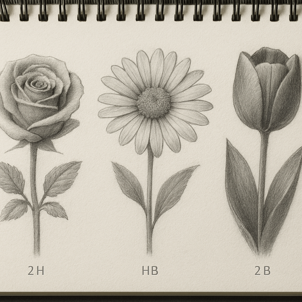
Notice the pattern? Harder leads (HB, B) work well for flatter surfaces, while softer leads (4B, 6B) excel in deep folds and shadows. If you ever feel the paper getting saturated, step back, lift a bit with a kneaded eraser, and let the graphite breathe.
Before you close your sketch, run through this quick checklist: are the darkest values concentrated in the natural valleys? Did you leave a thin highlight strip on each petal tip? Is the transition from dark to light smooth, not grainy? If you can answer “yes” to most, your shading is on point.
Remember, the table is just a starting point – feel free to experiment with your own favourite grades. The more you play with pressure and blending, the more instinctive the right choice becomes, and soon you’ll be shading any bloom without thinking about it.
One extra tweak that many Indian art students swear by is matching the paper texture to the flower’s character. A slightly toothy 140 gsm sketchbook lets a 4B lay down rich shadows on a rose without tearing, while a smoother Bristol paper gives a daisy’s light gradients a glass‑like finish. If you’re juggling exams or a full‑time job, set a 15‑minute “shade sprint” each day – sketch the same flower type, switch the pencil grade, and note how the tone changes. Over a week you’ll develop an intuition that feels almost like muscle memory.
Step 6: Finishing Touches and Preservation
You’ve spent the last few minutes coaxing light and shadow onto each petal, and now the flower is starting to feel alive. But a drawing that looks good on the page can still fade, smudge, or lose that fresh‑off‑the‑sketchbook vibe if you don’t give it a proper finish.
Lock in the highlights
Grab your kneaded eraser and shape it into a tiny point. Lightly press on the very tips of the petals where the sun would hit – those little specks are what make the bloom sparkle. If you have a white drawing pencil (like the Derwent Drawing we love), swipe it over the lifted spots; it adds a subtle glow without needing any actual white pigment.
Why does this matter? In our experience, a well‑placed highlight stops the eye from wandering and keeps the viewer’s focus on the flower’s centre. It’s the difference between “a sketch” and “a finished piece”.
Seal the paper
Graphite loves to migrate, especially on smoother paper. A light spray of fixative creates a protective veil that stops smudging. Hold the can about 30 cm away and give the drawing a quick, even mist – you’ll hear a soft hissing sound and see a faint mist settle. Let it dry for a minute, then turn the page and repeat on the back if you’re worried about accidental rubbing.
Pro tip: If you’re working in a humid Indian climate, choose a fixative that’s labeled “low‑odor” and “quick‑dry”. It won’t leave a sticky residue that attracts dust, and it respects the delicate texture of a 140 gsm sketchbook.
Preserve the paper texture
Sometimes the paper’s tooth is part of the charm – those tiny ridges catch graphite in a way that flat Bristol can’t. To keep that texture intact, store your finished sketch flat in a portfolio or a large‑envelope‑style sleeve. Avoid folding the page; a gentle bend can crush the tooth and flatten the subtle shadows you worked so hard to build.
If you love to display the drawing, consider mounting it on acid‑free mat board. The board gives the paper a little breathing room and protects it from environmental pollutants.
Final check‑list
- Are the highlights still crisp after the fixative?
- Does the paper feel dry to the touch, or is there any tackiness?
- Is the drawing flat, without any unwanted curling?
- Have you stored it in a dust‑free, climate‑stable environment?
Answering “yes” to these questions means your flower is ready for a frame, a portfolio, or simply a proud spot on your desk.
Quick tip from a fellow artist
Ewelina, who runs a popular art blog, swears by a two‑step approach: first lift the brightest highlights with a kneaded eraser, then add a final glaze of white drawing pencil before spraying fixative. She explains the method in detail on her step‑by‑step crocus tutorial, and the results speak for themselves – the petals keep that fresh, almost three‑dimensional look even after weeks on the wall.
So, what should you do next? Take a step back, breathe, and admire the bloom you just brought to life. If something feels a bit flat, a tiny lift of graphite with the eraser or a dab of white pencil can instantly revive the depth. And remember, the preservation steps are as much a part of the creative process as the sketch itself – they protect the hours you poured into each stroke.
When you finish, share a photo on social media and tag #DrawingPencilsGuru. We love seeing how you preserve your work, and it might just inspire the next student in Delhi or Mumbai who’s staring at a blank page right now.
Conclusion
So, you’ve walked through each stage of how to draw flowers with pencil step by step, from the first light sketch to the final fixative mist. By now the paper probably feels alive, and you’ve seen how tiny lifts of graphite can turn a flat petal into a three‑dimensional whisper.
What does that mean for you as a budding artist in Delhi, Mumbai, or any studio? It means you can trust a simple routine to give consistent results without expensive workshops.
In our experience at Drawing Pencils Guru, the biggest breakthrough comes when you treat each layer like a conversation – you sketch, you listen, you adjust. That mindset keeps the process relaxed and lets the flower grow naturally on the page.
Now, before you close the sketchbook, run through this quick mental checklist: Are the highlights still crisp after the fixative? Do the petals show a clear base‑middle‑tip flow? Is the overall balance pleasing when you step back?
If you answered yes, congratulations – your flower is ready to be framed, shared online, or simply admired on your desk. And if something feels a bit flat, a gentle kneaded‑eraser lift or a whisper of a softer lead will bring it back to life.
Remember, the journey doesn’t end here; each bloom you draw builds muscle memory that makes the next one faster and more confident. Keep a sketch journal, try different species, and watch your skill bloom.
So go ahead, snap a photo, tag #DrawingPencilsGuru, and let the community celebrate your progress – after all, sharing is the best way to keep the inspiration flowing.
FAQ
How do I start drawing flowers with pencil step by step if I’m a complete beginner?
First, grab a light HB pencil and a plain sheet of sketch paper. Lightly block the biggest shapes – a circle for the centre and ovals for the petals – just like you’d doodle a quick smiley. Keep the lines feather‑light so they disappear under later layers. Once the skeleton feels right, move on to refining each petal with a softer 2B, adding gentle curves and a bit of pressure where the shadow will sit.
Think of it as building a conversation: the outline asks a question, the shading answers it. Pause, step back, and you’ll see the flower taking shape before you even finish the first layer.
What graphite grades should I use for each stage of the flower drawing process?
We usually start with an HB for the initial sketch – it’s easy to lift with a kneaded eraser. For the first layer of tone, switch to a 2B; it gives enough darkness without being too stubborn. When you reach the deepest shadows – like the cup of a rose or the inner folds of a daisy – reach for a 4B or even a 6B if the paper can handle it. Blend lightly, then lift highlights where the light hits.
Remember, the softer the lead, the more you’ll need to control pressure, so always test a tiny swatch on the corner of the page first.
How can I make the petals look three‑dimensional without over‑blending?
Start with thin, directional strokes that follow the natural growth of the petal. Lay down a light 2B wash on the outer curve, then use a slightly darker 4B just where the petal folds inward. Instead of smearing, use a clean fingertip or a tortillon to smooth the transition for a few millimetres, then stop. Leaving a hint of grain gives the surface texture that the eye reads as depth.
Finally, lift a tiny highlight on the tip with a pointed kneaded eraser – that little flash of paper makes the whole blossom pop.
What’s the best way to keep my sketch from getting smudged in a humid Indian climate?
Humidity makes graphite cling to the paper longer, so work in short bursts and keep a light hand. A quick spritz of a low‑odor fixative (just a light mist from about 30 cm away) after each major layer locks the graphite in place without turning the paper glossy. Store finished sketches flat in a portfolio or a large envelope, and avoid stacking them while the fixative is still wet.
And if you’re drawing in a breezy room, a simple sheet of clean tracing paper on top of the work area can catch stray charcoal or graphite dust.
How often should I sharpen my pencil and what sharpening method gives the cleanest line?
Whenever the tip starts to look blunt or you need a finer point for intricate petal veins, give it a quick shave. For most flower work, a handheld rotatory sharpener does the trick – it produces a consistent, long point without breaking the lead. If you want ultimate control, a craft knife lets you shape the tip exactly how you need it, but it takes a steady hand.
Keep a spare piece of scrap paper handy; a quick test stroke tells you if the point is ready for delicate work.
Can I use colored pencils or charcoal for flower sketches, and how does that change the step‑by‑step approach?
Absolutely. Colored pencils add hue early on, so you might start with a light wash of the petal’s base colour before laying down graphite shadows. Charcoal gives richer blacks for dramatic centre‑pieces, but it’s messier, so work on a toned board and seal each layer with fixative as soon as you’re happy. The core steps – outline, build tone, lift highlights – stay the same; you just swap the medium that delivers the tone.
Just remember to protect your hands with a light cloth if you’re using charcoal; it loves to stick around.
Where can I find quick reference material when I’m stuck on a specific flower shape?
A good old‑fashioned botanical illustration book works wonders – flip to the page, trace the basic geometry, then adapt it to your style. Online, free image libraries like the Public Domain Archive offer high‑resolution flower photos that you can print at 100 % and use as a guide. Keep a small “reference card” in your sketchbag with a few favourite silhouettes; pulling it out for a minute can clear the creative fog.
And if you ever feel totally stuck, sketch the whole flower as simple shapes first – a circle, a few ovals – then refine. That trick has rescued more beginners than any fancy tutorial.
