Did you know that over 80% of artists who start with basic drawing tools give up on colored pencils after their first few attempts? This is often because they associate them with childhood art supplies. The reality is far more exciting.

There is a significant difference between the wax-based pencils from our school days and the professional, pigment-rich tools available today. This versatile medium is now a powerful choice for creating gallery-worthy art.
Many beginners find their drawings look flat. The secret to adding life and dimension lies not just in where you place shadows, but in mastering the techniques of layering color. Understanding this process transforms a simple sketch into a vibrant, three-dimensional piece.
This article is your guide to that transformation. We will explore the core principles that elevate your work. Our goal is to provide clear, practical tips that make professional results achievable for everyone.
Key Takeaways
- Professional artist-grade colored pencils offer superior pigment quality compared to basic versions.
- Mastering shading is the key to transforming flat drawings into dynamic, realistic artwork.
- This guide focuses on practical layering techniques to create depth and dimension.
- Colored pencils are a legitimate and powerful medium for artists at all skill levels.
- Understanding color application for shadows is more important than just knowing where to place them.
- We provide a clear, step-by-step approach to help you build confidence with this versatile tool.
Introduction to Shading with Colored Pencils
Many artists discover that their drawings lack dimension, not from poor line work, but from a misunderstanding of shadow and light. This foundational skill separates a simple sketch from a compelling piece of art. We will explore why it matters and how far the tools themselves have come.
Why Shading Matters in Art
Shading is the magic that creates the illusion of depth. It mimics how light falls on objects, turning a flat drawing into something that feels real and tangible. The way an artist handles this determines the entire visual impact.
Without proper shading, even a well-drawn object appears lifeless. Understanding the relationship between a light source and shadow placement is the first critical step. This knowledge transforms your approach to any medium.
The Evolution of Colored Pencils
The tools available to today’s creators are vastly superior. Over time, colored pencil technology has advanced from basic wax sticks to professional-grade instruments. This evolution empowers artists to achieve results once reserved for paint.
Modern artist-quality pencils offer intense pigment, smooth application, and excellent lightfastness. Their superior composition allows for intricate layering and the ability to blend colored pencils effectively for seamless gradients. The table below highlights key improvements.
| Feature | Basic Pencils | Artist-Grade Pencils |
|---|---|---|
| Pigment Concentration | Low, chalky fillers | High, pure pigment |
| Blending Capability | Difficult, waxy buildup | Smooth, predictable layers |
| Lightfastness (Color Permanence) | Poor, fades quickly | Excellent, archival quality |
This shift has changed the perception of the medium. Many professionals now embrace colored pencils for their unique, controllable expression.
Essential Materials and Preparations
We believe that confidence in your art starts with confidence in your tools, from the pencils you hold to the surface you draw on. The right foundation makes every technique easier to master.

Choosing Quality Colored Pencils and Paper
Professional-grade colored pencils offer a significant advantage. Their rich pigment and soft cores allow for smooth layering and vibrant results.
Your choice between oil-based and wax-based pencils depends on your style. Oil-based options, like Faber-Castell Polychromos, provide a soft application that resists crumbling. Wax-based pencil brands, such as Camlin, often feature a buttery texture ideal for effortless blending.
| Feature | Oil-Based Pencils | Wax-Based Pencils |
|---|---|---|
| Core Consistency | Firm, less prone to breakage | Softer, buttery application |
| Blending Style | Excellent for layering | Effortless, smooth blends |
| Solvent Use | Highly compatible | Variable results |
Your paper choice is equally vital. We suggest acid-free paper with a weight above 100 GSM. This ensures the longevity of your artwork and provides the right texture for pigment to grip.
Setting Up Your Workspace
Good lighting is essential for accurate color perception during your drawing session. A well-lit area helps you see subtle value changes.
Place a few extra sheets of paper under your working sheet. This simple cushioning trick improves pencil control. Having one dedicated space for your coloring practice keeps materials organized and fosters consistent technique.
Mastering the Basics: How to Shade with Colored Pencils
Transforming two-dimensional drawings into lifelike creations requires mastering the interplay between illumination, touch, and surface quality. These three elements form the foundation of dimensional artwork.
Understanding Light, Pressure, and Texture
Visualizing your light source is the first step toward realistic shading. Imagine illumination coming from the top right corner of your subject. This mental picture guides where shadows fall and how intensely they appear.
Pressure control directly affects pigment deposition. Gentle touch creates delicate tones, while firm application produces rich, saturated color. The relationship between pressure and pigment is direct and powerful.
Building layers from light to dark gives you greater control. This approach allows for corrections and develops depth gradually. Each additional layer contributes to the final effect.
Different mark-making techniques create distinct textures. The spacing and density of your strokes determine value darkness. Experimenting with various approaches helps you discover your preferred way of working.
We recommend practicing pressure variation on scrap paper first. This helps you understand how your specific tools respond. Mastering these fundamental shading techniques builds confidence for more complex artwork.
Exploring Core Shading Techniques
Texture and form come alive through the deliberate arrangement of lines, strokes, and marks on your surface. These fundamental approaches give you distinct ways to build value and character in your artwork.
Hatching and Cross-Hatching Methods
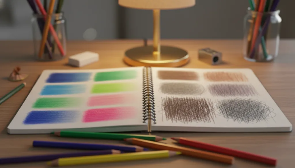
Hatching creates graduated tones using parallel lines. The spacing between your strokes determines the lightness or darkness of an area. This method requires patience but delivers beautiful, controlled results.
Cross-hatching builds richer complexity by adding layers in different directions. These intersecting marks can follow your subject’s contours for natural-looking depth. We recommend practicing with complementary colors to discover vibrant optical mixing effects.
Scribbling and Short Dashes for Texture
Scribbling offers a spontaneous approach using loose, squiggly lines. This technique builds texture organically from light to dark values. It’s perfect for creating energetic, organic surfaces.
Short dashes are among the most versatile marks you can make. They follow natural contours to suggest both form and surface quality simultaneously. Different techniques produce distinct textures—linear patterns from hatching, randomness from scribbling.
Understanding when to use each method comes with practice. Smoother subjects often benefit from blended approaches. Textured subjects work well with visible pencil strokes. Experiment with line direction and pressure to develop your personal style.
Advanced Shading Methods and Blending
The transition from basic drawing to gallery-quality work requires understanding sophisticated blending and contouring strategies. These approaches build upon fundamental skills to achieve professional results.
Layering and Blending for Smooth Gradients
Proper layering involves applying multiple thin applications with light pressure. This gradual buildup allows for better control over pigment saturation.
We recommend alternating between colors to create optical mixing effects. This method produces more vibrant, complex hues than single-color application.
Using the pencil’s side rather than the tip covers larger areas quickly. It creates softer transitions between colors for seamless blending.
Understanding pressure adjustment throughout the process is crucial. Too much pressure early can create waxy buildup that resists additional layers.
Contouring and Cross-Contouring Approaches
The contouring method follows your subject’s natural form with directional marks. These strokes reinforce three-dimensional structure and surface characteristics.
Cross-contouring adds richness by overlaying strokes in multiple directions. This technique creates more convincing form description and interesting textures.
Different pencils respond uniquely to these advanced methods. Wax-based varieties generally blend more smoothly, while oil-based options maintain more texture.
We suggest testing your specific tools on scrap paper first. This practice ensures confidence when applying these techniques to finished artwork.
Practical Tips and Shading Exercises
We’ve found that artists who dedicate regular time to focused shading exercises see the most dramatic improvements in their work. Consistent practice transforms theoretical knowledge into tangible artistic skill.

Begin with simple geometric forms like spheres and cubes. These basic shapes help you understand how light creates shadow and builds three-dimensional depth.
Step-by-Step Exercises to Build Depth
Start each session by establishing your light source position. Imagine illumination coming from the top right corner. This determines where highlights and shadow areas will appear.
Work with limited color palettes initially. Using just 3-4 pencils helps you focus on value relationships rather than getting overwhelmed by choices.
The most significant progress happens when you practice creating smooth gradients from light to shadow areas.
We recommend daily practice sessions of 15-20 minutes. This consistent approach accelerates skill development more effectively than occasional long sessions.
| Practice Approach | Beginner Focus | Advanced Application |
|---|---|---|
| Light Source Training | Single direction from top | Multiple light sources |
| Color Building | 3-4 pencil limited palette | Complex color mixing |
| Shadow Types | Basic form shadows | Cast and core shadows |
Try creating value scales with each of your colored pencils. Practice achieving five distinct value steps from lightest to darkest. This helps you understand each pencil’s full range.
Apply these techniques to everyday objects around your home. This trains your eye to see how light creates form through shadow. The way you approach these exercises matters more than perfect results.
For comprehensive guidance on developing your skills, explore our detailed shading techniques resource.
Overcoming Common Shading Challenges
Many creative individuals find their progress stalled by persistent issues that make their drawings look less dimensional than intended. We understand these frustrations and want to provide practical solutions.
Avoiding Flat or Overworked Strokes
Flat artwork often results from insufficient value contrast. Beginners sometimes apply the same color repeatedly for shadows, creating dull results. Instead, build shadows with complementary hues.
Overworking occurs when you apply too much pressure too quickly. This creates waxy buildup that prevents smooth blending. Gentle, layered application preserves your paper‘s texture.
Uneven pressure creates inconsistent marks and patchy coloring. Practice maintaining steady control throughout your strokes. This approach yields more professional results.
We also use strategic planning to prevent mistakes. Light sketching and testing color combinations on scrap paper saves time. This way avoids frustrating corrections later.
When coloring shadow areas, avoid pure black. Choose rich chromatic darks instead. These tips help maintain vibrant, dimensional artwork without overworked appearance.
Remember that restraint often produces better results than heavy-handed application. Taking time between layers allows objective assessment. These tips transform frustrating challenges into manageable steps.
Conclusion
The true magic of colored pencil work emerges when technical skill meets personal artistic vision. We’ve explored essential approaches that transform basic drawing into dimensional artwork.
Your journey with this versatile medium evolves through consistent practice. Each session builds muscle memory and deepens your understanding of color relationships.
Remember that quality materials make a significant difference. Investing in good paper and professional-grade pencils supports your creative development. These tools help rather than hinder your progress.
The techniques we’ve shared provide a comprehensive foundation. From basic mark-making to advanced blending, you now have a toolkit for any artistic challenge. Keep these principles at the top of your mind while allowing room for personal experimentation.
Every artist starts somewhere, and your dedication will yield beautiful results. We encourage you to continue exploring this rewarding medium with confidence and curiosity.