
Imagine holding a fresh set of colored pencils and laying them on a sleek sheet of black paper. The moment the first stroke hits the darkness, a vivid neon hue pops like a city light at midnight.
But have you ever felt that rush turn into frustration because the colors look muted or the paper tears under pressure?
That’s the quirky charm of working with colored pencils on black paper – the surface steals the spotlight, forcing every pigment to fight for attention.
The dark base changes how light and shadow behave; a light layer of white or pastel can become a striking highlight, while deeper shades melt into the background like ink in water.
So, what’s the secret sauce? First, pick pencils with soft, buttery cores – they lay down pigment effortlessly and stay vivid against the night‑tone. Next, press lightly at first; you’ll always have room to build depth without gouging the paper.
When you need to blend, a simple cotton swab or a soft blending stump works wonders – it smooths transitions without dragging the dark surface into a muddy mess.
And if you make a mistake, don’t panic. A kneaded eraser can lift pigment gently, and a white pencil can rescue a lost highlight without scrubbing away the black foundation.
In our experience at Drawing Pencils Guru, we’ve seen students in Indian art schools transform simple sketches into dramatic, mood‑rich pieces by embracing this contrast. By the end of this guide, you’ll know exactly which pencils, papers, and techniques to pair for eye‑catching results.
Ready to turn that black canvas into a playground of color? Let’s dive in.
Choosing the right paper texture is just as crucial as picking the perfect pencil. A slightly textured surface gives the pigment something to grip, preventing smudges, while a smooth finish lets colors glide like silk. Test a few sheets before you commit – a quick swipe will reveal whether the paper holds the color or lets it slip away.
TL;DR
If you want neon‑bright strokes that pop on a midnight canvas, mastering colored pencils on black paper is the shortcut to eye‑catching art.
We’ll walk you through selecting buttery cores, the right texture, light pressure tricks, and easy blending hacks so you can transform sketch into a vivid, gallery‑ready piece.
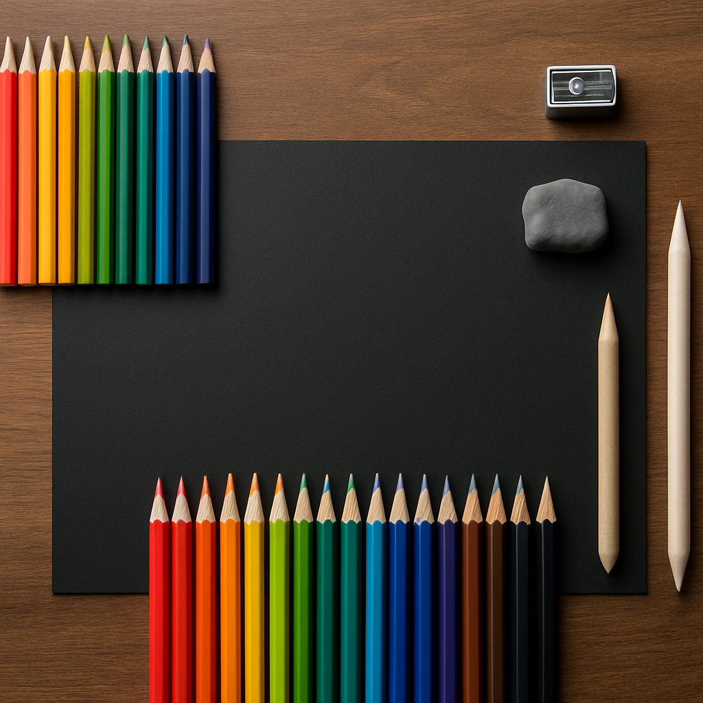
Step 1: Gather the Right Materials
First thing’s first – before you even think about the neon‑bright strokes, you need the right toolkit. Imagine you’re about to bake a cake; you wouldn’t start without flour, eggs, and a pan, right? The same logic applies to colored pencils on black paper.
What you’ll need can be broken down into four categories: pencils, paper, sharpening & erasing tools, and optional accessories that make the process smoother.
1. Choose buttery‑core colored pencils
Look for pencils with a soft, creamy core. They glide over the dark surface without digging in, which is crucial because black paper can be unforgiving. Brands that market “soft cores” or “oil‑based pigments” tend to lay down richer color on a night‑tone background.
Tip: Test a single stroke on a scrap piece. If the pigment feels grainy, swap it for a softer option – you’ll thank yourself later.
2. Pick the perfect black paper
Not all black paper is created equal. A slightly textured surface gives the pigment something to grip, while a glossy finish can make colors look flat. In our experience, a 140‑gsm, matte‑black drawing board strikes the right balance for most artists.
Need a deeper dive into paper selection? Check out Choosing the Best Paper for Colored Pencils: A Detailed Guide for a full rundown of textures, weights, and brands that work best with dark surfaces.
And don’t forget to size your paper to the project. A larger sheet gives you room to experiment, while a smaller pad is perfect for quick studies.
3. Sharpening and erasing gear
A sharp point is non‑negotiable. Dull pencils will scrape the paper and ruin that smooth neon effect. A quality handheld sharpener or a small electric model does the trick. Keep a kneaded eraser on hand – it lifts pigment without tearing the delicate black surface.
Pro tip: Lightly roll the eraser on a scrap piece first; this pre‑conditions it to lift pigment without smearing.
4. Optional accessories
Blending stumps, cotton swabs, and a soft brush can help you transition between colors without muddying them. If you’re planning to showcase the finished piece, think about a fixative spray that works on dark paper – it protects the vibrant layers from smudging.
Once you’ve mastered the basics, you might want to turn your artwork into prints or stickers. That’s where a service like JiffyPrintOnline comes in handy – they specialize in custom printing for artists who want to monetize their creations.
And if you’re looking to grow your art business beyond the studio, platforms such as RebelGrowth offer tools to market and sell your work to a wider audience.
Now that you know what to gather, let’s talk about how to set up your workspace so everything’s within arm’s reach.
Below is a quick visual recap of the essential kit.
Ready to roll? Take a moment to lay out each item, give it a quick test, and you’ll feel the confidence surge as you prepare to bring neon life to that midnight canvas.
Step 2: Preparing Your Black Paper Surface
Now that your pencils are sharp and your workspace is set, the next magic happens on the paper itself. If the surface isn’t ready, even the best pigments can look flat or bleed into the fibers.
Ever brushed a fresh sheet of black paper and felt that faint, almost powdery texture? That tiny sensation is your first clue that the paper will hold pigment – or that it might need a little extra love before you start drawing.
Pick a paper that plays well with colored pencils on black paper
We usually look for a weight between 60 gsm and 140 gsm. Anything lighter will crinkle under pressure, while a heavyweight pad gives you a sturdy “canvas” that resists tearing.
The tooth matters, too. A fine‑tooth surface (think of the subtle grit on a smooth watercolor block) gives the pencil a place to grip. Too rough and the lead will skip; too smooth and the pigment can sit on top, looking dull.
Popular choices among our Indian students include Fabriano Black and Canson Mi‑Tiñes. Both have that sweet spot of tooth and darkness, and they survive the monsoon humidity better than cheaper alternatives.
Test the surface before you commit
Grab a single, bright color – neon pink or electric blue work well – and make a light stroke. Does the line pop immediately, or does it look washed out? If it’s the latter, try a second pass or a different brand.
Another quick test is to press a clean fingertip over the stroke. A subtle sheen means the paper is accepting pigment; a matte finish suggests you might need a primer.
So, what should you do if the paper feels a bit too slick?
Cleaning and securing your work area
Before any drawing, give the sheet a gentle wipe with a soft, lint‑free cloth. This removes dust that can turn into unwanted specks when you blend.
Mount the paper on a sturdy drawing board or a clean piece of cardboard. Tape the edges lightly – a thin strip of painter’s tape is enough – so the sheet stays flat and won’t shift as you layer colors.
Now that the surface is clean and secured, you can think about a light primer. A soft pastel or white pencil brushed lightly over the areas you plan to highlight creates a “base” that makes neon pigments explode.
Here’s a trick we hear a lot in Delhi art workshops: use a 2B pastel to sketch the outline, then go back with the colored pencils. The pastel holds the graphite grain, and the dark paper still shows through, giving your work depth without extra layers.
Humidity can be a silent enemy, especially in coastal cities like Mumbai. Store your black pads in a zip‑lock bag with a silica packet, and let them acclimate to room temperature before you start. A dry sheet behaves predictably; a damp one can warp under pressure.
Quick checklist before you pick up the first pencil:
- Paper weight 60–140 gsm, fine tooth.
- Test a bright stroke for immediate pop.
- Wipe surface with a lint‑free cloth.
- Secure on a board with light tape.
- Consider a pastel or white primer for highlights.
- Store in a dry, sealed container if humidity is high.
When you’ve run through that list, you’ll feel the confidence of an artist who’s already tamed the darkness. The black paper is no longer a mystery; it’s a ready‑made stage for your colored pencils on black paper to shine.
Ready to layer, blend, and add those electric highlights? Let’s move on to the next step and watch the colors come alive.
Step 3: Mastering Basic Strokes and Techniques
Okay, you’ve got your buttery pencils, your dark pad, and the surface is clean. Now comes the fun part – learning how those strokes actually behave on black paper.
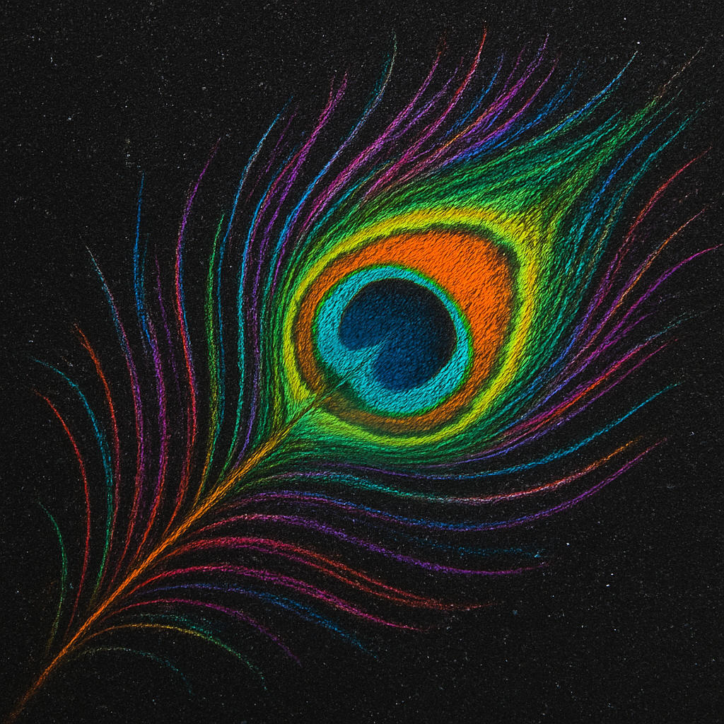
First thing you’ll notice is that a light touch gives you a ghost‑like line, while a firmer pressure makes the pigment scream. That’s the core emotional experience: the thrill of seeing a faint hint turn into a neon blaze in an instant.
So, what’s the first stroke you should try? Grab a bright teal or electric pink and draw a single, confident line across the page. Don’t worry about perfection; just feel the resistance of the paper and watch the color pop.
Basic Stroke Types
1. The Straight Swipe. Hold the pencil at a 45‑degree angle and pull it in one smooth motion. This creates a uniform layer that’s perfect for background washes.
2. The Cross‑Hatch. Layer short, intersecting lines at different angles. On black paper this technique builds depth without ever looking muddy.
3. The Circular Motion. Use a small circular or “scribble” motion for textured highlights – think of fireflies or glittering city lights.
Try each of these on a scrap corner first. You’ll see how the dark surface catches the pigment differently than a white sheet.
Real‑World Example: Night‑Market Scene
One of our students in Jaipur used a combination of cross‑hatching and circular strokes to render a bustling night market. He started with a deep indigo wash for the sky, then added tiny orange circles for lanterns. The result? Each lantern glowed like a real flame against the black backdrop.
Notice how the cross‑hatching gave the stalls a sense of structure, while the circles added that magical sparkle. You can replicate that by alternating between a soft, wide stroke for large color fields and tighter, repetitive marks for details.
Actionable Steps to Build Mastery
1. Warm‑up. Spend five minutes drawing random lines, circles, and hatches on a spare sheet. This gets your hand used to the paper’s tooth.
2. Layer with Purpose. Start with the lightest color you plan to use, then gradually introduce darker hues. Because the paper is already black, you’ll rarely need a “darkening” layer – the paper does that for you.
3. Control Pressure. Use your thumb as a pressure regulator. Lightly rest it on the pencil to soften the line, or lift it for a bolder mark.
4. Blend Sparingly. A quick swipe with a cotton swab or a clean fingertip can smooth a transition, but over‑blending will dull the neon effect. Think of blending as a “gloss” rather than a “wash”.
5. Check Your Light Source. Imagine where your light is coming from and add a tiny highlight with a white or pastel pencil. Even a single speck can make a whole area look three‑dimensional.
Expert Tip: Use a “Paper Primer” Stroke
Before you commit to a full color, lightly drag a 2B pastel or a white pencil over the area you plan to highlight. This tiny grain of light acts like a primer, letting the colored pencil sit on top rather than sinking into the fibers. It’s a trick we see time and again in Delhi workshops.
Does this feel a bit experimental? Good. The best way to internalize these techniques is to treat each practice session like a mini‑experiment. Note which pressure gives you the brightest pop, which angle yields the smoothest wash, and adjust accordingly.
Checklist for a Successful Stroke Session
- Paper secured on a board with light tape.
- Pencils sharpened to a fine point (double‑blade metal sharpener works best).
- One bright color selected for the first test stroke.
- Cotton swab, blending stump, or fingertip ready for subtle blends.
- Optional: a white or pastel pencil for a quick primer.
When you run through this checklist, you’ll notice a shift from “I’m guessing” to “I’ve got control”. That’s the moment the darkness stops being intimidating and becomes your playground.
Ready to move beyond the basics? In the next step we’ll dive into layering strategies that turn those simple strokes into fully realized, neon‑bright compositions.
Step 4: Layering Colors for Depth and Contrast
When you first start stacking colored pencils on black paper, the surface can feel like a night sky waiting for constellations. Does it ever seem like the colors just sit on top without any depth? That’s where layering steps in – it turns flat neon bursts into a three‑dimensional glow.
Think of each layer as a thin veil. The first veil is a light hue, the next a slightly richer shade, and the last a punch of contrast. By the time you’re done, the eye sees a seamless transition rather than a single slab of pigment.
Start with the lightest hue
Grab your brightest pencil – electric pink, neon teal, or a vivid orange – and apply a feather‑light stroke. Use barely more pressure than you would on white paper; the black ground already supplies a deep base. Let that layer dry (or set) before you add anything darker. This initial wash acts like a soft spotlight, defining where the eye will travel.
Why does this matter? On black paper the darkest values are already present, so building from light to dark lets you control where the highlights pop. It’s the same principle you’ll see in a sunrise painting, only inverted.
Build depth with transparent glazes
Once the light wash is in place, reach for a slightly less saturated version of the same hue. Press a touch harder, but keep the stroke smooth. The trick is to let the pigment sit in the paper’s tooth rather than mound on top – that’s why we always recommend a fine‑tooth black pad.
If you need a bridge between two colors, try a “glaze” technique: lay a thin line of a secondary color (say, a cool violet) over the first layer, then blend gently with a cotton swab. The result is a subtle shift that adds richness without muddying the neon intensity.
Use a dark pencil like an eraser
Here’s a tip we love from Potato Art Studios: treat your black colored pencil as a tiny eraser. Lightly drag the tip over an over‑pigmented spot, and you’ll lift just enough to reveal the underlying black. It’s perfect for sharpening edges or creating tiny shadows that make a bright area feel three‑dimensional.
Just remember to use a gentle hand – too much pressure can leave a darker mark that’s hard to correct.
Save white or pastel for the final highlight
White is the most precious commodity on a black canvas. Hold it until the very end, then dab it on the brightest highlights – the tip of a flower, the gleam on a glass bead, the spark of a firefly. Because you’ve already built layers, that single speck of white will explode like a neon star.
If you prefer a softer glow, a light pastel works the same way but with a smoother edge. The key is contrast: the darker the background, the more dramatic the white.
Practical layering checklist
- Lightest color first – feather‑light pressure.
- Mid‑tone glaze – add just enough pressure to let pigment settle.
- Dark pencil as eraser – lift excess without over‑darkening.
- Final white or pastel highlight – apply sparingly for maximum pop.
Layering at a glance
| Layer | Purpose | Tool/Tip |
|---|---|---|
| Base light wash | Define shape & initial color | 2B pastel or white pencil primer, light pressure |
| Transparent glaze | Build depth & subtle hue shifts | Mid‑tone pencil, cotton‑swab blend |
| Dark lift | Refine edges & create shadows | Black pencil used as eraser, gentle drag |
Now you’ve got a toolbox of layering moves that work specifically for colored pencils on black paper. Grab your pad, pick a bright hue, and start layering one whisper of color at a time. Before you know it, those neon strokes will feel like they’re lit from within, and you’ll have the confidence to tackle anything from a midnight cityscape to a glowing insect illustration.
Step 5: Finishing Touches and Preservation
Now the neon glow is alive, but a piece still needs that final polish so the colors don’t fade the next time you glance at it.
Do you ever finish a sketch and worry the vibrancy will melt into the black background after a few weeks? That fear is real, especially when you’ve poured hours into those electric highlights.
Lock in the brilliance with a fixative
A light spray of workable fixative is like a protective veil. It holds the pigment in the paper’s tooth without turning the matte black into a glossy mess. We recommend a quick 2‑3 second pass from about 12 inches away, then let it dry completely before you add anything else.
Why skip it? The tiny pressure of a fingertip or a stray brush can smudge the delicate whites you worked so hard to coax out.
Seal with clear acrylic medium (optional)
If you plan to display the artwork on a wall or ship it to a gallery, a thin coat of clear acrylic medium adds a subtle sheen and extra durability. Use a soft, flat brush and apply a barely‑visible layer – you don’t want to lose the matte‑on‑black mood.
Test on a scrap corner first; some papers, especially the lighter‑weight black pads, can react and become overly glossy.
And remember: a little goes a long way. Too much medium can pool in the texture and make the colors look muddy.
Final highlight tweaks
After the fixative is dry, you might notice a tiny spot that looks a shade duller. That’s your cue to lift the fixative gently with a clean cotton swab and re‑apply a whisper of white or pastel.
Because the fixative sits on the surface, it can be re‑activated with a light mist. A quick re‑spray lets you add that last sparkle without disturbing the underlying layers.
Safe storage for long‑term joy
Store finished pieces flat, between two sheets of acid‑free tissue. Avoid rolling them – the pressure can crush the delicate tooth and cause cracks in the pigment.
For artists in humid cities like Mumbai or Kolkata, slip a silica packet into the storage box. It keeps the paper from absorbing moisture, which can cause warping or mold.
And if you’re a student who needs to carry work back and forth to class, a sturdy portfolio with a zip‑top closure does the trick. Keep it out of direct sunlight; UV rays can bleach the bright pigments over time.
Quick preservation checklist
- Light, even spray of workable fixative (2‑3 seconds from 12 in).
- Optional clear acrylic coat – test on a scrap first.
- Re‑activate fixative for last‑minute highlights.
- Flat storage with acid‑free tissue and silica packet.
- Portfolio or box with zip closure, away from sunlight.
Does this feel like a lot? Think of it as the final brushstroke on a masterpiece – the difference between a sketch you tuck away and a piece you proudly hang on a wall.
When you protect your work properly, those neon strokes stay electric, and you’ll keep coming back for more experiments on that midnight canvas.
Conclusion
We’ve come a long way from the first electric streak on a midnight sheet to a polished piece that can hold its own on any gallery wall. If you’ve felt the rush of neon pigment fighting the darkness and the frustration when it fades, you now have a clear roadmap to tame that tension.
Remember the basics: pick buttery‑core pencils, choose a fine‑tooth black paper, test a single bright stroke, and protect your work with a light fixative spray. Layer light‑to‑dark, lift with a black pencil when you over‑apply, and finish with a whisper of white or pastel for that final pop.
So, what should you do next? Grab your favorite set—maybe a Polychromos or Luminance—and spend ten minutes experimenting with the three stroke types we covered. Notice how the paper’s tooth changes the look, then lock in the colors with a quick mist of fixative. You’ll see the difference immediately.
Quick takeaway checklist
- High‑pigment, soft‑core pencils.
- Black paper with fine tooth, 60‑140 gsm.
- Light pressure for initial washes, stronger for glazes.
- Use a black pencil as an eraser to refine edges.
- Seal with fixative; store flat with acid‑free tissue.
When you follow these steps, the neon strokes stay electric and your confidence grows with every sketch. Need more detailed tips or a comparison chart? Our guides at Drawing Pencils Guru dive deeper into each technique, so you can keep pushing the limits of colored pencils on black paper.
FAQ
What type of colored pencils work best on black paper?
Soft‑core, high‑pigment pencils are the sweet spot for black paper. Brands like Faber‑Castell Polychromos, Caran D’Ache Luminance, or Prismacolor Premier lay down vivid color with little pressure, so the pigment sits in the paper’s tooth instead of sliding off. Look for a buttery feel and a rich oil‑based binder – that combination gives the neon pop we all chase. If you’re on a budget, a student‑grade set with a similar soft core can work, just test a bright hue first.
How can I prevent smudging when drawing with colored pencils on black paper?
Smudging is the biggest headache when you work on a dark surface, but a few habits keep it under control. First, work from light to dark and let each layer dry or set before adding the next – the pigment has time to settle in the paper’s tooth. Second, use a clean, lint‑free cloth or a soft brush to wipe away stray dust between strokes. Finally, keep your hands slightly dampened with a touch of water; the moisture creates a barrier that reduces accidental rub‑offs.
Do I need a special kind of black paper for neon colors?
Not every black paper is created equal for neon colors. You want a fine‑tooth, heavyweight sheet (60‑140 gsm) that gives the pigment something to cling to without tearing. A subtle texture – think of a light sandpaper feel – helps the soft core settle and prevents the color from sliding off. If the surface feels too slick, a quick pastel or white pencil primer creates a micro‑grain that boosts adhesion. In humid Indian studios, storing the pad in a zip‑lock bag with a silica packet preserves that perfect tooth.
What’s the best way to blend colors without turning them muddy on a dark surface?
Blending on black paper is a dance between keeping the neon punch and avoiding a muddy gray. The trick is to use the lightest shade as your bridge. Apply a thin layer of a mid‑tone color, then sweep a clean cotton swab or a fingertip over it in a circular motion – this spreads the pigment without crushing the paper’s fibers. Avoid over‑blending; stop as soon as the transition looks smooth, because the dark background already provides the deep shadow you need.
Can I erase mistakes on black paper without ruining the surface?
Erasing on a black sheet feels risky, but a black colored pencil can act as a gentle eraser. Lightly drag the tip over the area you’ve overloaded; the dark pigment lifts just enough to reveal the underlying black, letting you refine edges or soften a highlight. For graphite or colored pencil mistakes, a kneaded eraser works best – press and roll it gently so you don’t tear the delicate tooth. Always test on a scrap corner first, especially with cheaper paper that might flake.
How should I protect and store my finished colored pencil artwork on black paper?
After the last highlight, a light spray of workable fixative locks the pigment in place without turning the matte black glossy. Hold the can about a foot away and give a quick 2‑3 second pass; let it dry completely before you touch the piece again. For extra durability, especially if you plan to ship the artwork, a thin coat of clear acrylic medium adds a protective sheen – just test on a corner first. Store finished drawings flat between acid‑free tissue, in a zip‑locked box with a silica packet, away from direct sunlight.
