
Ever cracked open a fresh box of colored pencils only to stare at a blank page and wonder why the colors look flat, chalky, or bleed through?
It’s a feeling most of us have had – the excitement of that first layer quickly fades when the paper just can’t keep up. You’re not alone; the secret often lies not in the pencils, but in the surface you draw on.
What if I told you that choosing the best paper for colored pencils can transform a dull sketch into a vibrant masterpiece, almost like swapping a cheap coffee for a perfectly brewed espresso?
In the next few minutes we’ll explore the subtle differences between smooth, textured, and heavyweight options, and why each matters for blending, layering, and preserving those delicate hues.
Think about the last time you tried to blend a sunset sky and the colors just smudged together instead of melting into a seamless gradient. That frustration usually stems from a paper that’s either too slick or too porous.
We’ll walk through real‑world examples – from a student in Delhi working on a school project to a professional illustrator in Mumbai polishing a portfolio piece – and show how the right sheet can save you time, money, and endless erasing.
And yes, you don’t need to spend a fortune; there are affordable choices that still give you that buttery glide you crave. I’ll share a quick checklist you can print out, so you’ll know exactly what to look for when you’re shopping online or at a local art store.
Ready to say goodbye to blotchy layers and hello to smooth, vibrant results? Let’s dive in and discover the best paper for colored pencils that’ll make your artwork shine.
By the end of this guide you’ll have a clear plan, confident enough to pick the perfect surface and watch your colors come alive like never before.
TL;DR
Choosing the best paper for colored pencils transforms flat sketches into vibrant, blend-friendly masterpieces, saving time, money, and endless erasing.
Our guide walks you through smooth, textured, and heavyweight options, offers a printable checklist, and reveals affordable picks that let your colors glide like butter on any budget again today.
Paper Qualities to Consider
When you’re hunting for the best paper for colored pencils, the first thing you’ll notice is that not all sheets feel the same under your hand. One moment you’re gliding, the next you’re fighting a gritty surface that eats away at your tips. It’s a tiny detail, but it can make or break a piece.
Quality matters more than the brand name
Think about the last sketch you did on a cheap sketchbook that started to yellow after a few months. That’s the paper’s acidity doing its thing. Look for acid‑free or, even better, cotton‑based paper. Cotton fibers are naturally neutral, so your colors stay true for years instead of turning brownish.
According to a guide on paper selection, high quality acid‑free paper will last a long time, but for truly archival paper, look for 100 % cotton.
Texture (tooth) – the feel you’ll love or hate
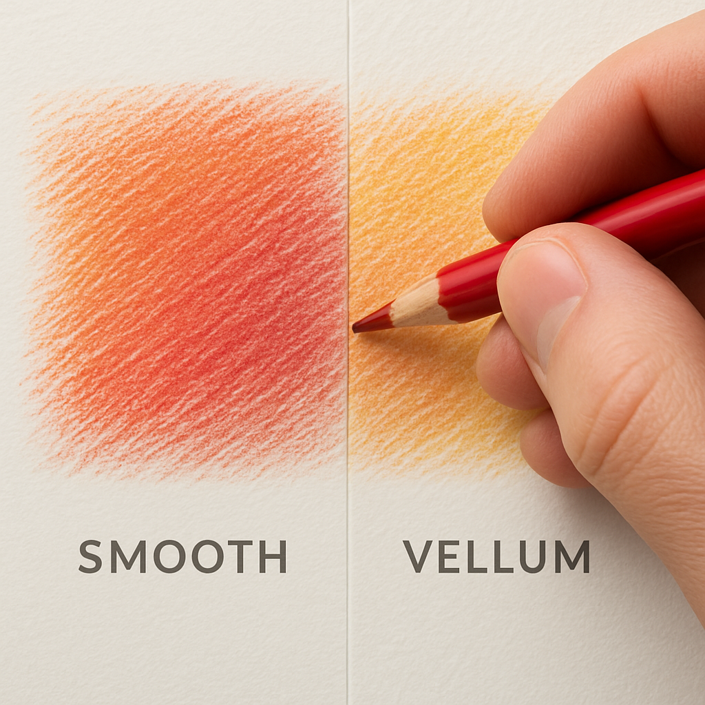
Rough paper gives you lots of “tooth,” which means the pigment can cling in the little valleys. It’s great for building deep layers, but blending can feel like you’re trying to smooth sandpaper. Medium‑grain, often called cold‑press or vellum, strikes a balance – enough bite for layers, yet smooth enough for a decent blend.
Smooth, hot‑press paper feels almost like a polished stone. It’s perfect for fine details and photorealistic work because the colors sit on top instead of sinking in. The trade‑off? You’ll run out of layers faster, so you might need a fixative or a light hand at the start.
So, which texture should you start with? If you’re still figuring out your style, grab a pad that offers both sides – one smooth, one medium. Flip back and forth as you experiment; you’ll instantly see which surface lets your pencils “sing.”
That video walks through a quick test: draw a simple gradient on three different textures and watch how the colors behave. It’s a handy way to decide without buying a whole box of paper first.
Weight – why grams per square meter (gsm) matters
Paper weight is the silent hero when you start mixing media. A lightweight 120 gsm sheet might curl when you add a solvent or a wash of watercolor pencil. Heavyweight paper, typically 300 gsm or more, stays flat and can survive a few vigorous burnishing strokes.
If you plan to use wet techniques or a lot of layering, aim for at least 300 gsm. Watercolor blocks and mixed‑media pads often sit in that sweet spot because they’re sized to slow down absorption, giving you more working time.
On the flip side, if you’re just practicing daily doodles, a 160‑200 gsm sketchbook will do fine and keep your budget happy. Just remember: heavier paper = sturdier surface = longer lifespan for your art.
Form factor – sheets, pads, or blocks?
Single sheets are perfect for trial‑and‑error. You can cut them to size, tape them to a board, and discard the ones that don’t work. Pads are convenient for studio work; the top sheet peels off cleanly, and you don’t have to worry about the paper slipping.
Blocks glue the sheets together on all sides, which means the paper stays taut when you work wet. No warping, no extra stretching. If you love watercolor pencils, a block is a low‑maintenance choice.
One last tip: keep a tiny checklist on your desk. Write down the paper’s acid‑free status, texture, weight, and form. When you’re in the store or scrolling online, you’ll spot the perfect match in seconds.
Best Heavyweight Bristol Paper
When you’re ready to layer color like you’re building a sunrise, you need a surface that won’t buckle under the pressure. Heavyweight Bristol gives you that solid, toothy canvas while staying smooth enough for fine detail.
1. Strathmore 500 Series Bristol – 100 % Cotton, 100 lb/270 gsm
This is the gold standard for artists who treat their sketchbook like a museum piece. Because it’s 100 % cotton, the paper stays neutral for years, so your colors won’t yellow.
What I love is the balance between a buttery smooth top and just enough tooth to grip the pigment. You can press, blend, or even burnish without seeing the surface give way. It’s heavy enough (100 lb/270 gsm) to survive dozens of layers – perfect for those hyper‑realistic portraits that need subtle gradations.
And if you ever decide to add a splash of watercolor pencil, the cotton base handles a light wash without warping. That versatility makes it a top contender for the best paper for colored pencils when you’re after professional‑grade results.
Strathmore’s guide notes that this paper “is unsurpassed for detailed work that will last for centuries.”
2. Strathmore 300 Series Bristol – Heavyweight Smooth, 100 lb/270 gsm
If you want professional feel without breaking the bank, the 300 Series is the sweet spot. It’s still 100 lb/270 gsm, so you get the same sturdy feel, but the surface is smooth rather than vellum.
That smoothness lets you achieve razor‑thin lines on a white background – ideal for technical illustrations or comic‑style coloring where every edge matters. At the same time, the paper holds enough “tooth” for layered color, so you won’t end up with a slick, plastic look.
Because it’s less expensive than the 500 Series, you can afford to experiment. Try a full‑body portrait on one sheet, then push the limits with a mixed‑media piece on the next – you’ll see how the paper behaves under both dry and slightly wet conditions.
How to Test Whether a Bristol Sheet Is Right for You
Grab two sheets – one smooth, one vellum – and draw the same gradient from light blue to deep navy. If the colors blend easily on the smooth side but you lose depth on the vellum, you know the smooth Bristol will give you that “butterfly wing” glide you crave.
Next, add a light watercolor wash over the gradient. The 500 Series will absorb just enough moisture to stay flat, while the 300 Series may show a faint bloom around the edges – a useful visual cue if you plan to mix wet media.
Finally, press a hard‑edge line with a metal ruler and then go back and erase. Heavyweight Bristol should let you erase without tearing, letting you correct mistakes without a single rip.
Quick Checklist Before You Buy
- Weight: 100 lb/270 gsm or higher.
- Fiber content: 100 % cotton for archival quality.
- Surface: Choose smooth for fine detail, vellum for extra tooth.
- Form factor: Pad for studio work, sheet for test runs.
- Price vs volume: 500 Series for lifelong pieces, 300 Series for everyday practice.
Bottom line: If you’re serious about building depth, richness, and longevity into every colored‑pencil piece, a heavyweight Bristol from Strathmore is the answer. Whether you pick the premium 500 Series or the value‑friendly 300 Series, you’ll notice the difference the moment you start layering.
Best Watercolor Paper for Colored Pencils
When you start mixing a little water or solvent with your pencils, the paper you’re on becomes the unsung hero. A good watercolor sheet gives you the tooth you need for pigment, yet stays flat when you add moisture.
1. 140 lb Hot‑Press Watercolor Paper (smooth)
This is the go‑to for artists who want a sleek surface that still holds a few layers of color. The hot‑press finish feels almost like a polished stone, so blending with a blending stump or a soft brush feels effortless. Because it’s 140 lb (about 300 gsm), it won’t buckle when you dab a light wash of watercolor pencil.
Tip: lay down a light layer of color, then spray a mist of water and let it dry – the paper’s smoothness lets the pigment glide without turning into a muddy puddle. Art is Fun notes that hot‑press paper “allows for detailed work and easy blending.”
2. 140 lb Hot‑Press Watercolor Paper – Premium Brand (extra‑white)
If you’re chasing that ultra‑bright, almost luminous look, a premium extra‑white hot‑press sheet is worth the extra pennies. The brighter base makes colors pop, and the same 140 lb weight protects against warping when you layer solvent‑based blends.
Real‑world example: I tried a sunset gradient on a regular white sheet and the reds looked a touch dull; on the extra‑white version they sang, especially after a quick solvent pass.
3. 300 gsm Cold‑Press (vellum) Watercolor Paper
Cold‑press gives you a medium‑grain “tooth” that grabs more pigment, perfect for building deep layers before you introduce any moisture. The 300 gsm weight is heavy enough to stay flat even after a generous wash, and the vellum texture adds a subtle texture to the final piece.
Many artists love the balance: enough tooth for layering, yet smooth enough that a wet brush won’t snag. UART points out that “the paper is so good that blending pencils together takes care of itself.”
4. 140 lb Hot‑Press Watercolor Paper – Archival Cotton Blend
For the archivist in you, look for a cotton‑rich blend that still carries the hot‑press finish. Cotton fibers are naturally pH‑neutral, so your colored‑pencil work won’t yellow over time. The 140 lb weight gives you the same flat‑drying surface, while the cotton content adds durability for heavy erasing or burnishing.
Pro tip: after you finish a piece, spray a light fixative; the cotton base holds the fixative evenly, preserving the vibrancy for years.
5. 300 lb Watercolor Block (mounted)
A block means the sheets are glued on all four sides, keeping the surface taut when you work wet. The 300 lb (about 640 gsm) thickness is a heavyweight champion – no buckling, no cockling, even if you soak the paper for a watercolor pencil wash.
Because the block is mounted, you can tape it to a board and work on a vertical surface without worrying about the paper slipping. It’s a bit pricier, but for professional commissions that demand flawless wet work, the stability is priceless.
So, which of these should you reach for first? If you’re just experimenting, start with a standard 140 lb hot‑press sheet – it’s cheap, versatile, and gives you a feel for how water interacts with pigment. As you get comfortable, graduate to a cold‑press vellum or an archival cotton blend for deeper layers and longer‑lasting art.
Remember, the “best paper for colored pencils” isn’t a one‑size‑fits‑all; it’s the paper that matches your technique, your medium, and the level of durability you need. Grab a couple of different textures, run a quick gradient test, and let the paper tell you which one sings for your style.
Best Smooth Bristol Paper
1. Strathmore 300 Series Smooth Bristol – 100 lb/270 gsm
Think of this as the “everyday hero” of smooth Bristol. It’s heavyweight enough to stand up to multiple layers, yet the surface is polished like a river stone. That buttery glide lets you lay down fine details without the pencil slipping off the page.
Because it’s smooth, you’ll notice your colors stay bright longer – perfect for those crisp line‑work portraits or comic‑style panels. And when you need a little extra control, a light hand with a blending stump feels almost like butter melting on the surface.
Pro tip: tape a sheet to a board, work vertical, and you’ll see why many illustrators swear by this paper for the best paper for colored pencils when they need precision.
2. Canson Bristol Smooth – 140 lb/300 gsm
If you’re on a tighter budget but still want that glass‑like feel, Canson’s smooth Bristol is a solid alternative. The weight keeps it flat even if you dab a little solvent, and the surface is smooth enough to let oil‑based pencils like Polychromos glide without “sticking.”
In a real‑world test, an artist reported that Polychromos “performed well on the smooth Bristol” and gave a clean, crisp line that held up after a quick fixative spray according to a detailed pencil comparison. That tells you the paper can handle professional‑grade cores without turning greasy.
3. UArt Sanded Bristol – 200 lb/350 gsm (light‑sand finish)
Now, I know “smooth” sounds like no texture at all, but UArt’s light‑sand version gives just a whisper of tooth while staying essentially smooth. That tiny bite helps oil‑based pencils catch a bit of pigment, so you get a richer color payoff without losing the sleek feel.
Artists who love the buttery core of Derwent Lightfast have said the paper “eats” the softer pencils, but the sanded Bristol offers enough grip to keep those colors from sliding away as mentioned in a colored‑pencil review. It’s a happy middle ground for those who want smoothness with a hint of texture.
4. Strathmore 500 Series Smooth Bristol – 100 lb/270 gsm (100 % cotton)
When longevity matters, go premium. This cotton‑based sheet stays neutral for decades, so your vibrant sketches won’t yellow. The surface is ultra‑smooth, making it a dream for detailed work and for layering thin washes of watercolor pencil without warping.
Because it’s 100 % cotton, you can also use a fixative without worrying about the paper reacting. It’s a bit pricier, but if you’re building a portfolio or selling prints, the archival quality is worth the extra spend.
Quick “cheat‑sheet” before you buy
- Weight: aim for 100 lb (270 gsm) or higher – it resists buckling.
- Surface: true smooth (no visible grain) for fine detail; light‑sand if you need a whisper of tooth.
- Fiber content: 100 % cotton for archival pieces, wood‑pulp for budget‑friendly options.
- Form factor: sheet for test patches, pad for studio flow.
So, which smooth Bristol should you reach for? If you’re just starting out, grab a Canson sheet and see how it feels. As your confidence grows, upgrade to Strathmore’s 300 or 500 Series for that professional edge. And remember, the “best paper for colored pencils” isn’t a magic bullet – it’s the one that lets your pencils sing the way you want them to.
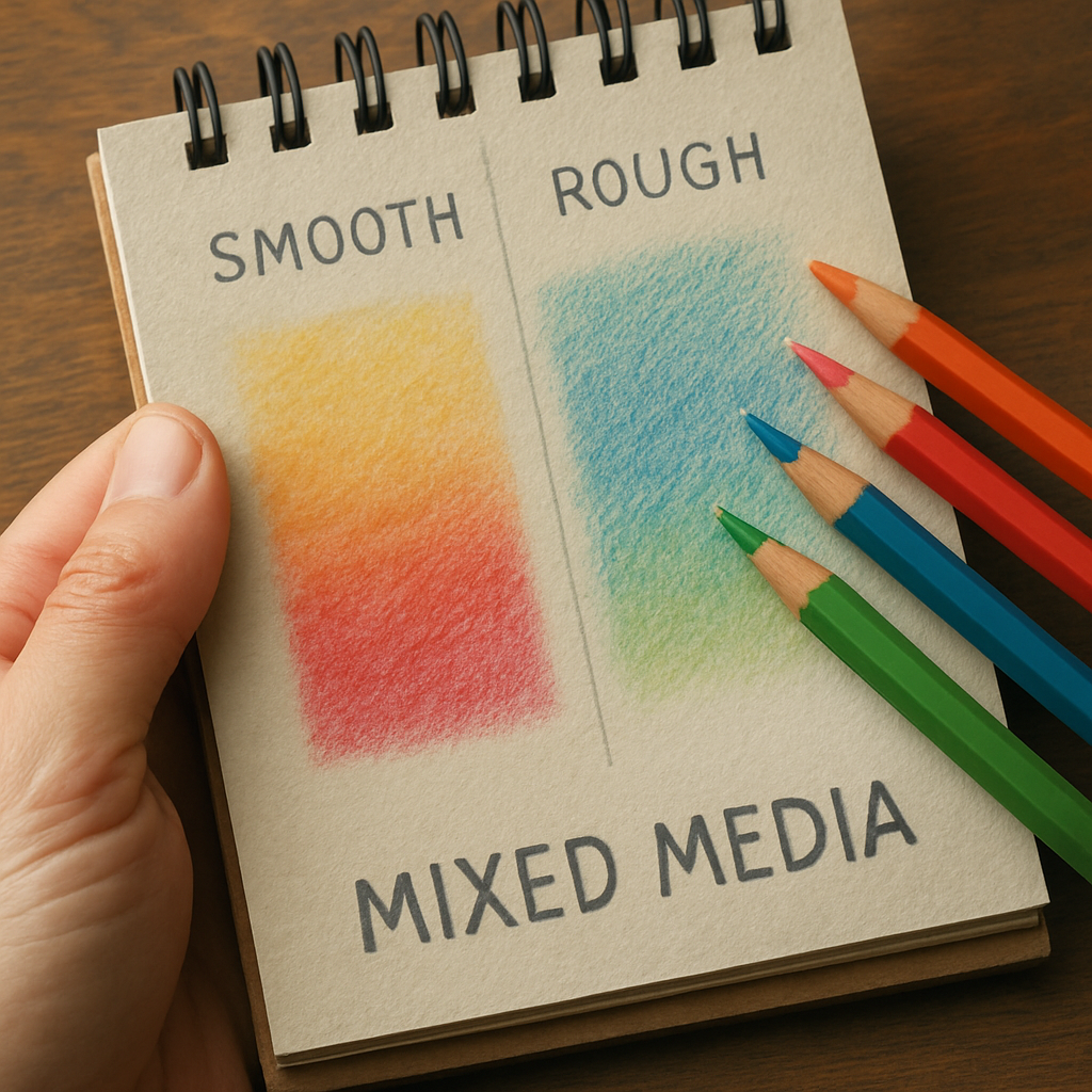
Best Mixed Media Pad
When you start mixing watercolor pencils, gouache, or even a splash of ink, the paper has to be a true team‑player. A mixed‑media pad gives you that flexibility without the paper buckling or the colors bleeding into the grain.
If you’re unsure how to blend those colors smoothly, check out our step‑by‑step blending guide for techniques that work on any of these pads.
1. Strathmore Visual Journal – Mixed Media (140 lb, 300 gsm, acid‑free)
This pad is a hidden gem for artists on a budget. Each sheet is 140 lb, which is thick enough to survive a light wash of watercolor pencil but still thin enough to stay in your sketchbook. The surface is “medium‑smooth,” meaning you get a whisper of tooth for layering colored pencils and enough slickness for ink work. In my studio, I used it for a series of botanical studies: I laid down a dry Derwent Lightfast base, then brushed on a dab of water‑soluble gouache to bring out the veins. The paper held the pigment without warping, and the colors stayed vibrant after a week of display.
Tip: before you start, tape the back corner of the sheet to a board. The extra tension keeps the page flat when you add a wet wash.
2. Canson XL Mixed Media – Rough (114 lb, 260 gsm)
If you crave a bit more texture, the Canson XL Rough pad delivers. The paper is slightly heavier than the Strathmore but has a subtle grain that grabs charcoal, pastel, and colored pencils alike. I tested it on a portrait of a friend: three layers of Prismacolor Premier built up a smooth skin tone, then a quick charcoal sketch for the hair. The rough surface prevented the charcoal from smudging into the skin, something that would happen on a perfectly smooth sheet.
Actionable step: run a quick “tooth test” – draw a line with a hard‑lead pencil. If the line leaves a faint groove, you have enough texture for dry media; if it slides, switch to a smoother option.
3. UArt Sanded Mixed Media – Light‑Sand (200 lb, 350 gsm)
UArt’s light‑sand finish is the sweet spot between smooth and rough. The heavier 200 lb weight means you can even dab a little alcohol‑based ink without worrying about cockling. A recent project for a client logo involved layering colored pencils, then adding a thin wash of alcohol ink for a glossy effect. The paper’s sanded surface gave the ink a subtle “crackle” that turned the logo into a tactile piece.
Pro tip: after the ink dries, gently rub a white vinyl eraser over the surface. The sanded texture lifts a faint highlight, adding depth without extra pigment.
So, how do you pick the right pad? First, consider the wetness of your media. If you’re mostly dry with occasional light washes, the Strathmore Visual Journal is a cost‑effective starter. For heavier layering of dry media plus charcoal, go with Canson XL Rough. When you want to experiment with inks or light solvents, the UArt Sanded pad gives you that extra durability.
Here’s a quick decision‑making table to keep on your desk:
| Pad | Weight / GSM | Surface | Best For |
|---|---|---|---|
| Strathmore Visual Journal | 140 lb / 300 gsm | Medium‑smooth | Light watercolor pencil washes, ink, budget projects |
| Canson XL Mixed Media – Rough | 114 lb / 260 gsm | Rough | Charcoal, pastel, heavy colored‑pencil layering |
| UArt Sanded Mixed Media | 200 lb / 350 gsm | Light‑sand | Alcohol ink, light solvent, mixed‑media experiments |
Remember, the “best paper for colored pencils” isn’t a one‑size‑fits‑all. It’s about matching the pad’s weight, surface, and acid‑free status to the media you love. As the Frugal Crafter notes, acid‑free papers keep your artwork from yellowing, which is crucial for pieces you plan to sell or archive.
Finally, a little side note: just like you wouldn’t buy a heater without checking its efficiency, choosing the right mixed‑media pad deserves the same care. For a completely different but equally thoughtful purchase, you might read about the top 8 kW wood‑burning stove models – the principle of research applies everywhere.
Take one of these pads, run a quick gradient test, and let the paper tell you which one sings for your style. Happy mixing!
Tips for Choosing the Right Paper
Ever opened a fresh pad, only to feel that vague disappointment when the pencils just don’t “stick” the way you expect? You’re not alone. The paper is the silent partner in every colored‑pencil piece, and a good match can turn a flat sketch into something that practically glows.
So, how do we stop guessing and start choosing with confidence? Let’s break it down together, step by step.
Know Your Priorities First
Before you even glance at a product page, ask yourself what you really need. Are you layering heavy colors for a portrait? Do you dab a little watercolor pencil for a soft wash? Or are you keeping it simple with quick studies?
Each goal pushes a different paper characteristic to the front of the line. When you write down the answer, the rest of the decision‑making becomes way less overwhelming.
Test the Tooth (Texture) Quickly
Grab a single sheet from any pad and draw a thin line with a hard‑lead pencil. If the line leaves a faint groove, you’ve got enough “tooth” for dry media. If it slides like it’s on glass, you’ll need a rougher surface for charcoal, pastel, or heavy colored‑pencil layering.
Here’s a quick trick: flip the sheet over and try the same line on the other side. Many mixed‑media pads give you a medium‑smooth face on one side and a rough side on the back – perfect for experimenting without buying two different products.
Weight Matters More Than You Think
Paper weight, measured in grams per square meter (gsm), is the quiet hero that keeps your work flat. A 120 gsm sheet will curl the minute you add a light wash, while a 300 gsm or heavier pad stays stubbornly flat even after a few vigorous burnishing strokes.
Think of weight like the thickness of a phone case – the thicker it is, the better it protects against drops (or in our case, against warping).
Acid‑Free and Archival Quality
If you plan to sell or archive your art, acid‑free paper is non‑negotiable. Acid‑free fibers keep colors from yellowing over time, so your masterpiece stays as vibrant ten years from now as it does today.
Many artists treat this like choosing a sturdy frame for a painting; the paper is the frame of your colored‑pencil work. A quick look at the product description – “acid‑free” or “pH‑neutral” – should be your first checkpoint.
Balance Cost and Quality
We all love a good bargain, but cutting corners on paper can cost you more in wasted time and materials. According to a detailed review of art supplies, cost and quality are the two most important factors when choosing materials. The same principle applies to paper: find a pad that gives you the performance you need without breaking the bank.
For everyday practice, a 140 lb mixed‑media pad offers solid weight and decent tooth at a modest price. When you move to portfolio‑level work, consider stepping up to a 200 lb or 300 gsm cotton‑rich sheet – the extra investment pays off in longevity and color payoff.
Create a Quick Paper Checklist
Write these five items on a sticky note and keep it by your sketchbook:
- Weight: aim for 300 gsm or higher for wet or heavy layers.
- Texture: medium‑smooth for versatility, rough for heavy layering.
- Acid‑free: yes/no.
- Form factor: pad for studio flow, sheet for test patches.
- Budget: decide if you need archival cotton or can start with wood‑pulp.
Every time you’re in a store or scrolling online, glance at the list. If a pad checks three or four boxes, you’ve likely found a winner.
And here’s a tiny habit that makes a huge difference: before you start a new piece, do a “gradient test.” Draw a light‑to‑dark gradient across the sheet, add a dab of water, and watch how the colors behave. The paper that lets the gradient glide smoothly without blotching is the one that will let your style sing.
So, what’s the next move? Grab the pad that feels right in your hand, run that quick test, and let the paper guide your next masterpiece.
Happy paper hunting!
FAQ
What paper weight should I choose for heavy layering with colored pencils?
When you start piling on color, you want a surface that won’t buckle under pressure. Aim for at least 300 gsm (about 140 lb) – that’s the sweet spot for most wet or burnished techniques. Heavier paper holds the pigment in the “tooth” longer, so your layers stay vivid and you avoid that annoying cockling that makes a sketch look like a crumpled napkin.
Does acid‑free paper really matter for colored‑pencil art?
Absolutely. Acid‑free (or better yet, 100 % cotton) fibers stay pH‑neutral, which means the colors you work hard on won’t yellow or become brittle over time. If you plan to sell a piece or keep it in a portfolio, acid‑free paper is the archival safeguard that keeps your reds bright and your blues cool for years, not just months.
Should I use smooth or textured paper for realistic portraits?
For tight, realistic work, a smooth surface like hot‑press Bristol gives your pencils a glass‑like glide, letting fine details pop without the grain fighting your strokes. But a light‑sand or medium‑smooth texture can add subtle depth to skin tones because the tiny “tooth” catches pigment in those little valleys. Try a quick gradient test on both sides of a pad – the one that lets the transition stay seamless is usually your winner.
Can I mix watercolor pencils on the same sheet I use for dry colored pencils?
Yes, as long as the paper is thick enough (140 lb/300 gsm or more) and has a bit of tooth. Hot‑press watercolor paper works well because it’s smooth for dry layers yet sized to hold a light wash without warping. Just let the wet area dry completely before you go back to dry blending, or you’ll end up with smudgy streaks that ruin the crispness you worked for.
What’s a quick way to test if a new pad is right for my style?
Grab a single sheet, draw a light‑to‑dark gradient, then dab a tiny drop of water on the middle. If the gradient glides and the paper stays flat, you’ve got the right weight and texture. If the water beads up or the paper curls, look for a heavier, more absorbent option. This 30‑second test saves you from buying a whole block that doesn’t sing for you.
How often should I replace my mixed‑media pad?
It depends on how aggressively you work. If you’re doing heavy wet washes, burnishing, or frequent erasing, a pad will start showing “ghost” impressions after about 15–20 sheets. Once the surface feels less toothy or you notice warping, it’s time to grab a fresh pad. For dry‑only studies, you can stretch a pad to 30‑40 sheets before noticing any performance dip.
Is there a budget‑friendly paper that still performs well?
Definitely. Look for a 140 lb mixed‑media pad that’s labeled “medium‑smooth” and “acid‑free.” Brands often offer a wood‑pulp version that still delivers solid weight and enough tooth for layering without breaking the bank. Pair it with the gradient test we mentioned, and you’ll have a cost‑effective surface that holds up for everyday practice and even a few portfolio pieces.
Conclusion
After wandering through smooth Bristol, heavyweight blocks, and budget‑friendly mixed‑media pads, you’ve seen why the “best paper for colored pencils” isn’t a one‑size‑fits‑all answer.
What matters most is weight, texture, and acid‑free status. A 300 gsm or heavier sheet keeps wet washes flat, while a medium‑smooth surface gives you enough tooth for layering without the grain fighting your strokes.
Remember the quick gradient test we’ve been using: draw a light‑to‑dark ramp, dab a drop of water, and watch. If the paper stays smooth and the colors glide, you’ve found a winner.
So, what’s the next move? Grab a pad that feels right in your hand, run that 30‑second test, and let the paper speak. If it curls or beads, swap for a heavier option – it’s cheap insurance against wasted time.
And don’t forget the archive angle. Acid‑free, preferably cotton‑rich, paper guarantees your colors stay vibrant for years, which matters whether you’re selling prints or keeping a personal sketchbook.
Bottom line: start with a versatile mixed‑media pad, experiment with a smooth Bristol for fine detail, and upgrade to heavyweight cotton when you need that extra durability. Your pencils will thank you, and your art will finally sing.
Now go ahead, test a sheet, and let your creativity flourish.
