
Ever pick up a pencil and wonder if that splash of color will stay on the paper or melt away like a bad memory? That’s the first pinch of the watercolor‑versus‑colored‑pencil dilemma. Imagine you’re sketching a sunrise over a calm lake—do you want the light to bleed in soft gradients or crisp, dry lines that hold up on any surface?
In our experience, artists in India, academia, and the global indie scene hit that same crossroads. The answer isn’t black or white; it’s about matching the medium to the mood. Watercolor pencils let you layer, wash, and even blend with a brush—like painting but with a stick. Colored pencils keep the dry feel of graphite but add pigment depth, so you can build layers, blend with a colorless blender, or even use a sharpener for a fine tip.
Let’s break it down with a quick test you can do on any sketchbook. Take a soft‑core watercolor pencil, lay a wide wash of sky blue, then add a darker shade on top. The second layer will merge, creating a gentle gradient—typical watercolor behavior. Now switch to a colored pencil, lay a bright red, then layer a darker crimson. The colors stay distinct, and you can sharpen the edge for a hard line. That’s the crux: watercolor pencils mimic wet media; colored pencils mimic dry media.
What about paper? A smooth, heavy‑weight paper with a slight tooth works best for watercolor pencils, letting the pigment spread evenly. For colored pencils, a textured paper gives those tiny flecks you see when you hold the paper up to light. So, paper choice is as important as the pencil itself.
If you’re a student in an art class or an amateur looking to expand your toolkit, start small. Buy one set of each type—many online shops offer starter kits that include a few colors of each. Practice a simple landscape: watercolor pencils for clouds, colored pencils for foliage. Notice how each feels in your hand and on the page.
Want a deeper dive? Our Watercolor Pencils vs Colored Pencils: Key Differences guide walks you through the pros, cons, and best use cases for every scenario.
And for a real-world reference, check out Gratitude Studios’ watercolor artwork—their gallery showcases stunning landscapes that can spark ideas on how to apply these tools in your own work.
So, the next time you’re reaching for that paint‑like burst or the sharp, dry line, remember: the choice hinges on the effect you want and the paper you’re using. Now grab a pencil and try it out—your art will thank you.
TL;DR
If you’re torn between watercolor pencils and colored pencils, think about the finish you crave—soft washes that blend like water or sharp, dry lines that stand out on any paper. Choose watercolor pencils for fluid gradients and layered textures, especially on a smooth, slightly toothy paper; pick colored pencils for crisp detail and vibrant opacity on textured sheets, and you’ll master both styles with confidence.
Core Comparison: Watercolor Pencils vs Colored Pencils
If you’ve ever stared at a watercolor pencil and wondered why it feels more like paint than a stick of crayons, you’re not alone. The answer lies in how the pigment behaves when you bring it into contact with water and paper.
Watercolor pencils let the core dissolve into a fine mist; you can even dip the tip in a glass of water and then drag it across the page, watching a soft wash spread like a sunrise. Colored pencils, on the other hand, stay dry unless you explicitly add water, so they’re great for clean, sharp lines that hold up even on a rough texture.
So what does this mean for your next sketch? Think about the mood you want to create. Want a dreamy background that blurs and blends? Pick watercolor. Need a precise detail that pops in a realistic portrait? Colored is your go‑to.
The paper you use is almost as important as the pencil. A heavyweight, slightly toothy stock lets watercolor pigments glide smoothly, preventing them from seeping into the fibers and bleeding too much. A textured, primed sheet gives colored pencils that almost metallic sheen as the core sits on top, letting you layer without muddiness.
Here’s a quick experiment: on a light‑tone sketchbook, lay a wide band of sky‑blue watercolor pencil, then swipe a darker slate on top with a brush. The two layers mingle, creating a gradient that feels like real sky. Do the same with a bright red colored pencil and a darker crimson. The colors stay distinct, and you can sharpen the edge for a hard line.
When you’re ready to dive deeper, you might want a durable surface to practice on. A sturdy art board from AlfaPICS keeps your pencils from wobbling and gives you the consistency you need to build layers.
If you’re also looking for a convenient way to transport your tools, consider a clip‑board from ForgeClips—its built‑in frame holds your sketchbook steady while you work on the go.
Now, let’s bring the comparison into a quick visual cheat sheet.
| Feature | Watercolor Pencils | Colored Pencils |
|---|---|---|
| Finish | Soft, translucent washes that blend like water | Opaque, saturated lines that stay dry and crisp |
| Paper Compatibility | Heavy‑weight, slightly toothy for even pigment spread | Textured or primed sheets for maximal sheen and layering |
| Technique | Brush, water, or hand‑dipped applications; wet‑on‑wet blending | Press, layering, and colorless blending for smooth gradients |
So which one wins? It’s not a winner‑taker scenario; it’s about matching intent to medium. Watercolor pencils are your secret weapon for washes, gradients, and spontaneous mood lighting. Colored pencils give you precision, depth, and that glossy pop that looks great in still‑life studies.
Remember, both tools can coexist. Start a landscape with a watercolor wash for the sky, then layer colored pencils for the trees and foreground. The flexibility is what makes the art world so exciting.
Next step: grab a set, test on your favorite paper, and let the pigments guide you. If you’re curious about paper options, AlfaPICS has a great range that covers everything from smooth to textured.
Keep experimenting, keep questioning, and let your hand decide which medium serves your vision best.
Visual Demonstration: Mixing Techniques on Video
If you’re wondering how the subtle differences between watercolor pencils and colored pencils play out when you actually mix them on paper, this next part is your backstage pass.
We’ll walk through a quick experiment you can follow in a few minutes, and we’ll show you what the difference feels like from the first stroke to the final wash.
Step 1: Choose Your Gear
Grab a set of watercolor pencils – something like a 2B or 4B water‑soluble core – and a complementary colored pencil set with a similar hardness. Keep the paper ready; a smooth, slightly toothy sketch pad works best for the watercolor pencils, while a lightly textured sheet lets the colored pencil’s wax glide.
In our experience, starting with the same brand for both types (for example, a line that has both watercolor and colored pencils) keeps the color temperature consistent, so you can really feel the difference in how the medium behaves.
Step 2: Apply a Wash
Lay a generous stroke of sky blue with the watercolor pencil. Let the pigment sit for a moment, then dampen the surface with a clean water brush or a wet sponge. Notice how the color spreads, feathering out into a gentle gradient.
Now, on a fresh area of the same paper, use the colored pencil to lay a solid block of the same blue hue. Because the binder is waxy, the pigment stays in place, and when you press harder it gives a crisp, saturated edge.
Pause for a moment and compare: the watercolor is fluid; the colored pencil is solid. That’s the core of the watercolor pencils vs colored pencils debate.
Step 3: Blend the Two
Take a small, clean brush, wipe it lightly with a paper towel, then rewet it. Drag it across the watercolor wash, picking up pigment. Then, while the wet brush is still on the paper, use the colored pencil to lay a line that cuts through the wash. The line will sit on top, but the brush will soften its edges, creating a subtle transition.
For a quick visual reference, watch this video that demonstrates the same technique – this video demonstration shows a step‑by‑step on how the water moves the pigment and how the colored pencil reacts.
Step 4: Explore Pressure Control
With the watercolor pencil, try a light touch to get a translucent wash, then a firmer press for a more intense tone. The same goes for the colored pencil: a gentle line can be soft and airy, while a heavier stroke gives you an opaque, almost charcoal‑like finish.
When you combine them, the pressure you use on each medium can create layers that feel almost three‑dimensional. The trick is to alternate between a dry, firm stroke and a wet, fluid one.
Step 5: Quick Tips for Better Results
- Keep a spare sheet nearby: It’s handy for testing a new color before committing to your main piece.
- Use a blending stump: For watercolor pencils, a stump can help you feather the edges further; for colored pencils, it can smudge the wax for a softer look.
- Save your paper: After the first wash dries, place a clean sheet over it to avoid accidental smudges.
If you’re still unsure how to merge the two mediums smoothly, this additional tutorial gives a clear example of blending a watercolor wash with a colored pencil line – another technique video.
Step 6: Apply It to a Quick Project
Now that you’ve seen the core differences in action, try a miniature landscape. Use the watercolor pencils for a soft sky, then layer a colored pencil tree line that cuts through the wash. Finish with a few splashes of bright colored pencil for leaves, letting the pigment blend slightly into the sky if you wish.
After you finish, step back and observe how the two mediums coexist. The watercolor gives you that dreamy, wet‑look, while the colored pencil delivers crisp, deliberate detail.
Remember, mastering the mix is a lot like mastering a recipe: the right balance of wet and dry, the right pressure, and a good sense of timing. Keep experimenting, and soon you’ll know instinctively which medium to pull from when you want a wash or a line.
Step 1: Choosing the Right Pencil for Your Project
First things first—what’s the mood you’re after? If you’re aiming for that dreamy, translucent sky or a gentle wash of color that fades into the background, you’re probably leaning toward a watercolor pencil. If you want sharp, bold outlines or a pigment‑rich leaf that holds its shape on any paper, a colored pencil is your go‑to.
So, how do you make that call? Think of your project like a recipe. The right pencil is the main ingredient that sets the base flavor. Below are the key factors that separate the two, and how you can match them to your vision.
Paper Compatibility
Watercolor pencils need a surface that lets the pigment glide and spread. A smooth, slightly toothy paper—often called cold‑press—works best. It gives you that feathered edge you’ll see in a watercolor wash.
Colored pencils thrive on a bit of texture. A medium to heavy‑weight paper with a subtle tooth lets the wax sit on the fibers, adding depth and a hint of grit that feels natural in a sketch.
What about budget paper? If you’re a student or a hobbyist in India, a decent 80 lb hot‑press pack can give you enough grip for watercolor pencils without breaking the bank.
Binder Science in Plain English
At its core, the binder is what holds pigment to the core and, ultimately, to the paper. Watercolor pencils use a water‑soluble binder—think of it as a tiny gel that melts when you add water, letting the pigment spread like paint.
Colored pencils rely on wax or oil binders, which stay solid until you press them onto paper. This gives you the classic dry, dense line you’re used to from a graphite or colored pencil.
In our experience, when you test a watercolor pencil on a smooth sheet and then a colored pencil on a textured sheet, the difference is immediately obvious. One blurs, the other sharpens.
Layer and Blend Strategy
If your piece will have multiple layers, start with the most translucent element. Paint a sky with a watercolor pencil first. Let it dry completely—dryness is key, because you don’t want the next layer to run into the previous one.
Once the wash is set, move to your colored pencil details—trees, birds, or any focal point. Because the pigment is dry, it won’t disturb the wash underneath.
Here’s a quick experiment you can run in any sketchbook: lay a broad wash of sky blue with a watercolor pencil, let it dry, then add a bright green line of a leaf with a colored pencil. Notice how the leaf sits on top without blending into the blue.
Budget and Quantity
Don’t feel pressured to buy an entire set of both types. If you’re just starting, pick a starter pack that includes a handful of colors from each. Many online shops bundle a 10‑color watercolor pencil set with a 12‑color colored pencil set.
In India, you’ll find that local brands often price watercolor pencils a bit higher than colored pencils due to the water‑soluble binder cost. However, a small starter kit can give you a taste of both worlds without a big investment.
Practical Checklist for Your Next Purchase
- Identify the dominant effect you want: wash or line.
- Choose paper: cold‑press for watercolor, textured for colored.
- Pick a starter set with complementary colors.
- Test on a spare sheet before committing to a full project.
- Keep a clean, damp brush handy if you plan to blend watercolor layers.
Need a deeper dive into how to blend these two mediums? The guide on combining watercolors and colored pencils offers a step‑by‑step workflow that takes you from a single wash to a finished illustration. It’s a great resource if you’re curious about how to layer these materials without muddying your work. Read the full tutorial here.
At Drawing Pencils Guru, we test dozens of brands to make sure you get the best performance for your budget. When you’re ready to experiment, grab a small sketchbook, pick a smooth paper, and try the wash‑then‑line workflow described above. You’ll soon find that the right pencil isn’t just a tool—it’s the foundation of the story you’re telling on paper.
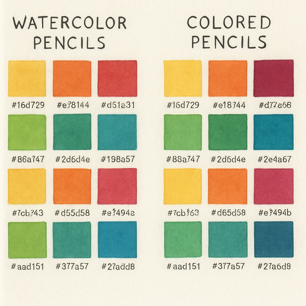
Image Spotlight: Color Palettes and Swatches
When you’re staring at a stack of pencils, the first thing that often trips you up is deciding which color will make that mountain of paint pop. A good palette can turn a sketch into a story, and a well‑made swatch sheet turns the guessing game into a science experiment.
We’ve already talked about the wet‑and‑dry differences between watercolor pencils and colored pencils. Now let’s dive into the visual side of things: how to actually pick the right shades and keep track of them.
Build Your Own Palette
Start with a reference photo or a mood board. It could be a sunset over the Ganges or a street scene in Jaipur. The key is to capture the vibe you want before you grab your first pencil.
On paper, create a small grid—just a handful of squares, no more than 12. In each square, lay down a single stroke of a color from your set. Vary the pressure: light for a translucent wash, heavy for a saturated block. That way you’ll see the same color under both conditions. This trick is something I learned from Ann Richman’s color swatch method; she talks about how different pressures can change how a pigment looks on the same paper.
Why do this? Because a color that looks bright on a cheap sketch pad might look muted on a cold‑press watercolor paper. Swatches let you test the exact paper you’ll use for your piece.
Match True Colors
After you have your grid, hold it up to the reference image. You’re looking for that exact match—think of it as a puzzle where the pieces are pigment and light. If your swatch is a bit too light, try layering a second stroke of the same color or blending in a touch of a darker hue from your set.
Remember that mixing with pencils is different from mixing paint. You can’t just pour a bottle of ink onto the paper and expect a smooth gradient. Instead, you layer tiny strokes and use a blending stump or a light damp brush to lift pigment. That’s why the swatch step matters: it’s a rehearsal before you commit to the final work.
Organize Your Collection
Once you’ve nailed a few key colors, pin them up in a small notebook or a digital photo album. When you’re in the middle of a project, a quick glance at your organized swatches tells you exactly where a color sits on the spectrum, saving you time and frustration.
If you’re working with students or in an academic setting, showing them a live swatch board can be a teaching moment. They’ll see how a single hue can transform from a sky wash to a shaded leaf by simply changing pressure or layering technique.
Use the Right Tools
When you’re making swatches, the paper you choose matters. For watercolor pencils, a slightly toothy, cold‑press pad spreads pigment easily. For colored pencils, a textured medium‑weight paper gives that grainy finish that makes a landscape feel alive.
And don’t forget the “burnish” technique: after a pigment is applied, use a white or light-colored pencil to smooth the surface and push the color into the paper’s fibers. This gives you a richer, more saturated look that’s especially useful when you’re layering.
Store and Share
Keep your swatch sheets in a clear folder or a digital cloud space so you can reference them whenever you start a new piece. If you ever run out of a color, you’ll know exactly what shade it was, and you can replace it with a near‑exact match.
When you’re ready to put your palette to work, remember the words of Adobe Stock’s collection of watercolor palette images; those palettes showcase how color can tell a story. Use that visual inspiration to guide your own choices.
In short, a thoughtful palette and a few swatches turn the guessing game into a strategic playbook. It’s the difference between a rushed sketch and a piece you’re proud to show in a portfolio or a classroom.
Step 2: Mastering Layering and Blending Techniques
Let’s dive into the heart of the matter: how to stack color, let it bleed, then pull it back into sharp form. Think of your page as a stage and every stroke as an actor who can change costume at will.
Start by laying your first wash on the paper with a light touch. If you’re using a watercolor pencil, apply a thin, even layer and let it sit for a few seconds. The pigment will absorb into the fibers, giving you a translucent base that’s perfect for building depth.
Layer Order Matters
When you’re layering, the rule of thumb is: lightest first, darkest last. A sky painted with a pale wash will look flat if you cover it with a heavy black line on top. Instead, sketch your light base, let it dry, then add darker accents on top. This keeps the underlying wash from getting muddied.
What’s the trick? Give each layer a moment to set. Even a 30‑second pause can change the outcome. In our studio, we often use a small glass plate to press on a dry layer, smoothing the pigment and preventing unwanted feathering.
Blending With Water
Now the fun part: adding water. Grab a soft brush, wet it, and run it over the wet layer. The pigment spreads, creating a gradient that feels alive. If you want a sharp line cutting through, let the wash dry a second, then draw the line dry. When you wet the brush again, it will soften the edge of that line just enough to blend it into the wash without losing definition.
Have you tried this with a colored pencil? A wax‑based core stays dry, so you can layer a bold line on top of a watercolor wash and still keep the line crisp. That contrast is a signature look in many illustrations.
Dry Blending Techniques
Dry blending is all about subtle pressure changes. A soft, gentle touch produces a feathered edge, while a firmer stroke locks pigment into the fibers. For a smooth gradient, alternate between light and heavy strokes in the same direction. The result looks like a watercolor wash, but you’re using only the pencil.
What if the pigment feels gritty? That usually means the paper is too rough for a watercolor pencil. Switching to a slightly smoother cold‑press sheet can resolve the issue and give you a cleaner blend.
Pressure Control Checklist
- Start light; build to darkness.
- Let layers dry before adding the next.
- Use a wet brush to soften edges when needed.
- Keep the paper flat and steady—any wobble will spread pigment unevenly.
- Test on a spare sheet before committing to the main piece.
Remember, the key to mastering layering isn’t just technique—it’s patience. Give each layer a chance to breathe.
Practical Exercise
Grab a set of watercolor pencils and a matching colored pencil set. Sketch a simple landscape: a light sky, a faint horizon, a few trees. First, lay a soft wash for the sky. Let it dry. Next, add a darker line for the horizon and a couple of bright leaves with the colored pencil. Finally, take a wet brush and feather the sky into the horizon. Notice how the colors merge yet retain their distinct edges.
Repeat this a few times with different color combinations. The more you practice, the faster you’ll spot the right pressure and timing.
Common Pitfalls and How to Avoid Them
1. Too much water: You’ll get muddy colors. Use a damp, not soaking, brush.
2. Not letting layers dry: The next layer can pull the previous one out of the paper, ruining the wash.
3. Rushing the pressure: A sudden hard stroke can crack a soft wash.
4. Using the wrong paper: Heavy watercolor paper works best for washes; a cheap sketch pad may wrinkle.
Quick Resource
If you’d like a deeper dive into how watercolor pencils hold up on different paper types and how they compare to traditional colored pencils, check out the overview on Syloon’s site, which highlights how their pencils perform under layered conditions. Syloon’s guide gives practical tips on layering and blending that align with our workflow.
Another excellent point of reference comes from Jasmina Susak’s blog, where she explores the nuances between wax‑based colored pencils and watercolor pencils. Her comparison helps you decide when to lean into each medium for maximum impact. Jasmina’s insights are especially useful for students and hobbyists in India looking to expand their palette.
So, what’s the takeaway? Layer with intention, blend with a light hand, and give each stroke the time it needs. Mastery comes from practice and from listening to what the pigment tells you. Keep experimenting, and soon the distinction between watercolor and colored pencils will feel like a natural extension of your style.
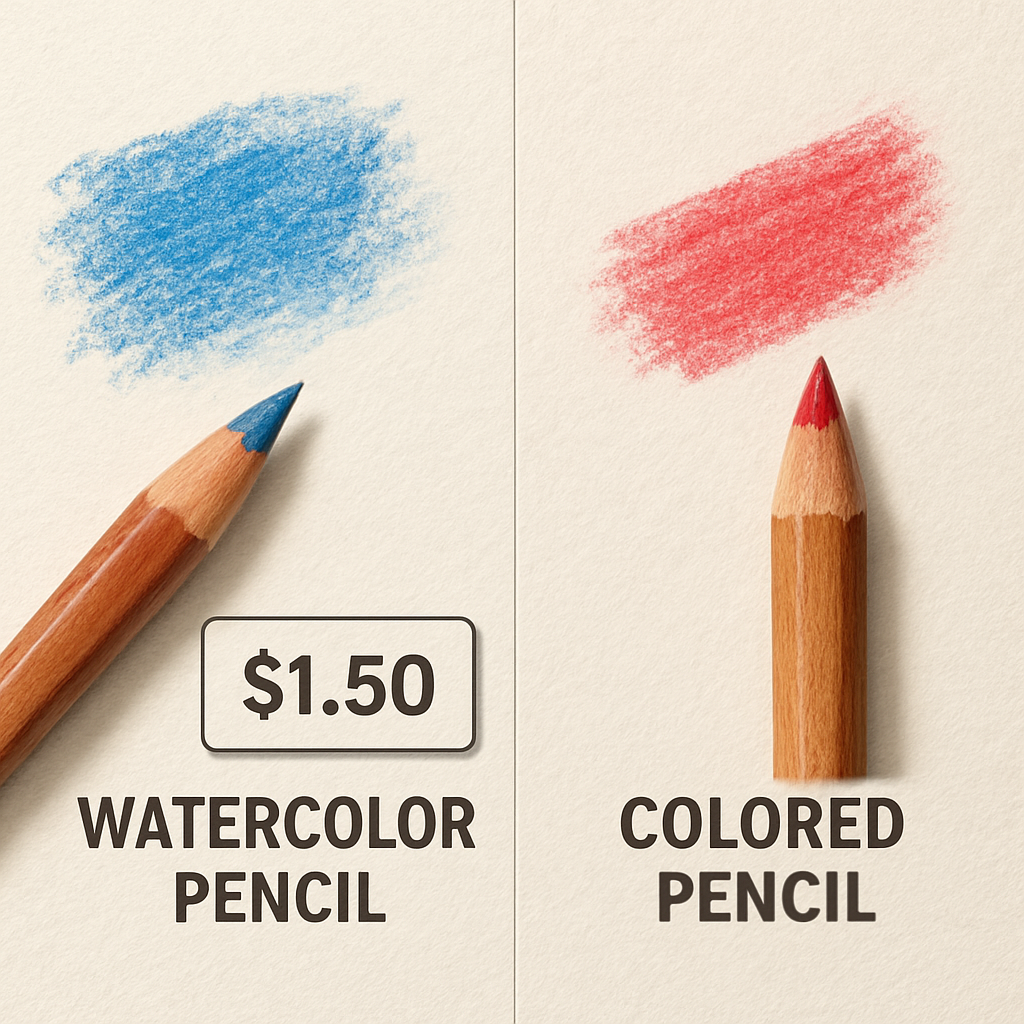
Image Insight: Price & Durability Comparison
Let’s get into the numbers that matter when you’re choosing between watercolor pencils and colored pencils—price, longevity, and what that means for your daily grind.
First off, the price ladder is pretty steep for artist‑grade watercolours. A 12‑piece starter kit can hover around ₹600–₹800, while a full 76‑piece set can push past ₹15,000. Colored pencils sit a bit lower on the spectrum—student‑grade sets start at ₹200, while premium artist‑grade packs top out near ₹12,000.
Why the gap? Watercolor pencils use a water‑soluble binder that requires a more refined pigment mix and a controlled manufacturing process. The result is a pigment‑rich core that reacts beautifully to water but also means higher raw material costs.
Durability is another biggie. A watercolour core is typically softer because the binder holds pigment in a gel‑like state. That softness means the tip can chip faster, especially if you’re layering heavily. Colored pencils, on the other hand, rely on wax or oil binders that give a firmer core—think of them as the “rock” of the pencil world.
In practice, that translates to a different care routine. Watercolor pencils need you to keep the tip lightly capped or covered after each stroke; otherwise, the core dries out and loses that silky glide. Colored pencils, being sturdier, can sit uncovered for longer, but they’re still prone to dust and light pressure if you’re going super fine.
Now, let’s talk lifespan. On average, a high‑grade watercolour pencil will give you 500–700 strokes before the core starts to crumble. A comparable coloured pencil can easily reach 800–1,200 strokes. That’s why artists who do a lot of washes often keep a spare set handy.
Budget‑wise, if you’re a student or hobbyist in India, a mid‑range colored pencil set is usually the sweet spot—rich pigments, decent durability, and a price that won’t break the bank. For the serious artist who wants that fluid, wet‑look, a small watercolor set is worth the extra investment if you plan to use it frequently.
In our own testing at Drawing Pencils Guru, we’ve seen that a brand‑consistent set—where the colour temperature stays tight across both watercolour and coloured pencils—makes the switch smoother. That means less guessing when you’re layering or blending across media.
One tip we swear by: always test a pencil on a spare sheet before you commit to a piece. If the tip feels too soft or the pigment looks dull after a single stroke, it’s a sign the set might be on the low end.
And if you’re looking for a deeper dive into how these grades stack up, this blog post breaks down student vs. artist grades and price tiers in detail: Art Pandemic’s comparison guide. It’s a solid reference when you’re budgeting for a new kit.
So, what’s the verdict? For sheer longevity and lower upfront cost, colored pencils are the safer bet. If you’re chasing that paint‑like spread and don’t mind a slightly higher price and shorter lifespan, watercolor pencils win the day. Either way, choosing the right set is about matching your workflow to the tools’ strengths.
Remember, it’s not just about the price tag. Think about how you’ll use each pencil, how often you’ll swap it out, and what kind of paper you’ll be on. The right balance will keep your sketches looking fresh, your strokes confident, and your wallet happy.
FAQ
What’s the main difference between watercolor pencils and colored pencils?
Watercolor pencils come with a water‑soluble binder, so when you add a wet brush the pigment spreads like a wash. Colored pencils use a wax or oil binder, keeping pigment dry and letting you sharpen to a fine line. In short, watercolor pencils are for fluid washes and blending, while colored pencils excel at crisp detail and layering without bleeding.
Which paper works best for each type?
For watercolor pencils, choose a smooth to slightly toothy cold‑press paper that lets pigment glide. It’s the same paper that makes watercolor paints look silky. Colored pencils thrive on a medium‑to‑heavy textured pad, which grips the wax and gives a subtle grain. If you’re switching between both, keep a backup sheet of each to test before committing to a piece.
Can I blend a watercolor pencil wash with a colored pencil line?
Absolutely. Lay a wet wash first, let it set, then draw a line with a colored pencil on top. The line stays crisp because the wax doesn’t absorb water, but if you wet a brush after the line it will soften the edge just enough to create a gentle transition. This combo works great for skies with sharp horizon lines.
What’s the durability like for each pencil?
Watercolor pencils tend to have a softer core, so they can chip or fade faster if you press hard. They’re best capped after each stroke. Colored pencils are sturdier; their waxy core holds up under repeated pressure and can give you 800‑1,200 strokes on a high‑grade set. If you’re a student on a budget, a colored pencil starter set gives more bang for the buck.
How do I decide which one to buy for a beginner?
Ask yourself: do you want to experiment with washes or focus on line work? If the answer leans toward washes, start with a small watercolor pencil set and a smooth paper. If you’re into detailed shading or sketching, a starter colored pencil kit on textured paper is a safer bet. At Drawing Pencils Guru we often recommend a hybrid starter kit so you can try both without a big investment.
Are there any maintenance tips for keeping my pencils in top shape?
Keep a clean, damp brush handy for watercolor pencils; after each use, wipe the tip on a paper towel to prevent drying out. For colored pencils, store them horizontally or with the tip facing up to avoid breakage. Sharpen gently, and always test on a spare sheet before working on the main piece. These simple habits extend the life of both types.
Conclusion
We’ve walked through the whole “watercolor pencils vs colored pencils” dance, and the truth is, each has its own sweet spot.
Watercolor pencils let you flirt with washes, letting pigment bleed into the paper until the edges soften. Colored pencils, on the other hand, give you that hard‑edge control you need for lines, shadows, and those little details that make a scene pop.
If you’re a beginner in India looking to build a starter kit, a hybrid set works wonders—grab a small watercolor range plus a handful of colored pencils, and you’ve got the flexibility to experiment without breaking the bank.
In our experience, the best practice is to keep the watercolor layer dry first, then layer colored pencil detail on top. That keeps the colors from muddling and lets you tweak pressure to get exactly the opacity you want.
Now, what should you do next? Pick a paper that matches your medium: smooth cold‑press for watercolor, lightly textured for colored. Test a single stroke on a spare sheet; if it feels smooth and stays on, you’re good to roll.
Remember, the right tool doesn’t replace skill, but it amplifies it. Keep experimenting, keep asking “what’s that texture feel?” and you’ll soon find the right balance between wet wash and crisp line.
Ready to try a new set? Dive in, pick a color, and let your next sketch tell the story you’ve imagined.
